20100412

History of Data Visualization

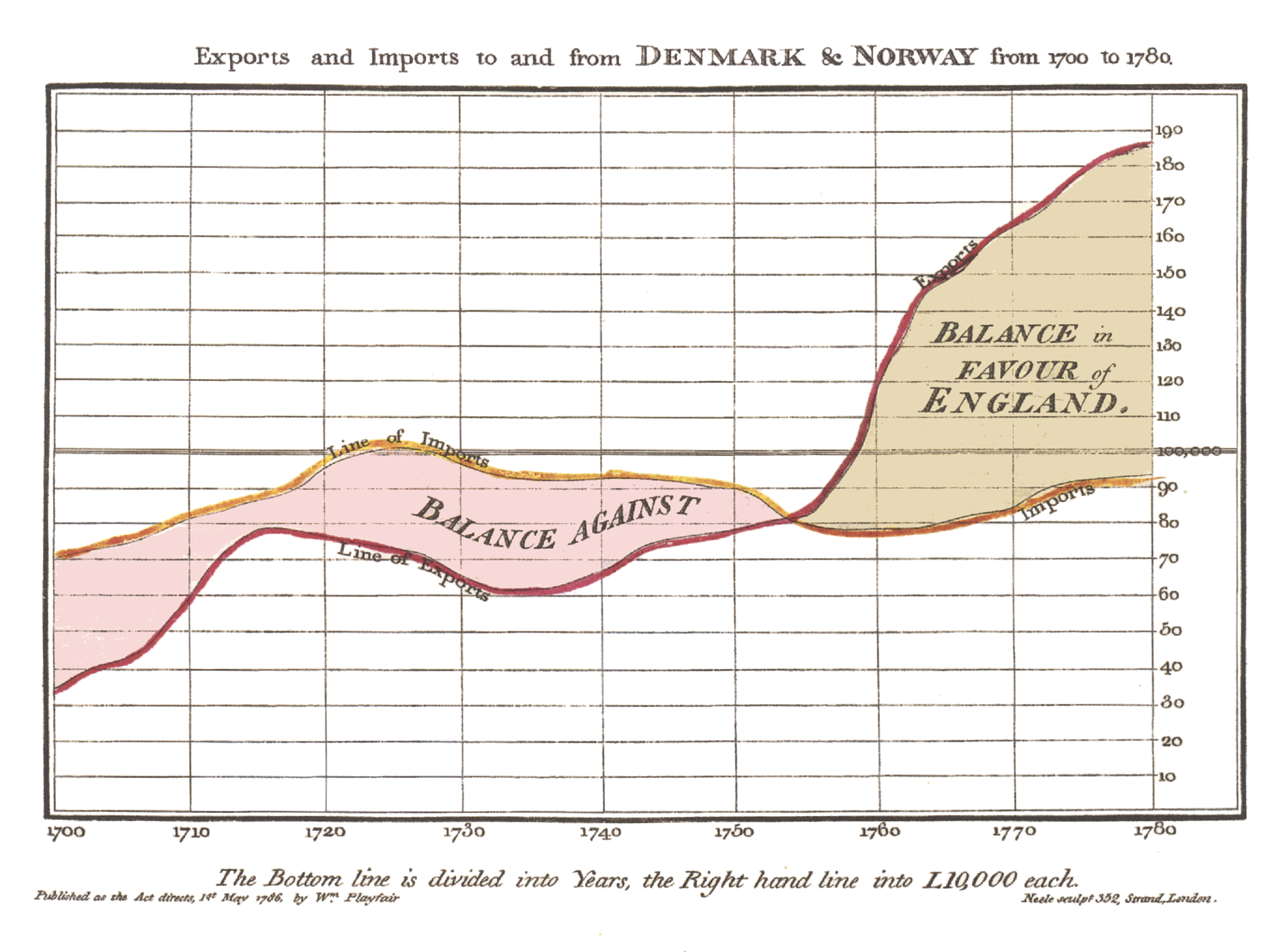
William Playfair said more than 200 years ago: (according to Doug McCune and others, he was the first person who visualized the data, unless the legend about Munehisa Homma will be finally proven): "As the eye is the best judge of proportion, being able to estimate it with more quickness and accuracy than any other of our organs, it follows, that wherever relative quantities are in question …[the Line Chart] ... is peculiarly applicable; it gives a simple, accurate, and permanent idea, by giving form and shape to a number of separate ideas, which are otherwise abstract and unconnected." William Playfair invented four types of Data Visualizations: in 1786 the Line Chart, see it at Wikipedia here:

http://upload.wikimedia.org/wikipedia/commons/5/52/Playfair_TimeSeries-2.png


and Bar Chart chart of economic data, and in 1801 the Pie Chart and circle graph, used to show part-whole relations. Recreation of some Playfair Charts can be found here. Some legends (I have to see a prove of them yet) attributed to Munehisa Homma (also known as Munehisa Honma, Sokyu Honma and Sokuta Honma) the invention of Candlestick Charts way before (around 1755?) first Charts was used and published in western countries.

Article in "Economist", named "Worth a thousand words" referred to "Three of History's Best Charts Ever". Economist obviously had no access (or knowledge?) to original Candlestick Charts (please let me know if you have these images or links to them). The 3 visualizations that The Economist described as "three of history's best" include...

1. Florence Nightangale's 1858 graphic demonstrating the factors affecting the lives (and death rates) of the British army (which resulted in a graphic type called “Nightingale's Rose” or “Nightingale's Coxcomb”), see it on "Economist" site here:

http://media.economist.com/sites/default/files/cf_images/20071222/5107CR3B.jpg.

She showed in a visual graphic that it wasn't wounds killing the highest number of soldiers - it was infections. This Radar (or Polar?) Chart was done in 1859.


2. Charles Joseph Minard's very famous 1861 graphic depicting the Russian campaign of 1812 - Tufte called it the “the best statistical graphic ever drawn”, see it on "Economist" site here:

http://media.economist.com/sites/default/files/cf_images/20071222/5107CR2B.jpg .

What a dramatic story it tells. This Area Chart, overlay-ed over map, was created in 1869.
Old Area Chart by Minard, 1869

Smart people in France even figured out of how to do it Dynamic in Excel:


3. William Playfair's 1821 chart comparing the “weekly wages of a good mechanic” and the “price of a quarter of wheat” over time, see it on "Economist" site here:

http://media.economist.com/sites/default/files/cf_images/20071222/5107CR1B.jpg .

He was one of the first people to use data not just to educate but also to persuade and convince. This old Column Chart, combined with Line (or Area Chart?) - basically one of the first published known Combo Charts, was created in 1821 (almost 200 years ago!)


Minard actually created more charts way before computers and Data Visualization software was created. For example in 1861 he created this Multiline Chart:


In 1866 Mr. Minard created one of the first Stacked Area Charts:


In 1859 Minard published one of the first Bubble Charts, overlayed over Map:


In short, Column, Bar, Line, Combo, Area, Bubble and other type of Charts was used way before (150-200 years ago) people started to use Data Visualization Software. Those oldest charts above and some other very old charts (some created in USA!) you can see in this slideshow:   http://picasaweb.google.com/pandre/Chartology#slideshow/ or/and you can watch this video:

[youtube="https://www.youtube.com/watch?v=r2q8kzdxbac"]

However, as I said in a beginning, some Data Visualization techniques was known and used even before William Playfair. At least 266 years ago in Japan Munehisa Homma invented (again it is a Legend, because even Steve Nison has no copies of original hand-drawn Japanese Candlestick Charts from 18th Century) Candlestick Charts, which eventually became a part of Financial Visualization and they were reused for Stock Charts (a combo of daily Trading Volume and Open-High-Low-Close Multiline Chart of Daily prices).

Permalink: http://apandre.wordpress.com/2010/04/12/history-of-data-visualization/

[soundcloud url="http://api.soundcloud.com/tracks/4986122" iframe="true" /]

20100320

Trend Analysis: see it 1st

Data Visualization can be a good thing for Trend Analysis: it allows to "see this" before "analyze this" and to take advantage of human eye ability to recognize trends quicker than any other methods. Dr. Ahlberg started (after selling Spotfire to TIBCO and claiming that "Second place is first loser") a "Recorded Future" to basically sell ... future trends in form (mostly) of Sparklines; he succeeded at least in selling RecordedFuture to investors from CIA and Google. Trend analysis is an attempt to "spot" a pattern, or trend, in data (in most cases well-ordered set of datapoints, e.g. by timestamps) or predict future events.

Visualizing Trends means in many cases either Time Series Chart (can you spot a pattern here with your naked eye?):


or Motion Chart (both best done by ... Google, see it here http://visibledata.blogspot.com/p/demos.html ) - can you predict the future here(?):


or Sparklines (I like Sparkline implementations by Qlikview and Excel 2010) - sparklines are scale-less visualization of "trends":


may be Scatter (Excel is good for it too):


and in some cases Stock Chart (Volume-Open-High-Low-Close, best done with Excel) - for example Microsoft stock is fluctuating near the same level for many years, so I guess there is no visible trend  here, which may be spells a trouble for Microsoft future (compare with visible trend of Apple and Google stocks):


Or you can see Motion, Timeline, Sparkline and Scatter charts alive/online below: for Motion Chart Demo, please Choose a few countries (e.g. check checkboxes for US and France) and then Click on "Right Arrow" button in the bottom left corner of the Motion Chart below:

[googleapps domain="spreadsheets" dir="spreadsheet/pub" query="key=0AuP4OpeAlZ3PdDRwbTVYZFEwdWJUcXk5MS1WM3IzbHc&output=html&widget=true" width="500" height="700" /]

In statistics trend analysis often refers to techniques for extracting an underlying pattern of behavior in well-ordered dataset which would otherwise be partly hidden by "noise data". It means that if one cannot "spot" a pattern by visualizing such a dataset, then (and only then) it is time to apply regression analysis and other mathematical methods (unless you smart or lucky enough to remove a noise from your data). As I said in a beginning: try to see it first! However, extrapolating the past to the future can be a source for very dangerous mistakes (just check a history of almost any empire: Roman, Mongol, British, Ottoman, Austrian, Russian etc.)

20100202

Dimensionality of Visible Data

Human eye has own Curse of Dimensionality (term suggested in 1961 by R.Bellman and described independently by G. Hughes in 1968). In most cases the data (before they visualized) usually organized in multidimensional Cubes (n-Cubes) and/or Data Warehouses and/or speaking more cloudy - in Data Cloud - need to be projected into less-dimensional datasets (small-dimensional Cubes, e.g. 3d-Cubes) before they can be exposed through (preferably  interactive  and  synchronized set of charts, sometimes called dashboards) 2-dimensional surface of computer monitor in form of Charts.

[caption id="attachment_1155" align="aligncenter" width="510"] Projection of DataCloud to DataCubes and then to Charts[/caption]

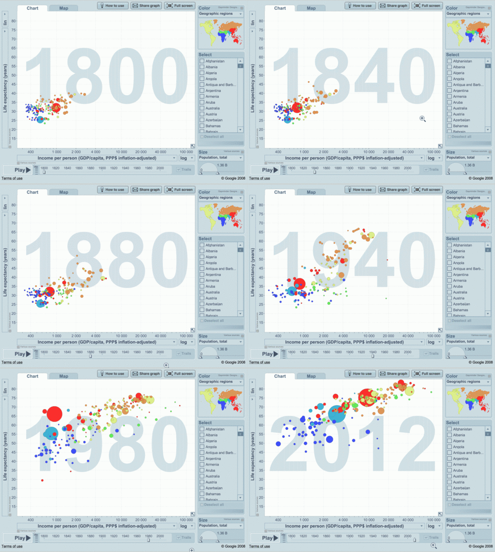
During last 200+ years people kept inventing all type of charts to be printed on paper or shown on screen, so most charts showing 2- or 3-dimensional datasets. Prof. Hans Rosling led Gapminder.org to create the web-based, animated 6-dimensional Color Bubble Motion Chart (Trendalyzer):

tumblr_mssaaxhajz1stz40uo1_500

ansd screenshot of it here:


which he used in his famous demos: http://www.gapminder.org/world/ , where 6 dimensions in this specific Chart are (almost a record for 2-dimensional chart to carry):

  • X coordinate of the Bubble = Income per person,

  • Y coordinate of the Bubble = Life expectancy,

  • Size of the Bubble = Population of the Country,

  • Color of the Bubble = Continent of the Country,

  • Name of the Bubble = Country,

  • Year = animated 6th Dimension/Parameter as time-stamp of the Bubble.


Trendalyzer was bought from Gapminder in 2007 by Google and was converted into Google Motion Chart, but Google somehow is not in rush to enter the Data Visualization (DV) market.

Dimensionality of this Motion Chart can be pushed even further to 7 dimensions (dimension as an expression of measurement without units) if we will use different Shapes (in addition to filled Circles we can use Triangles, Squares etc.) but it will be literally pushing the limit of what human eye can handle. If you will add to the consideration a tendency of DV Designers to squeeze more than one chart on a screen (how about overcrowded Dashboards with multiple synchronized interactive Charts?), we are literally approaching the limits of both human eye and human brain, regardless of the dimensionality of the Data Warehouse in backend.

Below I approximately assessed the dimensionality of datasets for some popular charts (please feel free to send me the corrections). For each Dataset and respective Chart I estimated the number of measures (usually real or integer number, can be a calculation from other dimensions of dataset), the number of attributes (in many cases they are categories, enumerations or have string as datatype) and 0 or 1 parameter (presenting a well-ordered set, like time (for time series), date, year, sequence (can be used for Data Slicing), natural, integer or real  number) and Dimensionality (the number of Dimensions) as a total number of measures, attributes and parameters in a given dataset.


ChartMeasuresAttributesParameterDimensionality
Gauge, Bullet, KPI00
Monochromatic Pie11
Colorful Pie112
Bar/Column112
Sparkline112
Line112
Area112
Radar112
Stacked Line1113
Multiline1113
Stacked Area1113
Overlapped Radar1113
Stacked Bar/Column1113
Heatmap123
Combo123
Mekko213
Scatter (2-d set)213
Bubble (3-d set)314
Shaped Motion Bubble3115
Color Shaped Bubble325
Color Motion Bubble3216
Motion Chart3317


The diversity of Charts and their Dimensionality adding another complexity for DV Designer: what Chart(s) choose. You can find on web some good suggestions about that. Dr. Andrew Abela created Chart Chooser Diagram

[caption id="attachment_1145" align="aligncenter" width="510"] Choosing a good chart by Dr. Abela[/caption]

and it was even converted into online "application"!

Permalink: http://apandre.wordpress.com/2011/03/02/dimensionality/

20100103

Blog as a thought saver

"How do I know what I think until I see what I say?" Or let me rephrase Mr. E.M. Forster: "How do YOU know what I think until I will blog about it"?

I resisted to an idea to have a blog since 1996, because I perceived the blogging as very similar to a fasting in desert (actually after a few months of blogging I am amazed - according to WordPress Statistics - that my blog has hundreds and hundreds of visitors every day!). But recently I got a few excellent pushes to start my own blog because when I posted comments on somebody's blog they got deleted against my will. Turned out that owners of those blogs can delete my comments and thoughts anytime if he/she/they do not like what I said. It happened to me on one of Forrester's Blogs and it happened to me on my own profile on LinkedIn - when I posted so called "update" and some of LinkedIn employees decided to delete it. In both cases above administrators even did not bother to send me my own thoughts for archiving purposes - they just disappear!

So I decided to start the blog about Data Visualization (DV),


because I am doing DV for many years and accumulated many DV implementations and thoughts about DV, DV tools, DV Vendors, DV Market etc. For now I will have 8 main pages (and they will be used as root pages for hierarchy of sub-pages):

  • Home Page of this blog  is a place where all posts and comments will go,

  • Visualization Page (with sub-pages) is for DV Samples and Demos,

  • DataViews Page (and it's sub-pages) is about ... Data Views, Charts and Chartology,

  • Tools Page designated for DV Software and comparison of DV Tools,

  • Solutions Page will describe possible DV solutions, DV System, products  and DV services I can provide,

  • Market Page dedicated to DV Vendors and DV market news and analyses,

  • Data Page is about ETL processes, Data Collection and Data Sources

  • About page can give you an info about me


Another argument (for me to do DV blogging) was said 2500 years ago by Confucius:" Choose a job you love, and you will never have to work a day in your life." And finally, I have to mention this 500-years old story in hope it will help me to filter out from this blog all unneeded pieces: “An admirer asked Michelangelo how he sculpted the famous statue of David that now sits in the Academia Gallery in Florence. How did he craft this masterpiece of form and beauty? Michelangelo’s offered this strikingly simple description: He first fixed his attention on the slab of raw marble. He studied it and then “chipped away all that wasn’t David.”


p001: http://wp.me/pCJUg-3