20110930

Omniscope 2.6 (wait is over!)

Do you want the 1st class Data Visualization on your cool Mac without any Virtual Machine with Windows? If so, your best choice will be the Omniscope 2.6 which is finally about to be released (after more then 2 years of delays) by Visokio, located in UK. Of course the Omniscope will run on Windows (most customers use it on Windows anyway) too: all it needs is Java (if needed, a private copy of Java will be installed on your computer as part of Omniscope package). You can get Omniscope Viewer on Linux workstation as well but if you need a full Omniscope 2.6 on Linux, you will have to ask Visokio about special license for you.


Java  was the problem for me, when I first heard about Omniscope, but more about that in a Special note at the end of this post. Visokio is a tiny company, started in 2002. Because of its size and private funding it took 3 years to release Omniscope 1.0 in 2005 and another 4 years to release Omniscope 2.5 in 2009,


which is what Visokio currently is still shipping. Visokio obviously have rich customers in financial (13+ clients), publishing and marketing(10+), and many other  industries and some of them in love with Apple's Macs, but most customers prefer Windows. Omniscope is a Desktop Java application but completely integrated with internet. It has 4 editions (in both 32-bit and 64-bits versions), which are identical as far a deployment file-set concern, so all you need is buy an appropriate license. The installation process requires about 5 clicks, and user can get started by simply dragging in an Excel file and data will immediately appear and can be explored organically.


Omniscope Editions: Viewer, Desktop, Server, Server Plus.


Free Viewer allows server-less distribution of all Data Visualizations and interact fully (explore, select, filter and drill-down among other interactions) with all data, charts and reports, which are all can be easily exported to PDF, PPT, XLS and JPG files. Omniscope has zero-install "Web Start online version of free Viewer.

Omniscope Desktop/Professional ($4000 with discount for volume orders) in addition to all Viewer functionality, acts as a Development Studio for Data Visualizations (so called IOK applications are secure and compressed files, ready for easy internet delivery) and as a ETL wizard (using Drag-and-Drop Data Manager) for data:


Omniscope Desktop creates, edits and continuously refreshes all involved datasets, formulas, filters, views, layouts, even assumption-driven models, designs and export interactive Flash Data Players, embeddable into websites and into documents. Desktop able to read multidimensional cubes, just like Tableau and PowerPivot, which is a big advantage over Qlikview and Spotfire.

Omniscope Server (about $16000) adds to Desktop functionality: enables 64-bit IOK files behave (even remotely) as Central Datamarts (multi-source data assembly), as Timeslices (auto-refreshable proxies for datasources: one per each datasource), as Master Report IOK (automatically refreshed from Central Datamart IOK) and as Distributed Report IOK(s) (automatically distributed and live-refreshed from Master Report IOK), automates the refreshing of data, enables batch and scheduled distribution of customized IOK files.

Server Plus (about $24000) includes all Server functionality and adds ability to empower selected actions in free Omniscope Viewers (e.g. continuous data refreshing from Datamart IOK files, export to XLS, PPT, PDF, add/edit/save comments and queries etc.), permits unrestricted publishing of IOK visualizations, enables white labeling and branding Viewers and IOK files to customers specifications, allows multiple servers work as one.


Data Engine.


Omniscope is using in-memory Columnar Database, as all best Data Visualizers do but its architecture is different. For example, all datasets are collection of Cells (organized in column, rows and tables). Each Cell with String or Text is a separate Java Object and it leads to a large overhead in terms of memory usage (I always blame Java, which allows only 1.2GB of addressable memory for 32-bit Windows). Some usage statistics prompting that 32-bit Omniscope Desktop/Professional thinks that 5 millions cells is a large dataset and 15 millions cells is a very large dataset. According to Visokio, average client data file is around 40 fields and 50,000 records (2 million cells).

With Omniscope 2.6, experts from Visokio was able to run on 32-bit Windows PC (with 2GB of RAM) the Data Visualization with 70 millions of cells. For comparison with Qlikview I was able to fit 600+ millions of (data) cells into the same 32-bit PC, basically 9 times more data then with Omniscope and overall Omniscope is slower then competitors. As of now, Omniscope will try to use as much memory as possible in order to accelerate performance. I expect in near future the version of Omniscope with large performance and memory management improvements.

64-bit Installations of Omniscope are far more scalable, for example with 8GB of RAM 120 millions of cells was not a problem; largest known installation of Omniscope has 34 million Rows (about half of billion of cells) running on 64-bit Windows/Java PC with 16GB of RAM
In Omniscope 2.6, the DataManager can be used as an entirely new and independent application, allowing you to create and automate ETL workflows, without even loading data into the classic Omniscope interface.  You can visually drag sources in, append and merge, and transform with a variety of powerful operations such as Field Organiser which allows you to add formulas.  You can then publish, including a Batch Publisher which allows you to specify commands in another IOK file, such as "Publish [this subset] to [email] using [this view template]", etc.


For full list of Omniscope features please check this: http://www.visokio.com/omniscope-features and for new features in version 2.6 please review this: http://www.visokio.com/omniscope-new-in-2-6 .

The original foundation of exportable Flash DataPlayer "generation" was totally re-written (for Omniscope 2.6) in ActionScript 3, which increased the scalability of DataPlayer  and added new view types/features. DataPlayers available as an experimental feature in Omniscope 2.6, and fully feature-complete in Omniscope 2.7 (I personally think that the time for Flash is gone/over and it is time to port DataPlayers into HTML5).

Visokio is confident that Omniscope 2.7 will come soon after release of Omniscope 2.6 and it will be integrated with super-popular Open Source Statistical R Library, and hopefully will contain HTML5-based DataPlayer, integration with Salesforce etc. If customers will demand, I also expect the Linux version of Omniscope at some future point.

By the way, my recent Poll is confirming that Omniscope is among Data Visualization Leaders and it got respectable 6% of votes so far! You can vote on this poll, just click here!

Special Note about Java.


While Java gave Omniscope the unique ability to run everywhere, it also gave a performance disadvantage to it, compare with my favorites Qlikview, Spotfire, Tableau and PowerPivot (all 4 written as native Windows applications).

20110922

Teradata Columnar sounds good

Teradata sounds good and smells like money, especially today. I already mentioned that they received U.S. Patent #7966340 on June 21, 2011. The patent is about SQL-MapReduce technology: the data analytic framework that combines the popular MapReduce™ software with the enterprise friendliness of SQL. (Also see article about "multi-structured data sources" from Aster  Data).

Today Teradata Columnar is announced (available in December 2011 as a component of Teradata Database 14) and Teradata Database 14 is released. The new columnar capability from Teradata allows users to mix-and-match ("hybrid") columnar and row-based physical storage when it best suits an application. Teradata Columnar is integrated with the row-based storage and relational database software. Only the data in the columns required for a query are pulled into memory for processing, reducing the time-constraining input/output of a row-based approach that would read data from all the columns.

Teradata Columnar brings traditional "columnar" benefit: the flexible data compression. Teradata Columnar dynamically adjusts the compression mechanisms for optimal storage depends on type and size of data involved, automatically chooses from among six types of compression: run length, dictionary, trim, delta on mean, null and UTF8 based on the column demographics.

Again, these are just a good sound bites until Teradata Columnar will be released. Teradata may be trying to out-market Microsoft with its SQL Server 2011 (or Denali; as of today available as CTP3 community release) which already has the Columnstore Index, integrated with row-based storage and relational database.

I am wondering if Tableau will able timely and natively support Teradata Columnar as it supports now the Teradata Database (important for Data Visualization applications):

20110920

Proliferation of useless Dashboards

This is a guest post from, Marc Gedansky, a well-known sales and marketing consultant in the Business Intelligence space.  Marc writes and speaks frequently on a variety of issues that influence technology providers and users, and is based in Cambridge, MA. I am fortunate to know Marc as Business Intelligence and Data Visualization expert and as my friend for many years.

Recently I noticed that internet (thanks to big data waves and to easy to use Data Visualization tools) is polluted with a lot of useless Dashboards and I spoke with Marc about this topic. Turned out he has a a very good explanation for it and he was kind enough to share his opinion on this blog as a guest blogger. Marc's post reminded me the old story:

"An admirer asked Michelangelo how he sculpted the famous statue of David that now sits in the Academia Gallery in Florence. How did he craft this masterpiece of form and beauty? Michelangelo’s offered this strikingly simple description: He first fixed his attention on the slab of raw marble. He studied it and then “chipped away all that wasn’t David.

________________________________________

Dashboards – why are so many useless?


Marc Gedansky, http://marc1717.blogspot.com/

“Perfection is achieved, not when there is nothing more to add, but when there is nothing left to take away.” - Antoine de Saint-Exupery

Most dashboards are designed with no clue as to the meaning and/or importance of this quote.

(BTW, even though this is a blog about data visualization, I (M.G.) won’t show any poorly designed dashboard examples, as they are ubiquitous.  Trying to find them is about as difficult as trying to find leaves


on the ground in New England during the Fall).

I view dashboards every day; on software company sites, news sites, financial sites, and blogs.  Since dashboards can distill so much information and display it in such a small space, they hold the potential of quickly delivering valuable insights; of cutting through the “data clutter” to immediately reveal important trends or truths.

So why then, are most dashboards crammed with so many charts, dials, and graphs that they overwhelm you?  Just because you can fit a half-dozen on a screen, why is there a need to do it?  (This approach reminds me of my friend Geoff, who, upon hearing that Hellmann’s was coming out with mayonnaise that had half the calories remarked, “great, now I can eat twice as much”.)

I think there can only be two reasons.

1. The designer/developer wants to show off their expertise with Qlikview, or Spotfire, or Tableau, or X product.

2. The designer/developer does not care about the average person, and wants to build smart software for brilliant users.

That attitude reminds me of a meeting I attended at a software company a few years ago.  The head of development was upset because he was being asked to make his software “easy to use”.    He called it “dumbing down”, and complained that it would be less challenging for his development team to build “software for idiots”.  At this point, the President of the company interjected, “if our customers are smart enough to write us a check, then they are smart enough to use our software.  And the onus for them to be able to use our software is on us, not on them.”

For Continuation of this post please see it on this blog's page: http://apandre.wordpress.com/dataviews/dashboard/proliferation-of-useless-dashboards/

20110911

Spotfire Silver 2.0

Spotfire Silver version 2.0 is available now on https://silverspotfire.tibco.com/us/home and it will be officially announced at TIBCO User Conference 2011 (9/27-9/29/11) at http://tucon.tibco.com/

Spotfire Silver available in 4 Editions, see Product Comparison Chart here: https://silverspotfire.tibco.com/us/product-comparison-chart and Feature List at Feature Matrix here: https://silverspotfire.tibco.com/us/get-spotfire/feature-matrix

Update 9/27/11: TIBCO officially released Silver 2.0, see http://www.marketwatch.com/story/tibco-unveils-silver-spotfire-20-to-meet-growing-demand-for-easy-to-use-cloud-based-analytics-solutions-2011-09-27 "TIBCO Silver Spotfire 2.0 gives users the ability to embed live dashboards into their social media applications, including business blogs, online articles, tweets, and live feeds, all without complex development or corporate IT resources... Overall, the software's capabilities foster collaboration, which allows users to showcase and exchange ideas and insights -- either internally or publicly. In addition, it allows users to share solutions and application templates with customers, prospects, and other members of the community."

Spotfire Silver Personal Edition is Free (Trial for one year, can be "renewed" with other email address for free) and allows 50MB (exactly the same amount as Tableau Public) and allows 10 concurrent read-only web users of your content. If you wish more then Personal Edition you can buy Personal Plus ($99/year) or Publisher ($99/month or $1000/year) or Analyst ($399/month) Account.

In any case you will GET for your Account needs a real Spotfire Desktop Client and worry-free and hassle-free web hosting (by TIBCO) of your Data Visualization applications - you do not need to buy any hardware,  software or services for web hosting, it is all part of your Spotfire Silver account.

To test Spotfire Silver 2.0 Personal Edition I took Adventure Works dataset from Microsoft (60398 rows, which is 6 times more than Spotfire's own estimate of 10000 rows for 50MB Web storage). Adventure Works dataset  requires 42MB as Excel XLS file (or 16M as XLSX with data compression) and only 5.6MB as Spotfire DXP file (Tableau file took approximately the same disk space, because both Spotfire and Tableau are doing a good data compression job). This 5.6MB size of DXP file for Adventure Works is just 11% of web storage allowed by Spotfire (50MB for Personal Edition) to each user of free Spotfire Silver 2.0 Personal Edition.

Spotfire Silver 2.0 is a very good and mature Data Visualization product with excellent Web Client, with Desktop Client development tool and with tutorials online here: https://silverspotfire.tibco.com/us/tutorials . Functionally (and Data Visualization-wise) Spotfire Silver 2.0 has more to offer then Tableau Public. However Tableau Public account will not expire after 1 year of "trial" and will not restrict number of simultaneous users to 10.

Spotfire Silver 2.0 Publisher and Analyst Accounts can compete successfully with Tableau Digital and they have much clear licensing then Tableau Digital (see http://www.tableausoftware.com/products/digital#top-10-features-of-tableau-digital ), which is based on number of "impressions" and can be confusing and more expensive then Spotfire Silver Analyst Edition.

20110817

Data Visualization Poll (Fall 2011)

7 months ago I published a poll on LinkedIn and got a lot of responses, 1340 votes (in average 1 vote per hour) and comments. People asked me many times to repeat this poll from time to time. I guess it is time to re-Poll. I added 2 more choices (LinkedIn allows maximum 5 choices in their polls and it is clear not enough for this poll), based on a feedback I got: Omniscope and Visual Insight/Microstrategy. I also got some angry voters complaining that certain vendors are funding this poll. This is completely FALSE, I am unaffiliated with any of vendors, mentioned in this poll and I am working for completely independent (from those vendors) software company, see the About page of this Blog.

[polldaddy poll=5431389]


20110801

Tableau 6.1 is released

Today Tableau 6.1 is released (and client for iPad and Tableau Public for iPad), that includes the full support for incremental Data updates whether they are scheduled or on demand:


New in Tableau 6.1


  • Incremental Data updates scheduled or on demand

  • Text parser faster, can parse any text files as data source (no 4GB limit)

  • Files larger than 2GB can now be published to Tableau Server (more "big data" support)

  • Impersonation for SQL Server and Teradata; 4 times faster Teradata reading

  • Tableau Server auto-enables touch, pinch, zoom, gesture UI for Data Views

  • Tableau iPad app is released, it browses and filters a content on Server

  • Any Tableau Client sees Server-Published View: web browser, mobile Safari, iPad

  • Server enforces the same (data and user) security on desktop, browser, iPad

  • Straight links from an image on a dashboard, Control of Legend Layout etc.


Here is a Quick demo of how to create Data Visualization with Tableau 6.1 Desktop, how easy to publish it on Tableau server 6.1 and how it is instantly visible, accessible  and touch optimized on the iPad:


New since Tableau 6.0, more then 60 features, including:


  • Tableau now has in-memory Data Engine, which greatly improves I/O speed

  • Support for "big" data

  • Data blending from multiple sources

  • Unique support for local PowerPivot Multidimensional Cubes as Data Source

  • Support for Azure Datamarket and OData (Open Data Protocol) as Data Sources

  • Support for parameters in Calculations

  • Motion Charts and Traces (Mark History)

  • In average 8 times faster of rendering of Data Views (compare with previous version)


Tableau Product Family


  • Desktop: Personal ($999), Professional ($1999), Digital, Public.

  • Server: Standard, Core Edition, Digital, Public Edition.

  • Free Client: Web Browser, Desktop/Offline Tableau Reader.

  • Free Tableau Reader enables Server-less distribution of Visualizations!

  • Free Tableau Public served 20+ millions visitors since inception


Tableau Server


  • Easy to install: 13 minutes + optional 10 minutes for firewall configuration

  • Tableau has useful command line tools for administration and remote management

  • Scalability: Tableau Server can run (while load balancing) on multiple machines

  • Straightforward licensing for Standard Server (min 10 users, $1000/user)

  • With Core Edition Server License: unlimited number of users, no need for User Login

  • Digital Server Licensing based on impressions/month, allows unlimited data, Tableau-hosted.

  • Public Server License: Free, limited (100000 rows from flat files) data, hosted by Tableau.


Widest (and Tableau optimized) Native Support for data sources


  • Microsoft SSAS and PowerPivot: Excel Add-in for PowerPivot, native SSAS support

  • Native support for Microsoft SQL Server, Access, Excel, Azure Marketplace DataMarket

  • Other Enterprise DBMSes: Oracle, IBM DB2, Oracle Essbase

  • Analytical DBMSes: Vertica, Sybase IQ, ParAccel, Teradata, Aster Data nCluster

  • Database appliances: EMC/GreenPlum, IBM/Netezza

  • Many Popular Data Sources: MySQL, PostgreSQL, Firebird, ODBC, OData, Text files etc.


Some old problems I still have with Tableau


  • No MDI support in Dashboards, all charts share the same window and paint area

  • Wrong User Interface (compare with Qlikview UI) for Drilldown Functionality

  • Tableau's approach to Partners is from stone ages

  • Tableau is 2 generations behind Spotfire in terms of API, Modeling and Analytics


20110714

Tabular Model, Columnstore, new BIDS

Microsoft finally released SQL Server 11 "Denali" as CTP3 (Community Technology Preview) for public ... Preview. Microsoft is (these are politeness words I can type) stubbornly refusing to have/build own Data Visualization Product. I doubt Crescent "experience" can be considered as a product, especially because it is Silverlight-base, while world already moved to HTML5.

If you have 7 minutes, you can watch Crescent Demo from WPC11, which is showing that while trailing a few years behind DV Leaders and Google, Microsoft is giving to its die hard followers something to cheer about:


I have to admit, that while there is nothing new (for DV expert) in video above, it is a huge progress compare with Excel-based Data Visualizations, which Microsoft tried to promote as a replacement of ProClarity and PerformancePoint Server. Even Microsoft itself positions Crescent (which is 32-bit only!) as a replacement for SSRS Report Builder, so DV Leaders can sleep well another night.

However, Microsoft's BI Stack is the number 4 or 5 on my list of DV Leaders and CTP3 is so rich with new cool functionality, that it deserves to be covered on this blog.

Of course major news is availability of Tabular Data Model, which means VertiPaq in-memory columnar Engine, similar to PowerPivot Engine but running on Server without any SharePoint (which is a slow virus, as far as I am concerned) and without stupid SharePoint UI and limitations and I quote Microsoft: " In contrast with the previous release, where VertiPaq was only available via in PowerPivot for SharePoint, you can now use VertiPaq on a standalone Analysis Services instance with no dependency on SharePoint."!

SSAS (SQL Server Analysis Services) has new (they may existed before, but before CTP3 - ALL who knew that were under NDA) features like memory paging (allows models to be larger than the physical memory of the server, means unlimited scalability and BIG Data support), row level security (user identity used to hide/show visible data), KPI, Partitions; CTP3 removes the maximum 4GB file size limit for string storage file, removes the limit of 2 billion rows per table (each column is still limited to a maximum of 2 billion distinct values, but in columnar database it is much more tolerable restriction!).

New version of PowerPivot is released with support of  Tabular Model and I quote: "You can use this version of the add-in to author and publish PowerPivot workbooks from Excel 2010 to Microsoft SQL Server" and it means no SharePoint involvement again! As Marco Russo put it: "Import your existing PowerPivot workbooks in a Tabular project (yes, you can!)" and I agreed 100% with Marco when he said 4 times: Learn DAX!

After 3 years of delays, Microsoft is finally has BIDS for Visual Studio 2010  and that is huge too, I quote again: "The Tabular Model Designer ... is now integrated with Microsoft SQL Server “Denali” (CTP 3) Business Intelligence Development Studio." It means that BIDS now is not just available but is the main unified development interface for both Multidimensional and Tabular Data Models. Now we can forget about Visual Studio 2008 and finally use more modern VS2010!

Another extremely important for Data Visualization feature is not in SSAS but in SQL Server itself: Columnstore index is finally released and I a quote 1 more time again: "The ... SQL Server (CTP 3) introduces a new data warehouse query acceleration feature based on a new type of index called the columnstore. This new index ... improves DW query performance by hundreds to thousands of times in some cases, and can routinely give a tenfold speedup for a broad range of decision support queries... columnstore indexes limit or eliminate the need to rely on pre-built aggregates, including user-defined summary tables, and indexed (materialized) views. Furthermore, columnstore indexes can greatly improve ROLAP performance" (ROLAP can be used for real-time Cubes and real-time Data Visualizations).

All these cool SQL Server 11 new stuff is coming soon into Azure Cloud and this can be scary for any DV vendor, unless it knows (Tableau does; Qliktech and Spotfire still ignore SSAS) how to be friendly with Microsoft.

As we know now the newly coined by Microsoft term BISM (Business  Intelligence  Semantic Model) was a marketing attempt to have a "unified" umbrella


for 2 different Data Models and Data Engines: Multidimensional Cubes (invented by Mosha Pasumansky 15 years ago and the foundation for SSAS and MDX - SQL Server Analysis Services) and Tabular Model (used in PowerPivot and VertiPaq in-memory columnar Database with new DAX Language which is going to be very important for future Data Visualization projects).

New CTP3-released BIDS 2010 (finally almighty Visual Studio 2010 will have a "Business Intelligence Development Studio" after 3+ years of unjustified delays!) UI-wise will able to handle these 2 Data Models, but it is giving me a clue why Mosha left Microsoft for Google. And lack of DV product is a clue for me why Donald Farmer (face of Microsoft BI) left Microsoft for Qliktech.

Even more: if you need both Data Models to be present, you need to install 2 (TWO!) different instances of "Analysis Services": one with Multidimensional Engine and one with new Tabular (VertiPaq/PowerPivot) Engine. It seems to me not as ONE "BI" architecture but TWO "BI" Architectures, interface-glued on Surface by BIDS 2010 and on back-end by all kind of Data Connectors. Basically Microsoft is in confused BI state now because financially it can afford 2 BI Architectures and NO Data Visualization Product!

I cannot believe I am saying this, but I wish Bill Gates back from retirement (it will be good for Microsoft shares and good for Microsoft market capitalization too - just ask Apple's shareholders about Steve and they will say he is a god)!

Permalink: http://apandre.wordpress.com/2011/07/14/tabular-model/

20110630

3-in-1: PCM, SQL-MapReduce patent, DV is new BI

In last few days something (3 news covered here in one post below) important for the future of Data Visualization and Big Data Analytics happened. IBM recently had 100th Birthday and almost at the same time their engineers published new invention, based on PCM (Phase-Change Memory).

  • PCM will not lose data when when power is turned off.

  • PCM 100 times faster (10 microseconds latency!) then flash and HDD.

  • PCM can endure at least 10 million write cycles (Flash maxed-out @30000)

  • PCM is cheap, has huge capacity and will be mass-produced before 2016.

  • PCM can be used everywhere from huge servers to smartphones


This invention is changing the approach to how to store and access "Big Data" and what portion of "Big Data" need to be in-memory (RAM) for Data Visualization purposes as oppose to outside of RAM (say on hard disk, flash or PCM). IBM may have a keys to Big Data kingdom...

To some people it may be unrelated, but not to me: Teradata just got the Patent on SQL-MapReduce technology they got from Aster Data acquisition. This technology allows also to integrate with Apache Hadoop and derived database systems, used in many Big Data applications.

And last but not least is a recent acknowledgment (for some reason it came from India's branch of IBM Software and I am wondering why, but finally it came "Straight from the horse's mouth"! ) from IBM that Data Visualization is the future of Business Intelligence (I said THIS many years ago and still repeating it from time to time: DV is new BI or in other words: the BI is dead, all hails to DV!). IBM is very proudly saying that Cognos 10 supports "enormous" number of Charts (I guess it will make Qlikview, Spotfire and Tableau people laughing)

and that the most discussed feature in Cognos 10 is Active Reports. This functionality allows the report authors to create interactive reports (apparently it is a big deal for IBM!).

IBM even is spreading rumors for weeks (through people who signed NDA with them) about Cognos TM1-based "new visualization tool", which will "disrupt" DV market... I guess because IBM knows that BI is dead (and IBM wasted $14+B buying 24 BI companies lately) and DV is new BI.

Since IBM improved PCM (see above) and had 100th birthday, I really wish good luck to them, but I wish IBM to stay focused on what they good at instead of spreading all over the high-tech. All these 3 "news" were published yesterday and today and somehow connected in my mind to Data Visualization's future and forced me to publish this "eclectic" post...

20110627

Excel as a BI Platform – Part 3

Below is a Part 3 of the Guest Post by my guest blogger Dr. Kadakal, (CEO of Pagos, Inc.). This article is about of how to build Dashboards and Data Visualizations with Excel. The topic is large, and the first portion of article (published on this blog 3 weeks ago) contains the the general Introduction and the Part 1 “Use of Excel as a BI Platform Today“.  The Part 2 – “Dos and Don’ts of building dashboards in Excel“ published 2 weeks ago  and Part 3 – “Publishing Excel dashboards to the Internet“ is started below and its full text is here.

As I said many times, BI is just a marketing umbrella for multiple products and technologies and Data Visualization became recently as one of the most important among those. Data Visualization (DV) so far is a very focused technology and article below shows how to publish Excel Data Visualizations and Dashboards on Web. Actually a few Vendors providing tools to publish Excel-based Dashboards on Web, including Microsoft, Google, Zoho, Pagos and 4+ other vendors:

I leave to the reader to decide if other vendors can compete in business of publishing Excel-based Dashbaords on Web, but the author of the artcile below provides a very good 3 criterias of how to select the vendor, tool and technology for it (and when I used it myself it left me only with 2 choices - the same as described in article).

Author: Ugur Kadakal, Ph.D., CEO and founder of Pagos, Inc. 


Publishing of Excel Dashboards on the Internet


Introduction


In previous article (see "Excel as BI Platform" here) I discussed Excel’s use as a Business Intelligence platform and why it is exceedingly popular software among business users. In 2nd article ("Dos&Don’ts of Building Successful Dashboards in Excel") I talked about some of the principles to follow when building a dashboard or a report in Excel. Together this is a discussion of why Excel is the most powerful self-service BI platform.

However, one of the most important facets of any BI platform is web enablement and collaboration. It is important for business users to be able to create their own dashboards but it is equally important for them to be able to distribute those dashboards securely over the web. In this article, I will discuss two technologies that enable business users to publish and distribute their Excel based dashboards over the web.

Selection Criteria


The following criteria were selected in order to compare the products:

  1. Ability to convert a workbook with most Excel-supported features into a web based application with little to no programming.

  2. Dashboard management, security and access control capabilities that can be handled by business users.

  3. On-premise, server-based deployment options.


Criteria #3 eliminates online spreadsheet products such as Google Docs or Zoho. As much as I support cloud based technologies, in order for a BI product to be successful it should have on-premise deployment options. Without on-premise you neglect the possibility of integration with other data sources within an organization.

There are other web based Excel conversion products on the market but none of them meet the criteria of supporting most Excel features relevant to BI; therefore, they were not included in this article about how to publish Excel Dashboard on Web .

20110614

Excel as a BI Platform – Part 2

Below is a Part 2 of the Guest Post by my guest blogger Dr. Kadakal, (CEO of Pagos, Inc.). This article is about of how to build Dashboards and Data Visualizations with Excel. The topic is large, and the first portion of article (published on this blog last week) contains the the general Introduction and the Part 1 “Use of Excel as a BI Platform Today“.

The Part 2 – “Dos and Don’ts of building dashboards in Excel“ is below and Part 3 – “Publishing Excel dashboards to the Internet“ is coming soon. It is easy to fall into a trap with Excel, but if  you avoid those risks as described in article below, Excel can become of one of the valuable BI and Data Visualization (DV) tool for user. Dr. Kadakal said to me recently: "if the user doesn't know what he is doing he may end up spending lots of time maintaining the file or create unnecessary calculation errors". So we (Dr. Kadakal and me) hope that article below can save time for visitors of this blog.

BI in my mind is a marketing umbrella for multiple products and technologies, including RDBMS, Data Collection, ETL, DW, Reporting, Multidimensional Cubes, OLAP, Columnar and in-Memory Databases, Predictive and Visual Analytics, Modeling and DV.

Data Visualization (aka DV), on other hand, is a technology, which enabling people to explore, drill-down, visually analyze their data and visually search for data patterns, like trends, clusters, outliers, etc. So BI is marketing super-abused term, while DV so far is focused technology and article below shows how to use Excel as a great Dashboard builder and Data Visualization tool.

Dos&Don’ts of Building Successful Dashboards in Excel


Introduction (click to see the full article here)


In previous week's post (see also article "Excel as BI Platform" here) I discussed Excel’s use as a Business Intelligence platform and why it is exceedingly popular software among business users. In this article I will talk about some of the principles to follow when building a dashboard or a report in Excel.

One of the greatest advantages of Excel is its flexibility: it puts little or no constraints on the user’s ability to create their ideal dashboard environments. As a result, Excel is being used as a platform for solving practically any business challenge. You will find individuals using Excel to solve a number of business-specific challenges in practically any organization or industry. This makes Excel the ultimate business software.

On the other hand, this same flexibility can lead to errors and long term maintenance issues if not handled properly. There are no constraints on data separation, business logic or the creation of a user interface. Inexperienced users tend to build their Excel files by mixing them up. When these facets of a spreadsheet are not properly separated, it becomes much harder to maintain those workbooks and they become prone to errors.

In this article, I will discuss how you can build successful dashboards and reports by separating data, calculations and the user interface. The rest of this post you can find in this article

 Dos and Don’ts of building dashboards in Excel" here.


It discusses how to prepare Data (both static and external) for dashboards, how to build formulas and calculation models, UI and Input Controls for Dashboards and of course - Pivots,Charts, Sparklines and Conditional Formatting for innovative and powerful Data Visualizations in Excel.

20110605

Excel as a Business Intelligence Platform - Part 1

This is a Part 1 of surprise Guest post. My guest is Ugur Kadakal, Ph.D., he is the CEO and founder of Pagos, Inc., which he started almost 10 years ago.

Dr. Kadakal is an expert in Excel, Business Intelligence, Data Analytics and Data Visualization. His comprehensive knowledge of Excel, along with his ambitious inventions and ideas, supply the foundation for all Pagos products, which include SpreadsheetWEB (which converts Excel spreadsheets into web applications), SpreasheetLIVE  (a fully-featured, browser-based spreadsheet application environment) and Pagos Spreadsheet Component (which integrates Excel spreadsheets into enterprise web applications).

Pagos started and hosted the largest free collection and repository of professional templates of Excel spreadsheets on the web: http://spreadsheetzone.com . 3 Excel-based Dashboard below can be found on this very popular repository and done by Dr. Kadakal:

Dashboard 1 : Human Resources Dashboard: http://spreadsheetzone.com/templateview.aspx?i=498

Dashboard 2 : Business Activity Dashboard in EuroZone: http://spreadsheetzone.com/templateview.aspx?i=490

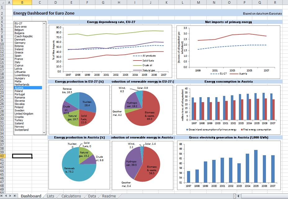
Dashboard 3 : Energy Dashboard for Euro Zone: http://spreadsheetzone.com/templateview.aspx?i=491

The topic is large, so this Guest article is splitted on 3 blog posts. The first portion of article contains the Introduction and Part 1 "Use of Excel as a BI Platform Today", then I expect Dr. Kadakal will do at least 2 more posts: Part 2 - "Dos and Don’ts of building dashboards in Excel", Part 3 - "Moving Excel dashboards to the Web".

Excel as a Business Intelligence Platform – Part 1


Introduction


Electronic spreadsheets were one of the very first Business Intelligence (BI) software. While the availability of spreadsheet software and it use as a tool for data analysis dates back to the 1960s, its application in the BI field began with the integration of OLAP and pivot tables. In 1991, Lotus released Improve, followed by Microsoft’s release of PivotTable in 1993. However, Essbase was the first scalable OLAP software to handle large data sets that the early spreadsheet software was incapable of. This is where its name comes from: Extended Spread Sheet Database.

There is no doubt that Microsoft Excel is the most commonly used software for BI purposes. While Excel is general business software, its flexibility and ease of use makes it popular for data analysis with millions of users worldwide. Excel has an install base of hundreds of millions of desktops: far more than any other BI platform. It has become a household name. From educational utilization to domestic applications and enterprise implementation, Excel has been proven incredibly indispensable. Most people with commercial or corporate backgrounds have developed a proficient Excel skillset. This makes Excel the ultimate self-service BI platform. However, like all systems, Excel has some weaknesses that make it difficult to use as a BI tool under certain conditions.


Use of Excel as a BI Platform Today


Small Businesses


Traditionally, small businesses are not considered as an important market segment by most BI vendors. Their data analysis and reporting needs are limited primarily due to their smaller commercial volumes. However, this is changing quickly as smaller organizations begin to collect large amounts of data, thanks to the Internet and social media, and require tools to manage that data. However, what is not changing is the limited financial resources available to them. Small businesses cannot spare to spend large amounts of money on BI software or consultants to aid them in the creation of the applications. That’s why Excel is the ideal platform for them and will most probably remain that way for a foreseeable future. The reasons are clear: (1) most of them already have Excel licenses, (2) most of their users know how to use Excel and (3) their needs are simpler and can be met with Excel.

Mid-Range Businesses


Mid-range businesses are a quickly growing market segment for BI vendors. Traditionally, Excel as a BI platform has been more popular among these businesses. Cost and availability are the primary factors in this. However, two aspects have been steering them to searching for alternatives: (1) Excel can no longer handle their growing data volumes and (2) other BI vendors started offering cost-effective alternatives.

As a result, Excel’s market share in this field is in decline although it still remains the most popular. On the other hand, with the release of Office 2010 and its extended capabilities for handling very large data sets, Excel stands a good chance at reversing this decline.


Large Enterprises


The situation with large enterprises is rather complex. Most of them already have large-scale a BI implementation in place. Those implementations often connect various databases and data warehouses within the organizations. They have made significant investments and continue doing so to expand and maintain their BI systems. They already have a number of dashboards and reports designed to serve their business units. However, business users always need new and different dashboards and reporting tools. The only software that gives them the ultimate flexibility in creating their own reports is Excel. As a result, even in large Enterprises, usage of Excel for BI purposes is common. Business users often go to their data warehouses or BI tools and get a data extract to bring into Excel. They can then prepare their analysis and build their reports in Excel.

Enterprises will continue using their existing platforms because they have made huge investments building those systems. However, Excel use by business users as their secondary BI and reporting tool will continue to rise unless the alternative vendors significantly improve their self-servicing capabilities.


Summary


Excel is one of the ultimate business platforms and offers unparalleled features and capabilities to non-programmers. This makes it an ideal self-service BI platform. In this article, we examined the use of Excel as a BI platform in companies of different sizes. In the next article of this series, we will discuss how to use Excel more efficiently as a BI platform, from handling data to calculations and visual interactions.

20110526

Footprint Comparison for DV Leaders

Comparison of DV Tools is the most popular page (and post) of this site, visited by many thousands of people. Some of them keep asking to append this comparison with different additional features, one of them is a comparison of requirements of leading DV tools for file and memory footprint and also for reading and saving time.

I took mid-sized dataset (428999 rows and 135 columns), exported it into CSV and compressed it to ZIP format, because all native DV formats (QVW by Qlikview, DXP by Spotfire, TWBX by Tableau and XLSX by Excel and PowerPivot) are compressed one way or another. My starting filesize (of ZIPped dataset) was 56 MB. Here is what I got, see for yourself:

[googleapps domain="spreadsheets" dir="spreadsheet/pub" query="hl=en_US&hl=en_US&key=0AuP4OpeAlZ3PdGszUVZDVGwxOE0wVExZcmhPdVlXQ2c&single=true&gid=0&output=html&widget=true" width="500" height="300" /]

One comment is that numbers above are all relative to configuration of hardware used for tests and also depend on other software I ran during tests, because that software also requires RAM, CPU cycles, disk I/O and even on speed of repainting applications windows on screen, especially for Excel. I probably will add more comments to this post/page, but my first impression from this comparison is that new Tableau's Data Engine (released in version 6.0 and soon will be updated in 6.1) made Tableau more competitive. Please keep in mind, that comparison of in-memory footprint was much less significant in above test, because Qlikview, Excel and PowerPivot putting all dataset into RAM, while Tableau and Spotfire can leave some (unneeded for visualization) data on disk, treating it as "virtual memory". Also Tableau using 2 executables (not just one EXE as others): tableau.exe (or tabreader.exe) and tdserver64.exe

Since Tableau is the only DV Leading software, capable to read from SSAS Cubes and from PowerPivot (local SSAS) Cubes, I also took large SSAS Cube and for testing purposes I selected SSAS Sub-Cube with 3 Dimensions, 2 Measures and 156439 "rows", measured the Time and Footprint, needed for Tableau to read Sub-Cube, Refresh it in Memory, Save to local application file, and also measurted "Cubical" Footprint of it in Memory and on Disk and then compared all results with the same tests while running Excel 2010 alone and Excel 2010 with PowerPivot:

[googleapps domain="spreadsheets" dir="spreadsheet/pub" query="key=0AuP4OpeAlZ3PdFZUczdEbEVqU2lOMXRDOXJBUXJnQ3c&single=true&gid=1&output=html&widget=true" width="500" height="300" /]

While Tableau's ability to read and visualize Cubes is cool, performance-wise Tableau is far behind of Excel and PowerPivot, especially in Reading department and memory footprint. In Saving department and File footprint Tableau is doing nothing because it is not saving cube locally in its local application TWBX file (and it keeps data in SSAS cube outside of Tableau) so Tableau's file footprint for SSAS Cubes is not an indicator but for PowerPivot-based local Cubes Tableau does better job (saving data into local application file) then both Excel and PowerPivot!

20110505

Spotfire 3.3: mature, scalable, social

TIBCO released Spotfire 3.3 and first (see what is new here) that jumped to my eyes was how mature this product is. For example, among new features is improved scalability - each additional simultaneous user of a web analysis initially claims very little additional system memory:


Many Spotfire customers will be able to support a greater number of web users on their existing hardware by upgrading to 3.3. Spotfire Web Player 3.3 includes significant improvements in memory consumption (as shown above for certain scenarios). Theoretically goal is to minimize the amount of system memory needed to support larger numbers of simultaneous users on the same analysis file. Main use case here: the larger the file and the greater the number of simultaneous web users on that file, then less initial system memory required to support each additional user: it is greatly reduced compared to version 3.2.1 and earlier.

Comparison with competition and thorough testing of new Spotfire scalability has to be done (similar to what Qliktech done with Qlikview here), but my initial reaction is as I said in a Title: we are witnessing a very mature software. Apparently the Defense Intelligence Agency (DIA) agrees with me and Defense Intelligence Agency Selects TIBCO Spotfire Analytics Solutions for Department of Defense Intelligence Information System Community. "With more than 16,500 military and civilian employees worldwide, DIA is a major producer and manager of foreign military intelligence"

Spotfire 3.3 also includes collaborative bookmarking, which enables all Spotfire users  to capture a dashboard - its complete configuration, including markings, drop down selections, and filter settings and share that visualization immediately with other users of that same dashboard, regardless of client in use. Spotfire actually not just a piece of Data Visualization Software, but a real Analytical Platform with large portfolio of products, including completely integrated S-PLUS (commercial version of R Library which has million of users), best Web Client (you can go Zero-footprint with Spotfire Web Player or/and partially free Spotfire Silver), free iPad Client version 1.1.1 (requires iTunes, so be prepared for Apple intrusion), very rich API, SDK, integration with Visual Studio, support of IronPython and JavaScript , well-thought Web Architecture, set of Extension Points etc.

System requirements for Spotfire 3.3 can be found here. Coincidentally with 3.3 Release Spotfire VAR Program got expansion too. Spotfire has a very rich set of training options, see it here. You can also find set of good Spotfire videos from Colin White's Screencast Library, especially 2011 Webcasts.

My only and large concern with Spotfire is its focus, since it is part of a large corporation TIBCO, which has 50+ products and 50+ reasons to focus on something else. Indirectly it can be confirmed with sales: my estimate that Tableau is growing much faster than Spotfire (sales-wise) and Qlikview Sales probably 3 times larger (dollar-wise) than Spotfire sales. Since TIBCO bought Spotfire in 2007, I expected Spotfire will be integrated with other great TIBCO products, but after 4 years it is still not a case... And TIBCO has no reason to change its corporate policies, since its busines is good and stock is doing well:


(at least 500% increase of share price since end of 2008!). Also see article written by Ted Stamas for SeekingAlpha and comparison of TIBX vs. ETF here:


I think it is interesting to notice that TIBCO recently rejected a buyout offer from HP!

20110430

Good week for Qliktech

Last week of April 2011 was good for Qliktech. It released the results for a First Quarter 2011 and they are very positive.

Revenue is up (does not look like it is slowing down) 44% YoY, if compared with 1Q2010 with revenue $63M and projection for total 2011 now about $300M (up from preliminary projection of $280M before Q1 happened). Ended the first quarter of 2011 with an active customer count of approximately 19,000 (means about 900000 licensed, paying Data Visualization and BI users now and number of Qlikview users may exceed 1 million in 2011!), up from approximately 14,000 active customers at the end of the first quarter of 2010! Among other news:

  • Qliktech hired 103 new employees in Q1 of 2011 and currently employed 883 people (a 43% increase year-over-year).

  • Qliktech signed a strategic alliance with Deloitte, starting with Netherlands and planning expansion of alliance to Deloitte worldwide.

  •  About 2 weeks ago Qliktech unveils one of the first HTML5-based full client application: Qlikview on iPad (free [user will need license to access Qlikview Server anyway] - and delivered it through the Safari mobile Web browser) - Qliktech claims that it is "every bit as rich as a native app."


I guess most of DV Client applications should have HTML5 reincarnation soon... As a result of all these positive sound bites, Qliktech shares ended this week above $32, more than tripled in 9 months:


and I compared Qliktech's relative growth in above Annotated Timeline chart with Microstrategy, TIBCO and Apple (yes, Qliktech is growing at least twice faster than ... Apple). I cannot include Tableau in comparison, because Tableau Software is still ... a private company.

Qliktech's capitalization as of today, 4/30/11 is $2.5B, $1B more than Microstrategy and only twice less than TIBCO's capitalization. I know at least 3 software vendors, who are focused only on BI and DV: Tableau (it is still a private company; BTW, Tableau 6.1 will be released soon) - growing faster (114% YoY- see it here) than anybody, Qliktech (share price has tripled in last 9 months) and Microstrategy (it's share price almost doubled in last 9 months). I consider the dedication to DV and BI as very important for future success in DV market; for example TIBCO's Spotfire is only one of 50+ TIBCO's products... and it dangers the future of one of the most advanced and mature DV products - Spotfire (version 3.3 is coming soon) .

One of reasons for Qliktech growth is its 1000+ partners and extensive Partner Programs for OEM Partners, Solution Providers, Business Consultants and System Integrators. Those overdeveloped Partner Programs required mandatory commitments from Partners in terms of Revenue Targets, Membership Fees, Qlikview Certifications and Minimum number of Trained employees. Lately Qliktech unreasonably raised those requirements and it may backfire and slowdown Qliktech growth and will help competitors like Tableau (Tableau actually opposite to Qliktech: their partnership program is underdeveloped - in my opinion - and requires big improvements) and recently Microstrategy (which seems learning from own and competitors mistakes and catching up lately).

Update 3 months later:


in Q2 of 2011 Qliktech reached 21000 customers worldwide (it means almost 1 million licensed users), $74 Millions in revenue (45% over Q2 2o1o); 1000 full time employes (400+ more compare with Q2 2010), $2.4B Market Capitalization and guess what - $2.2  Million of lost!

Permalink: http://apandre.wordpress.com/2011/04/30/good-week-for-qliktech/

20110423

Visual Insight from Microstrategy

Microstrategy is a famous and BI-dedicated company, operating for 22+ years, recently released Visual Insight (as part of the release of Microstrategy 9.2 this week) and joint the DV race. A couple of years ago, I advised to some local company in terms of choosing Data Visualization Partner and final 3 choices were Qlikview, Spotfire and Microstrategy. Microstrategy was most competitive pricing-wise, but their Data Visualization functionality was not ready yet. They are ready now, see it here (from webcast this week):


Visual Insight as part of Microstrategy 9.2 targets so called "self-service BI", and transition (they acknowledged that) from "old BI" (tabular reports: published static and OLAP reports) to "new BI" (Data Visualization and Dashboards), from Desktop to Mobile Clients (that is a forward looking statement for sure), from Physical to Cloud.

Microstrategy is claiming that Visual Insight allows to visualize Data in 30 minutes (that is good to know, but DV Leaders already have it for a while, welcome to the club!) compare with 30 days for the same process with "traditional BI":


(I am saying this for 6 years now and on this blog since inception of it; does it mean that old BI is useless now and too pricey? Microstrategy presenters saying that answer is yes! and I want to thank Microstrategy for the validation of my 6-years old conclusion). For full set of Microstrategy 9.2 slides click here.

Microstrategy 9.2 has a full BI product portfolio, fast in-memory Data Engine, free mobile and tablet clients, has even Free Reporting Suite . Microstrategy (like Qliktech, Tableau and Visokio) is completely focused on Business Intelligence and Data Visualization functionality unlike its giant competitors like SAP, IBM, Oracle and Microsoft.

Update 9/27/11. MIcrostrategy released free Cloud Personal edition, based on Visual Insight, see it for yourself here:


20110410

Visual BI with Vizubi

Since many people will use Excel regardless of how good other BI and DV tools are, I am regularly comparing abilities of Excel to solve Data Visualization problems I discussed on this site. In most cases Excel 2003 is completely inappropriate and obsolete (especially visually), Excel 2007 is good only for limited DV tasks like Infographics, Data Slides, Data Presentations, Static Dashboards and Single-Chart Visualizations. Excel 2010 has some features relevant to Data Visualizations, including one of the best columnar in-memory databases (PowerPivot as free add-in), an ability to synchronize multiple Charts through slicers, a limited ability to drilldown data using slicers and even the support for both 64-bit and 32-bit. However, when comparing with Qlikview, Spotfire and Tableau the Excel 2010 feels like a stone-age tool or at least 2 generation behind as far as Data Visualization (and BI) is a concern...

That was my impression until I started to use the Excel Plugin, called Visubi (from company with the same name, see it here ). Suddenly my Excel 2003 and Excel 2007 (I keep them for historical purposes) started to be almost as capable as Excel 2010, because Visubi adding to all those versions of Excel a very capable columnar in-memory database, slicers and many features you cannot find in Excel 2010 and PowerPivot and in addition is greatly improving the functionality of Excel PivotTables and Tables! Vizubi enables me to read (in addition to usual data sources like ODBC, CSV, XLS, XLSX etc.) even my QVD files (Qlikview Data files)! Visubi, unlike PowerPivot, will create Time Dimension(s) the same way as SSAS does. All above means that users are not forced to migrate to Office 2010, but they will have many PowerPivot features with their old version of Excel. In addition Vizubi added to my Excel tables and Pivots uniques feature: I can easily switch back and forth between Table and PivotTable presentation of my data.

Most important Visubi's feature is that all Vizubi's tables and pivots are interactive and each piece of data is clickable and enables me to drill down/up/through my entire dataset:

[youtube=http://www.youtube.com/v/HNpkGv1htt8&border=0]

It is basically equivalent or exceeded the drilldown ability of Qlikview, with one exception: Qlikview allows to do it through charts, but Vizubi does it through Tables and PivotTables. Visubi enables Excel user creates large databases with millions of rows (e.g. test database has 15 millions of rows) and enables ordinary users (non-developers) easily create Tables, Reports, Charts, Graphs and Dashboards with such database - all within familiar Excel environment using easy Drag-and-Drop UI:


Vizubi's Database(s) enables users to share data over central datastore, while keeping Excel as a personal desktop DV (or BI) client. See Vizubi videos here and tutorials here.

Vizubi is a small (15 employees) profitable Italian company and it is a living prove that size does not matter - Vizubi did something extremely valuable and cool for Excel users that giant Microsoft failed to do for many years, even with PowerPivot. Prices for Vizubi is minimal considering the value it adds to Excel: between $99 and &279, depends on the version and the number of seats (discounts are available, see it here ).

Vizubi is not perfect (they just at version 1.21, less then one year old product), for example I wish they will support a graphical drilldown like Qlikview does (outlining rectangles right on Charts and then instant selection of appropriate subset of data ), a web client (like Spotfire) and web publishing for their functionality (even Excel 2010 supports Slicers on a web in Office Live environment), 64-bit Excel (32-bits is so 20th century), the ability to read and use SSAS and PowerPivot directly (like Tableau does), some scripting (Javascript or VBScript like Qlikview) and"formula"  language (like PowerPivot with DAX) etc.

I suggest to review these articles about Vizubi: in TDWI by Stephen Swoyer and relatively old article  from Marco Russo at SQLBlog .

Permalink: http://apandre.wordpress.com/2011/04/10/visubi/

20110328

Deloitte: me DV too (it wishes...)

Last week Deloitte suddenly declared that 2011 will be a year of Data Visualization (DV for short, at least on this site) and main technology trend in 2011 will be a Data Visualization as "Emerging Enabler". It took Deloitte many years to see the trend (I advise to them to re-read posts by observers and analysts like Stephen Few, David Raab, Boris Evelson, Curt Monash, Mark Smith, Fern Halper and other known experts). Yes, I am welcoming Deloitte  to DV Party anyway: better late then never. You can download their "full" report here, in which they allocated first(!) 6 pages to Data Visualization. I cannot resist to notice that "DV Specialists" at Deloitte just recycling (using own words!) some stuff (even from this blog) known for ages and from multiple places on Web and I am glad that Deloitte knows how to use the Internet and how to read.

However, some details in Deloitte's report amazed me of how they are out of touch with reality and made me wondering in what Cave or Cage (or Ivory Tower?)

[gallery order="DESC" columns="2" orderby="ID"]

these guys are wasting their well-paid time? On a sidebar of their "Visualization" Pages/Post they published a poll: "What type of visualization platform is most effective in supporting your organization’s business decision making?". Among most laughable options to choose/vote you can find "Lotus" (hello, people, are you there? 20th century ended many years ago!), Access (what are you smoking people?), Excel (it cannot even have interactive charts and proper drilldown functionality, but yes, everybody has it), Crystal Reports (static reports are among main reasons why people looking for interactive Data Visualization alternatives), "Many Eyes" (I love enthusiasts, but it will not help me to produce actionable data views) and some "standalone options" like SAS and ILOG which are 2 generations behind of leading DV tools. What is more amazing that "BI and Reporting option" (Crystal, BO etc.) collected 30% of voters and other vote getters are "standalone option" (Deloitte thinks SAS and ILOG are  there) - 19% and "None of the Above" option got 22%!

In the second part of their 2011 Tech Trends report Deloitte declares the "Real Analytics" as a main trend among "Disruptive Deployments". Use of word "Real Analytics" made me laugh again and reminds me some other funny usage of the word "real": "Real Man", Real Woman" etc. I just want to see what it will be as an "unreal analytics" or "not real analytics" or whatever real antonym for "real analytics" is.

Update: Deloitte and Qliktech form alliance in last week of April of 2011, see it here.

More updates: In August 2011 Deloitte opened ""The Real Analytics website"" here: http://realanalyticsinsights.com/ and on 9/13/11 they "Joined forces in US with Qliktech: http://investor.qlikview.com/releasedetail.cfm?ReleaseID=604843

Permalink: http://apandre.wordpress.com/2011/03/29/deloitte-too/

20110324

Win $3M (if you have nothing better to do)

Heritage Provider Network is offering a cool $3 millions in prize money for the development of an algorithm that can best predict how often people are likely to be sent to the hospital. Jonathan Gluck -- senior executive at Heritage -- said the goal of the competition is to create a model that can "identify people who can benefit from additional services," such as nurse visits and preventive care. Such additional services could reduce health care spending and cut back on excessive hospitalizations, Gluck said.


The algorithm contest, the largest of its kind so far, is an attempt (also see Slate article here) to help find the best answers to complicated data-analysis questions. Previous known was the $1 million Netflix Inc. prize awarded in 2009 for a model to better predict what movies people would like. In 2009, a global team of seven members consisting of statisticians, machine-learning experts and computer engineers was awarded the $1 Million contest prize and Netflix replaced its legacy recommendation system with the team’s new algorithm (2nd Netflix's competition was stopped by FTC and lawyers). I personally think that this time Data Visualization will be a large part of winning solution.


The competition -- which will be run by Australian startup firm Kaggle -- begins on April 4 and will be open for about two years. Contestants will have access to de-identified insurance claims data to help them develop a system for predicting the number of days an individual is likely to spend in a hospital in one year. Kaggle spent months streamlining claims data and removing potentially identifying information, such as names, addresses, treatment dates and diagnostic codes. Teams will have access to three years of non-identifiable healthcare data for thousands of patients.

The data will include outpatient visits, hospitalizations, medication claims and outpatient laboratory visits, including some test results. The data for each de-identified patient will be organized into two sections: "Historical Data" and "Admission Data." Historical Data will represent three years of past claims data. This section of the dataset will be used to predict if that patient is going to be admitted during the Admission Data period. Admission Data represents previous claims data and will contain whether or not a hospital admission occurred for that patient; it will be a binary flag.


The training dataset includes several thousand anonymized patients and will be made available, securely and in full, to any registered team for the purpose of developing effective screening algorithms. The quiz/test dataset is a smaller set of anonymized patients. Teams will only receive the Historical Data section of these datasets and the two datasets will be mixed together so that teams will not be aware of which de-identified patients are in which set.

Teams will make predictions based on these data sets and submit their predictions to HPN through the official Heritage Health Prize web site. HPN will use the Quiz Dataset for the initial assessment of the Team's algorithms. HPN will evaluate and report back scores to the teams through the prize website's leader board.

Scores from the final Test Dataset will not be made available to teams until the accuracy thresholds are passed. The test dataset will be used in the final judging and results will be kept hidden. These scores are used to preserve the integrity of scoring and to help validate the predictive algorithms. You can find more about Online Testing and Judging here.


The American Hospital Association estimates that more than 71 million people are admitted to the hospital each year, and that $30 Billion is spent on unnecessary admissions.

20110313

Pagos Released SpreadsheetWEB 3.2

Pagos released this week SpreadsheetWEB 3.2 (PSW for short) with new Data Visualization features (Pagos Data Visualizer or PDV for short). Among those features is an ability to drill-down any Visible Data through synchronized filters, which immediately made the SpreadsheetWEB a player in Data Visualization Market.


Tools like Tableau, Qlikview or Spotfire allow people to visualize data, but have very limited ability to collect and update data. PSW (Pagos SpreadsheetWEB), on other hand, since versions 1.X was able to convert any Excel Spreadsheet into Web Application and Web-based Data Collector, to save collected data into SQL Server (including latest SQL Server 2008 R2) Database, and to Report or Visualize the Data online through SaaS web-based spreadsheet, which looks and behaves as Excel Spreadsheet! SpreadsheetWEB has unique ability to collect data in a Batch Process and run large datasets against SpreadsheetWEB application. This video demonstrates data collection and data management and collaborations utilizing workflow capabilities and SpreadsheetWEB Control Panel interface. SpreadsheetWEB can use Web-Service as Data Source (like Excel does) and allows web-based spreadsheets to function as Web Service too:


One of the reasons why most people still use and like Excel as a BI tool is that they can use many of the built-in worksheet formulas to process data in real-time while filtering the dashboard. SpreadsheetWEB converts those formulas and can execute them on the server. Database-driven SpreadsheetWEB applications support most features in Excel, including worksheet formulas, 333+ Excel functions, formatting, 33+ types of Excel charts as well as Sparklines,


also see video here:


as well as pivot tables, validation, comments, filters and hyperlinks, while almost completely eliminating the need for application and database developers, as well as need for IT services. Basically if person knows Excel, than he knows how to use SpreadsheetWEB. SpreadsheetWEB (both 64-bit and 32-bit) has HTML Editor and Scripting Support (JavaScript), similar to what macros do for Excel (be aware that it is not port of VBA):


Among 3 DV Leaders only Tableau is able to read Microsoft SQL Server Analysis Services (SSAS) data sources, which is a must for long-term success in Visual Analytics market. SpreadhseetWEB has this functionality the same way as Excel does and therefore ahead of Qlikview and Spotfire in this extremely important department. Among other advanced Data Visualization Features SpreadsheetWEB supports Maps in Dashboards


and multi-page Dashboard reports. I like Version Control for applications and Server Monitoring features - they can be very attractive for enterprise users. SpreadsheetWEB does not require SharePoint Server to execute Excel workbooks on the server. Pagos developed proprietary spreadsheet technology to achieve that independence from SharePoint Server (I personally consider SharePoint as a Virus). This makes Pagos very attractive to cost conscious small to medium size organizations. Installing SpreadsheetWEB only requires Windows Server and Microsoft SQL Server. In addition, SpreadsheetWEB works with free SQL Express Edition, which is an additional savings for Customers with small datasets.

For advanced Data Visualization functionality, Pagos established the OEM partnership with TIBCO and integrates SpreadsheetWEB with TIBCO Spotfire Analytic Platform. For advanced SaaS features, including strictest security and hosting requirements and SAS70 Compliance, Pagos partners with Rackspace.

SpreadsheetWEB is one of the few players in the market that offer Software-as-a-Service (SaaS) licensing along with traditional server licensing. Pagos has very attractive SaaS fees and extremely competitive pricing for those who want to buy own SpreadsheetWEB server: $4900 per SpreadsheetWEB server for 50 named users and 25 web applications and dashboards; that price at least 10 times better than prices from Qlikview, Spotfire and Tableau. Pagos provides 44+ Video Tutorials, 53+ online Demos, free non-expiring trial and Wiki-based full Documentation for SpreadsheetWEB, so people can review, browse and evaluate SpreadsheetWEB way before they will buy it.

Pagos is in BI business since 2002, profitable and fully self-funded since inception, with hundreds of customers. Pagos has other advanced BI-related products, like SpreadsheetLIVE (it offers a fully featured spreadsheet application environment within a web browser) and Pagos Spreadsheet Component (allows software developers to create web and desktop applications that can read, execute, and create Excel spreadsheets without requring Microsoft Excel). If you will compare SpreadsheetWEB with Microsoft's own attempt to webify Excel and Microsoft's own Long List of Unsupported Excel features, you can easily appreciate the significance of what Pagos achieved!

Permalink: http://apandre.wordpress.com/2011/03/13/spreadsheetweb/