

Gauges actually 0-dimensional, just showing 1 number usually over some appropriate background, like Thermometer or Speedometer (above).

KPIs (Key Performance Indicators) are similar to Gauges (and 0-dimensional) but visualizing the number in format of digital clock.

Bullets are similar to Gauges to (and 0-dimensional) but visualizing number in format of one Bar on top of other (usually thicker) Bar. Also I suggest to review this blog post.

A Doughnut or Torus (as well as a Pie Chart) can be considered both 1- and/or 2-dimensional: 1 Measure and possibly 1 Attribute. I suggest to "solve" grey area between 1 and 2 dimensions here as following: if Pie/Torus is monochromatic, then it is 1 Dimensional (above), if color is in use then it is 2 dimensional (below).

I consider a Color Pie as a 2-dimensional Chart: 1 Measure (in above example it is %% of Petroleum Imports) and 1 attribute (above it will be a Country with designated individual Color).

Line Chart has 2 Dimensions - 1 measure and 1 Parameter (values of a Parameter are from well-ordered set, like Natural number (Year) above). In other words, Parameter is a well-ordered Attribute.

Bar Chart (as well as Line, Column and Area Charts) has 2 Dimensions - 1 measure and either 1 Parameter or 1 Attribute.

Column Chart has 2 Dimensions: 1 measurement and 1 Attribute. Difference between Column and Bar Charts is just an orientation of Bars/Columns: Axes X and Y are swapped.
 Area Chart similar to Line Chart - it is 2-dimensional with 1 measure and with either 1 parameter (above is a Year) or 1 attribute.
Radar (and Polar) Chart basically similar to Line or Area Chart and has at least 2 Dimensions: 1 Measure and 1 Attribute (or Parameter).

Edward Tufte claimed that he invented the Sparkline (however Dave Tufts thinks it was invented 400 years ago by Galileo Galilei) chart. Each Sparkline is a minichart (basically word-sized) stripped from any Axis, so no scales, just trends in very compressed form. Each single Sparkline has 1 (hidden, with no scale, relative to itself only) Measure and 1 (hidden, with no scale) Parameter. Due their small size, multiple Sparklines can be fitted on one screen or page, so it is probable 3-dimensional: 1 (hidden, scale-less) Measure, 1 Attribute and 1 (hidden, scale-less) Parameter.

Funnel Chart can be confusing, but it is a 2-Dimensional Chart with 1 Measure and 1 Attribute.
 Multiline Chart is 3-dimensional and usually has 1 Measure, 1 Attribute and 1 Parameter.
Dual Bar Chart has 3 Dimensions: 1 Measure, 1 Attribute and 1 Parameter.

Clustered Bar Chart is 3-Dimensional with 1 Measure and 2 Attributes.

Clustered Column Chart is 3-Dimensional (only diff from Bars is Axis orientation/swap) with 1 Measure and 2 Attributes.

Multi-Measure Radar Chart has 3 Dimensions: 1 Measure, 1 Attribute and 1 Parameter (above example actually has 1 Measure and 2 Attributes and 0 Parameters).

Stacked Area Chart has 1 Measure, 1 Attribute and 1 Parameter, totaling to 3 Dimensions.

3-Dimensional Stacked Bar has 1 Measure and 2 Attributes.

Stacked Line Chart has 1 Measure, 1 Attribute and 1 Parameter, with 3 Dimensions in Total.

Stacked-Column Chart hast 3 Dimensions - 1 Measure, 1 Attribute and 1 more Attribute (or Parameter). Above Chart has 1 Measure and 2 Attributes.

")
Stock Chart above is a Combo of a 2-Dimensional Column Chart (Daily Trading Volume) and a 3-Dimensional Multiline/Stock (derived from Japanese Candlestick Chart invented 265+ years ago by Japanese businessman, Munehisa Homma and adopted 100+ years ago by Charles Dow) Chart (Daily Open-High-Low-Close Prices of Shares of particular stock), sharing a common Parameter - the Trading Date.

Mekko Chart is 3-Dimensional with 1 Measure and 2 Attributes.

Heatmap Chart has 3 Dimensions: 1 Measure and 2 Attributes.

Scatter Chart is 3-Dimensional with 2 Measures and 1 Attribute.

Heatmap Chart, overlayed on top of geographical map has at least 3 Dimensions: 1 measure (above is a BMI, segmented/grouped and visualized by Color) + 1 Attribute (above is a State) + 1 Parameter (Year)

Color Shaped Bubble Chart can have either 4 or 5 Dimensions: 2 or Measures (3rd Measure used for a size of the shape) and 2 attributes.

Color Scatter Chart has 4 Dimensions: 2 Measures and 2 Attributes (above is Country and Continent/Color).

Standard Bubble has 4 Dimensions: 3 Measures and one Attribute.

Colored Bubble is 5-Dimensional: in addition to 3 Measures (X, Y and Size of the Bubble) it has 2 attributes.

Trellis Chart above has 5 Dimensions: 1 measure (Quantity) , 3 attributes (Commute Distance, Sex and Marital Status) and 1 Parameter (Age) and in effect contains 4 inter-related Stacked-Column Charts.

Color Shaped Bubble can have 5 Dimensions: 3 Measures and 2 Attributes.

Motion Chart above has 6 Dimensions (6th Dimension is an animated Parameter, visible in background) and is an Animated Color Shaped Bubble with 3 Measures (X, Y, Size), 2 Attributes (Country, Continent/Color) and 1 Parameter (Year visible in Background will be changed/animated during the Motion). See animated GIF imitating original Rosling's Demo here:
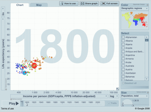
and here a sample I did myself, using Google's motion Chart - you can choose what you wish to see for Axis X, Y, Color and Size of Bubbles.
Permalink: http://apandre.wordpress.com/dimensionality/
No comments:
Post a Comment