20101225

Happy New 2011 Year!

Happy holidays to visitors of this blog and my best wishes for 2011! December 2010 was so busy for me, so I did not have time to blog about anything. I will just mention some news in this last post of 2010.

Tableau sales will exceed $40M in 2010 (and they planning to employ 300+ by end of 2011!), which is almost 20% of Qliktech sales in 2010. My guesstimate (if anybody has better data, please comment on it) that Spotfire's sales in 2010 are about $80M. Qliktech's market capitalization exceeded recently $2B, more than twice of Microstrategy ($930M as of today) Cap!

I recently noticed that Gartner trying to coin the new catch phrase because old (referring to BI, which never worked because intelligence is attribute of humans and not attribute of businesses) does not work. Now they are saying that for last 20+ years when they talked about business intelligence (BI) they meant an intelligent business. I think this is confusing because (at least in USA) business is all about profit and Chief Business Intelligent Dr. Karl Marx will agree with that. I respect the phrase "Profitable Business" but "Intelligent Business" reminds me the old phrase "Crocodile tears". Gartner also saying that BI projects should be treated as a "cultural transformation" which reminds me a road paved with good intentions.

I also noticed the huge attention paid by Forrester to Advanced Data Visualization and probably for 4  good reasons (I have the different reasoning, but I am not part of Forrester) :

  • data visualization can fit much more (tens of thousands) data points into one screen or page compare with numerical information and datagrid ( hundreds datapoints per screen);

  • ability to visually drilldown and zoom through interactive and synchronized charts;

  • ability to convey a story behind the data to a wider audience through data visualization.

  • analysts and decision makers cannot see patterns (and in many cases also trends and outliers) in data without data visualization, like 37+ years old example, known as Anscombe’s quartet, which comprises four datasets that have identical simple statistical properties, yet appear very different when visualized. They were constructed by F.J. Anscombe to demonstrate the importance of Data Visualization (DV):


Anscombe's quartet
IIIIIIIV
xyxyxyxy
10.08.0410.09.1410.07.468.06.58
8.06.958.08.148.06.778.05.76
13.07.5813.08.7413.012.748.07.71
9.08.819.08.779.07.118.08.84
11.08.3311.09.2611.07.818.08.47
14.09.9614.08.1014.08.848.07.04
6.07.246.06.136.06.088.05.25
4.04.264.03.104.05.3919.012.50
12.010.8412.09.1312.08.158.05.56
7.04.827.07.267.06.428.07.91
5.05.685.04.745.05.738.06.89


In 2nd half of 2010 all 3 DV leaders released new versions of their beautiful software: Qlikview, Spotfire and Tableau. Visokio's Omniscope 2.6 will be available soon and I am waiting for it since June 2010... In 2010 Microsoft, IBM, SAP, SAS, Oracle, Microstrategy etc. all trying hard to catch up with DV leaders and I wish to all of them the best of luck in 2011. Here is a list of some other things I still remember from 2010:

  • Microsoft officially declared that it prefers BISM over OLAP and will invest into their future accordingly. I am very disappointed with Microsoft, because it did not include BIDS (Business Intelligence Development Studio) into Visual Studio 2010. Even with release of supercool and free PowerPivot it is likely now that Microsoft will not be a leader in DV (Data Visualization), given it discontinued ProClarity and PerformancePoint and considering ugliness of SharePoint. Project Crescent (new visualization "experience" from Microsoft) was announced 6 weeks ago, but still not too many details about it, except that it mostly done with Silverlight 5 and Community Technology Preview will be available in 1st half of 2011.

  • SAP bought Sybase, released new version 4.0 of Business Objects and HANA "analytic appliance"

  • IBM bought Netezza and released Cognos 10.

  • Oracle released OBIEE 11g with ROLAP and MOLAP unified

  • Microstrategy released its version 9 Released 3 with much faster performance, integration with ESRI and support for web-serviced data

  • EMC bought Greenplum and started new DCD (Data Computing Division), which is obvious attempt to join BI and DV market

  • Panorama released NovaView for PowerPivot, which is natively connecting to the PowerPivot in-memory models.

  • Actuate's BIRT was downloaded 10 million times (!) and has over a million (!) BIRT developers

  • Panopticon 5.7 was released recently (on 11/22/10) and adds the ability to display real-time streaming data.


David Raab, one of my favorite DV and BI gurus, published on his blog the interesting comparison of some leading DV tools. According to David' scenario, one of possible ranking of DV Tools can be like that: Tableau is 1st than  Advizor (version 5.6 available since June 2010), Spotfire and Qlikview (seems to me David implied that order). In my recent DV comparison "my scenario" gave a different ranking: Qlikview is slightly ahead, while Spotfire and Tableau are sharing 2nd place (but very competitive to Qlikview) and Microsoft is distant 4th place, but it is possible that David knows something, which I don't...

In addition to David, I want to thank  Boris Evelson, Mark Smith, Prof. Shneiderman, Prof. Rosling, Curt Monash, Stephen Few and others for their publications, articles, blogs and demos dedicated to Data Visualization in 2010 and before.

Permalink: http://apandre.wordpress.com/2010/12/25/hny2011/

20101203

Columnstore index in SQL Server 11.0 will accelerate DW queries by 100X

Microsoft reused its patented VertiPaq column-oriented DB technology in upcoming SQL Server 11.0 release by introducing columnstore indexes, where each columns stored in separate set of disk pages. Below is a "compressed" extraction from Microsoft publication and I think it is very relevant to the future of Data Visualization techologies. Traditionally RDBMS uses "row store" where


heap or a B-tree contains multiple rows per page. The columns are stored in different groups of pages in the columnstore index. Benefits of this are:

  • only the columns needed to solve a query are fetched from disk (this is often fewer than 15% of the columns in a typical fact table),

  • it’s easier to compress the data due to the redundancy of data within a column, and

  • buffer hit rates are improved because data is highly compressed, and frequently accessed parts of commonly used columns remain in memory, while infrequently used parts are paged out.


"The columnstore index in SQL Server employs Microsoft’s patented Vertipaq™ technology, which it shares with SQL Server Analysis Services and PowerPivot. SQL Server columnstore indexes don’t have to fit in main memory, but they can effectively use as much memory as is available on the server. Portions of columns are moved in and out of memory on demand." SQL Server is the first major database product to support a pure Columnstore index. Columnstore recommended for fact tables in DW in datawarehouse, for large dimensions (say with more than 10 millions of records) and any large tables designated to be used as read-only.

"In memory-constrained environments when the columnstore working set fits in RAM but the row store working set doesn’t fit, it is easy to demonstrate thousand-fold speedups. When both the column store7and the row store fit in RAM, the differences are smaller but are usually in the 6X to 100X range for star join queries with grouping and aggregation." Your results will of course depend on your data, workload, and hardware. Columnstore index query processing is most heavily optimized for star join queries. OLTP-style queries, including point lookups, and fetches of every column of a wide row, will usually not perform as well with a columnstore index as with a B-tree index.

Columnstore compressed data with a factor of 4 to a factor of 15 compression with different fact tables. The columnstore index is a secondary index; the row store is still present, though during query processing it is often not need, and ends up being paged out. A clustered columnstore index, which will be the master copy of the data, is planned for the future. This will give significant space savings.

Tables with columnstore indexes can’t be updated directly using INSERT, UPDATE, DELETE, and MERGE statements, or bulk load operations. To move data into a columnstore table you can switch in a partition, or disable the columnstore index, update the table, and rebuild the index. Columnstore indexes on partitioned tables must be partition-aligned. Most data warehouse customers have a daily, weekly or monthly load cycle, and treat the data warehouse as read-only during the day, so they’ll almost certainly be able to use columnstore indexes.You can also create a view that uses UNION ALL to combine a table with a column store index and an updatable table without a columnstore index into one logical table. This view can then be referenced by queries. This allows dynamic insertion of new data into a single logical fact table while still retaining much of the performance benefit of columnstore capability.

Most important for DV systems is this statement: "Users who were using OLAP systems only to get fast query performance, but who prefer to use the T-SQL language to write queries, may find they can have one less moving part in their environment, reducing cost and complexity. Users who like the sophisticated reporting tools, dimensional modeling capability, forecasting facilities, and decision-support specific query languages that OLAP tools offer can continue to benefit from them. Moreover, they may now be able to use ROLAP against a columnstore-indexed SQL Server data warehouse, and meet or exceed the performance they were used to in the past with OLAP, but save time by eliminating the cube building process". This sounds like Microsoft finally figured out of how to compete with Qlikview (technology-wise only, because Microsoft still does not have - may be intentionally(?) - DV product).

Permalink: http://apandre.wordpress.com/2010/12/03/columnstore-index/

20101201

SAP HANA scales linearly

SAP released HANA today which does in-memory computing with in-memory database. Sample appliance with 10 blades with 32 cores (using XEON 7500) each; sample (another buzzword: "data source agnostic") appliance costs approximately half-million of dollars. SAP claimed that"Very complex reports and queries against 500 billion point-of-sale records were run in less than one minute" using parallel processing. SAP HANA "scales linearly" with performance proportional to hardware improvements that enable complex real-time analytics.

Pricing will likely be value based and that it is looking for an all-in figure of around $10 million per deal. Each deal will be evaluated based upon requirements and during the call, the company confirmed that each engagement will be unique (so SAP is hoping for 40-60 deals in pipeline).

I think with such pricing and data size the HANA appliance (as well as other pricey data appliances) can be useful mostly in 2 scenarios:

  • when it integrates with mathematical models to enable users to discover patterns, clusters, trends, outliers and hidden dependencies and

  • when those mountains of data can be visualized, interactively explored and searched, drilled-down and pivot...


8/8/11 Update: The 400 million-euro ($571 million) pipeline for Hana, which was officially released in June, is the biggest in the history of Walldorf, Germany-based SAP, the largest maker of business-management software. It’s growing by 10 million euros a week, co-Chief Executive Officer Bill McDermott said last month. BASF, the world’s largest chemical company, has been able to analyze commodity sales 120 times faster with Hana, it said last month. Russian oil producer OAO Surgutneftegas, which has been using Hana in test programs since February, said the analysis of raw data directly from the operational system made additional data warehouse obsolete.

Permalink: http://apandre.wordpress.com/2010/12/01/sap-hana/

20101120

Microsoft BI: Roadmap to where?

Microsoft used to be a greatest marketing machine in software industry. But after loosing search business to Google and smartphone business to Apple and Google they lost their winning skills. It is clear now that this is also true in so called BI Market (Business Intelligence is just a marketing term).  Microsoft bought ProClarity and it disappeared, they released PerformancePoint Server and it is disappearing too. They have (or had?) the best BI Stack (SQL Server 2008 R2 and its Analysis Services, Business Intelligence Development Studio 2008 (BIDS), Excel 2010, PowerPivot etc.) and they failed to release any BI or Data Visualization Product, despite having all technological pieces and components. Microsoft even released Visual Studio 2010 without any support for BIDS and recently they talked about their Roadmap for BI and again - they delayed the mentioning of BIDS 2010 and they declared NO plans for BI or DV products! Instead they are talking about "new ad hoc reporting and data visualization experience codenamed “Project Crescent”"!

And than they have a BISM model as a part of Roadmap: "A new Business Intelligence Semantic Model (BISM) in Analysis Services that will power Crescent as well as other Microsoft BI front end experiences such as Excel, Reporting Services and SharePoint Insights".

Experience and Model instead of Product? What Microsoft did with PowerPivot is clear: they gave some users the reason to upgrade to Office 2010, and as a result, Microsoft preserved and protected (for another 2 years?) their lucrative Office business but diminished their chances to get a significant pie of $11B (and  growing 10% per year) BI Market. new BISM (Business Intelligence Semantic Model) is a clear sign of losing technological edge:

image

I have to quote (because they finally admitted that BIDS will be  replaced by BISM - when "Project Juneau" will be available): "The BI Semantic Model can be authored by BI professionals in the Visual Studio 2010 environment using a new project type that will be available as part of “Project Juneau”. Juneau is an integrated development environment for all of SQL Server and subsumes the Business Intelligence Development Studio (BIDS). When a business user creates a PowerPivot application, the model that is embedded inside the workbook is also a BI Semantic Model. When the workbook is published to SharePoint, the model is hosted inside an SSAS server and served up to other applications and services such as Excel Services, Reporting Services, etc. Since it is the same BI Semantic Model that is powering PowerPivot for Excel, PowerPivot for SharePoint and Analysis Services, it enables seamless transition of BI applications from Personal BI to Team BI to Organizational (or Professional) BI."

Funniest part of this quote above that Microsoft is honestly believe that SharePoint is not a Virus but a viable Product and it will escape the fate of its "step-brother" - PerfromancePoint Server. Sweet dreams! It is clear that Microsoft failed to understand that Data Visualization is the future of BI market and they keep recycling for themselves the obvious lie "Analysis Services is the industry leading BI platform in this space today"! Indirectly they acknowledged it in a very next statement : "With the introduction of the BI Semantic Model, there are two flavors of Analysis Services – one that runs the UDM (OLAP) model and one that runs the BISM model". Hello?

Why we need 2 BI Models instead of 1 BI product? BIDS 2008 itself is already buggy and much less productive development environment than Qlikview, Spotfire and Tableau, but now Microsoft wants us to be confused with 2 co-existing approaches: OLAP and BISM? And now get this: "you should expect to see more investment put into the BISM and less in the UDM(OLAP)"!

Dirty Harry will say in such situation: "Go ahead, make my day!" And I guess that Microsoft  does not care that Apple's  Market CAP is larger than Microsoft now.


Afterthought (looking at this from 2011 point of view): I am thinking now that I know why Donald Farmer left Microsoft 2 months after BISM announcement above.

p010: http://wp.me/pCJUg-7r

20101110

Tableau 6 reads local PowerPivot, does Motion Chart

It looks like honeymoon for Qlikview after Qliktech's IPO is over. In addition to Spotfire 3.2/Silver, now we have the 3rd great piece of software in form of Tableau 6. Tableau 6.0 released today (both 32-bit and 64-bit) with new in-memory data engine (very fast, say 67 millions of rows in 2 seconds) and quick data blending from multiple data sources while normalizing across them. Data Visualization Software available as a Server (with web browsers as free Clients) and as a Desktop (Pro for $1999, Personal for $999, Reader for free).

New Data Sources include local PowerPivot files(!),  Aster Data ; new Data Connections include OData , (recently released) Windows Azure Marketplace Datamarket; Data Connection can be Direct/Live or to in-memory data engine. Tableau 6 does full or partial automatic data updates; supports parameters for calculations, what-if modeling, and selectability of Displaying fields in Chart's axis; combo charts of any pair of charts; has new project views, supports Motion Charts

tumblr_mssaaxhajz1stz40uo1_500

(a la Hans Rosling) etc. Also see Ventana Research and comments by Tableau followers. This post can be expanded, since it is officially 1st day of release.

n009: http://wp.me/sCJUg-tableau6

20101102

EMC / Greenplum, IBM / Netezza and DW as an appliance

DV (Data Visualization) makes more sense when you trying to Visualize huge datasets, which indirectly implies the eventual need for DW (Data Warehouses) and DW appliances (DWA). Among pioneers for DWA we can name the Teradata . This was not a very hot area until 7/6/10, when EMC bought Greenplum with its own MPP architecture. On 9/20/10 IBM bought Netezza for $1.7B and DWA market became officially hot in anticipation of need of DV and BI users for a lot of DWA for their "big data". Teradata claimed 2 years ago that Netezza are far behind performance-wise, but apparently IBM disagrees or does not care... Please note that Netezza,  before it was bought, pro-actively partnered with DV vendors, using them as a way to expand their market share and this points us to the future.

With "big data" buzz everywhere, I suspect a large wave of partnerships between DWA (EMC DCA (Data Computing Appliance), IBM, Teradata, Microsoft / DATAlegro, Oracle / Exadata, SAP ( HANA + Sybase IQ ) vendors, as well as vendors of virtual DWAs)  and DV vendors is coming in 2011. Data Visualization making DWA much more attractive for end users with huge datasets! Microsoft's PDW was released on 11/9/10 and SAP HANA will be released in November 2010 too

p008: http://wp.me/sCJUg-dwa

20101025

Cognos 10 is here too

BI and DV vendors do not want me to relax and keep releasing new stuff too often. I feel guilty now and I will (3+ months after it was released) comment on Spotfire 3.2 release soon. But today I have to comment on Cognos 10 Release (which will be available Oct. 30; everybody now does pre-announcement: 2 weeks ago Qlikview 10, yesterday BO4, today Cognos 10). I quote: "IBM acquired Cognos in early 2008 during a five year buying spree that saw it swallow over 24 analytics companies in five years for a total bill of US$14 billion". Rob Ashe, general manager for BI at IBM, said: "“Analytics is a key part of our 2015 roadmap. Last year, analytics contributed $9 billion to our revenues, and we expect to see that grow to $16 billion in 2015.”

The Cognos 10 embeds SSPS and Lotus Connections, supports SaaS, active/interactive reports via email (no need to install anything), mobile devices such as iPhones, iPads and BlackBerrys (as well as Symbian phones, and Windows Mobile devices), real-time updates, has “modern” Web 2.0 user interface. Cognos TM1 (from Applix) is a multidimensional, 64-bit, in-memory OLAP engine which provides fast performance for analyzing complex and sophisticated models, large data sets and even streamed data.

Personally I think Cognos 10 compares favorably against BO4, SAS 9.2, OBIEE 11g , but all 4 have at least 2 common problems: they are all engaged too much with Java and they are far (of Qlikview, Spotfire, Omniscope, Tableau etc.) behind in Data Visualization...

n006: http://wp.me/pCJUg-4Z

20101024

SAP pre-announced BO4

"Business Objects 4.0 will be available this  (2010) year" - SAP teases own customers at ASUG. It became a habit for SAP - to say something about a product they did not release yet. For example they did pre-announcement of HANA (in-memory analytics appliance) in May 2010, see http://www.infoworld.com/d/applications/sap-build-new-in-memory-database-appliances-392 and now they are saying that HANA will be released in November 2010: http://www.infoworld.com/d/applications/saps-in-memory-analytics-boxes-set-november-release-117 . It is very funny to see how 3 (SAP, IBM, Oracle) or 4 (if  you include the mindshare leader SAS) BI behemoths trying to compete (using money instead of creativity) with DV leaders like Qlikview and Spotfire who has in-memory columnar DB for years. E.g. IBM recently bought Netezza, SSPS and Applix and trying to marry Applix with Cognos. Or Oracle (after buying Sun) releasing Exadata and Exalogic to compete with... IBM's Netezza and SAP's HANA. SAP actually owns now (after they recently bought Sybase) the best collection of BI and DV-related technologies, like best columnar DB Sybase IQ (ok, Vertica too, but Qlikview, PowerPivot and Spotfire have it in-memory).

Back to BO4: it will be 64-bit only, Desktop Intelligence will not be included in this release, BO4 will be more dependent on Java (SAP, IBM, Oracle and SAS -  all 4 making a strategic mistake by integrating their product with dying Java), BO4 will have "data federation", BO4 will be integrated with SAP Portfolio (e.g. NetWeaver), Bo4 has now multi-dimensional analytical ability,
SAP Explorer allows in-memory Analytics etc. It took SAP 4+ months from pre-anouncement to release of BO4 - I guess they learn from
Microsoft (I am not sure how it helps).

Update as of 7/27/11: BI 4.0 still not released yet and SAP is planning to release it now in August 2011, basically 10 months later then it was pre-anounced! Among other updates: on 7/25/11 SAP released interesting video with Demo:


Update as of 8/31/11: It took SAP 11 months from pre-announcement of BO4 to officially release it, see http://blogs.sap.com/analytics/2011/08/31/update-on-sap-businessobjects-bi-4-0-general-availability/   SAP said today: "Based on efforts over the last several weeks, BI 4.0 is targeted to become generally available starting September 16, 2011." Also "For customers and partners currently using BI 4.0, new eLearning tutorials are now available on the SAP Community Network. Check out the latest tutorials and take advantage of the new capabilities BI 4.0 has to offer." It is very funny and very sad RELEASE process.

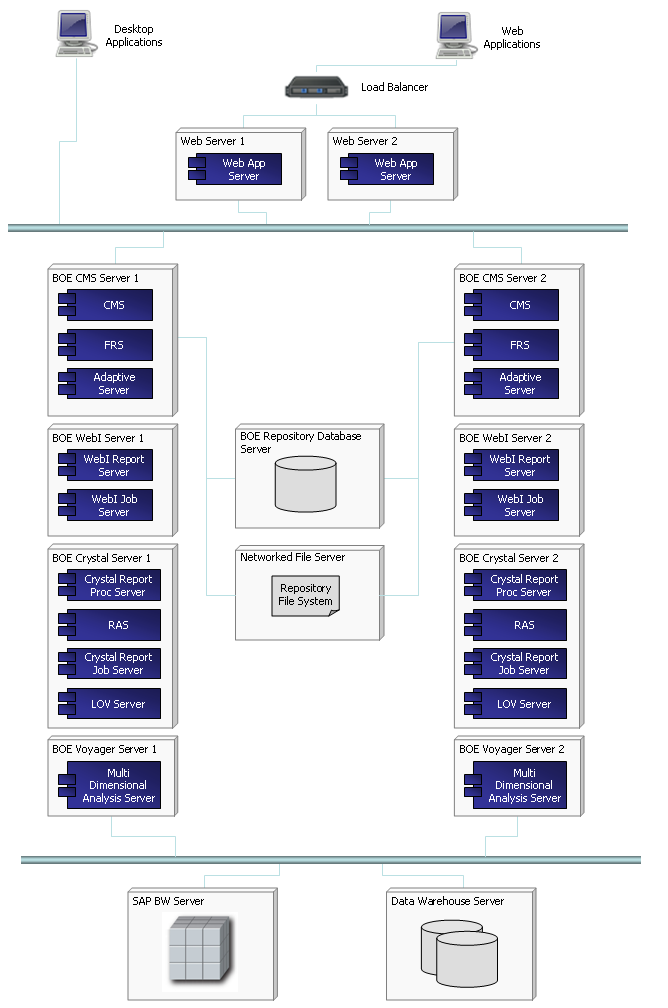
Enterprise Deployment of SAP BO may look like this:


n005: http://wp.me/pCJUg-4o

20101022

Tableau is growing 123% YoY


Tableau added 1500 new customers during last year (5500 total, also it is used by Oracle on OEM basis as Oracle Hyperion Visual Explorer), had $20M in sales in 2009, Q3 of 2010 showing 123% growth over the same period a year ago, claiming to be a fastest growing software company in BI market (faster than Qliktech), see http://www.tableausoftware.com/press_release/tableau-massive-growth-hiring-q3-2010


Tableau 6.0 will be released next month, they claiming it is 100 times faster than previous version (5.2) with in-memory columnar DB, 64-bit support and optional data compression. They are so confident (due increasing sales) so they put 40 job openings last week (they had 99 employees in 2009, 180 now and plan to have 200 by end of 2010). Tableau is raising (!) prices for their Tableau Desktop Professional from $1800 to $1999 in November 2010, while Personal will stay at $999. They aim directly at Qliktech saying (through their loyal customer) this: "Competitive BI software like QlikView from QlikTech is difficult to use without a consultant or IT manager by your side, a less than optimal allocation of our team's time and energy. Tableau is a powerful tool that’s easy to use, built to last, and continues to impress my customers."

In Tableau's new sales pitch they claiming (among other 60 new features):

  • New super-fast data engine that can cross-tab 10 million rows in under 1 second

  • The ability to blend data from multiple sources in just a click

  • Create endless combination graphs such as bars with lines, circles with bars, etc.


n004: http://wp.me/pCJUg-3Z

20101019

Qlikview 10 released near 10/10/10

Qliktech released as planned the new version 10 of Qlikview last week, see http://www.qlikview.com/us/company/press-room/press-releases/2010/us/1012-qlikview-10-delivers-consumer-bi-software and delivered a lot of new functionality, see

http://apandre.files.wordpress.com/2010/10/ds-whats-new-in-qlikview-10-en.pdf

to its already impressive list, like in-memory columnar database, the leading set of visual controls (pie/10, bar/7, column/7, line/6, combo/6, area/4, radar/4, scatter/5, bubble/3, heat-map/block/5, gauge/7, pivot/12, table/12, funnel/2, mekko, sparkline, motion charts etc.) totaling more than 80 different charts (almost comparable with Excel 2010 diversity-wise). Qlikview enjoying the position of the DV Leader in Data Visualization market for last few years, thanks to above functionality and to its charts, functioning as visual filters with interactive drill-down functionality, with best productivity for developers, with easiest UI and with multitude of clients (desktop, IE plugin, Java, ajax, most smartphones). Also take a look on this: http://www.ventanaresearch.com/blog/commentblog.aspx?id=4006 and this: http://customerexperiencematrix.blogspot.com/2010/12/qlikviews-new-release-focuses-on.html

Qliktech recently had a successful IPO and secondary offering,  see http://www.google.com/finance?q=Qlik which made capitalization of the Qliktech approaching $2B. DV competition is far from over: recently Qlikview got very strong competition from Spotfire 3.2, PowerPivot and upcoming (this or next month) releases of Tableau 6 and Omniscope 2.6. And don't forget DV misleaders with a bunch of money, trying to catch-up: SAP, IBM, Oracle, Microsoft, Microstrategy, even Google and others trying very hard to be a DV contenders                                                                                (n002: http://apandre.wordpress.com/2010/10/19/qlikview10/)

Qliktech uses this Diagram to present its current set of Components and DataFlow between them:


[caption id="attachment_357" align="alignleft" width="510" caption="QV10 Components and DataFlow."][/caption]

20100903

This DV blog is a work in progress (as a website)


My original intention was to write a book about Data Visualization, but I realized that all books in Data Visualization area will become obsolete very quickly and that Blog is much more appropriate format. This blog was started just a few months ago and it is always a work in progress, because in addition to blog's posts it has multiple webpages and most of them will be completed over time, approximately 1 post or page per week. After a few months of blogging I really started to appreciate what E.M. Forster (in "Aspects of the Novel"), Graham Wallas (in "The art of thought") and Andre Gide said almost 90 years ago: "How do I know what I think until I see what I say?".


So yes, it is under construction as a website and it is mostly a weekly blog.

Update for 3/24/2011: This site got 22 posts since first post (since January 2010, roughly one post per 2 weeks), 43 (and still growing) pages (some of them incomplete and all are work in progress), 20  comments and getting in last few weeks (in average) almost 200 (this number actually growing steadily) visitors per day. I am starting to get a lot of feedback and some of new posts actually was prompted by questions and requests from visitors and by phone conversations with some of them (they asked to keep their confidentiality).

Update for 11/11/11: This site/blog got (as of today) 46 posts and 61 pages (about 1 post or page per week, or should I say per weekend), 46 comments, hundreds of images and demos, 400+ visitors per weekday and 200+ visitors on weekend days, many RSS and email subscribers. Almost half of new content on this blog/site now created due demand from visitors and as a respond to their needs and requests. I can claim now that it is the visitor-driven blog and it is very aligned to the current state of the science and art of Data Visualization.

Update for 9/8/12: 67 posts, 65 pages, 133 comments, 12000+ visitors per month, Google+ extension of this Blog with 1580+ followers here: https://plus.google.com/u/0/111053008130113715119/posts#111053008130113715119/posts , 435 images, diagrams and screenshots

Permalink: http://apandre.wordpress.com/2010/09/03/dvblogasworkinprogress/

20100821

DV Comparison: Qlikview, Spotfire, Tableau, MS BI Stack

Published the comparison of 4 leading DV Products, see http://wp.me/PCJUg-1T

I did not included into comparison the 5th leading product - Visokio's Omniscope, because it has very limited scalability due the specifics of it's implementation: Java does not allow to visualize too much data. Among factors to considered when comparing DV tools:

  • - memory optimization [Qlikview is the leader in in-memory columnar database technology];

  • - load time [I tested all products above and PowerPivot is the fastest];

  • - memory swapping [Spotfire is only who can use a disk as a virtual memory, while Qlikview limited by RAM only];

  • - incremental updates [Qlikview probably the best in this area];

  • - thin clients [Spotfire has the the best THIN/Web/ZFC (zero-footprint) client, especially with their recent release of Spotfire 3.2 and Spotfire Silver];

  • - thick clients [Qlikview has the best THICK client] ,

  • - access by 3rd party tools [PowerPivot's integration with Excel 2010, SQL Server 2008 R2 Analysis Services and SharePoint 2010 is a big attraction];

  • - interface with SSAS cubes [PowerPivot has it, Tableau has it, Omniscope will have it very soon, Qlikview and Spotfire do not have it],

  • - GUI [3-way tie, it is heavily depends on personal preferences, but in my opinion Qlikview is more easy to use than others];

  • - advanced analytics [Spotfire 3.2 is the leader here with its integration with S-PLUS and support for IronPython and other add-ons]

  • - the productivity of developers involved with tools mentioned above. In my experience Qlikview is much more productive tool in this regard.


p003: http://wp.me/pCJUg-3R

20100727

Spotfire 3.2 released on 7/8/10

Since I commented on recent releases of competing DV products (Qlikview, Tableau, Cognos, Business Objects etc.) I feel the need to post about Spotfire 3.2. For me the most important new feature in 3.2 is the  availability of all functionality of Spotfire THICK client in Spotfire 3.2 WebPlayer, specfically Spotfire WebPlayer now can do the same visual drill-down as Qlikview does for a while. Overall the 3.2  Release enabled Spotfire to catch-up with Qlikview and become a co-leader in DV market. Also SPotfire Clinical 3.2 was released, which enables Spotfire to connect with Oracle Clinical Databases. TIBCO Spotfire offers a unique memory-swapping or paging feature, which lets it analyze models that are larger than a single available memory space.

Among new features ability to export any Pages and Visualizations to PDF, improved integration with S-Plus and IronPython, ability to embed more than 4GB (actually unlimited) of application's data into application file (and TIBCO Spotfire Binary Data Format file) and other improvements, like subtotals in Cross Table, SSO with NTLMv2 (Vista, Win7), Lists Tools and LDAP synchronization, Multiple Localizations for major Asian and European languages. Update on 11/2/10: TIBCO released Spotfire WebPlayer 3.2.1, which now fully supports iPad and its native multi-touch interface.

A few days later on 7/14/10, TIBCO released Spotfire Silver as a fully SaaS/ZFC version of Spotfire 3.2, designated for Self-Serviced BI users, who prefer to minimize their interactions with own IT/MIS departments. Spotfire Silver ahead of all DV competitors in terms of fully web-based but fully functional DV environment.

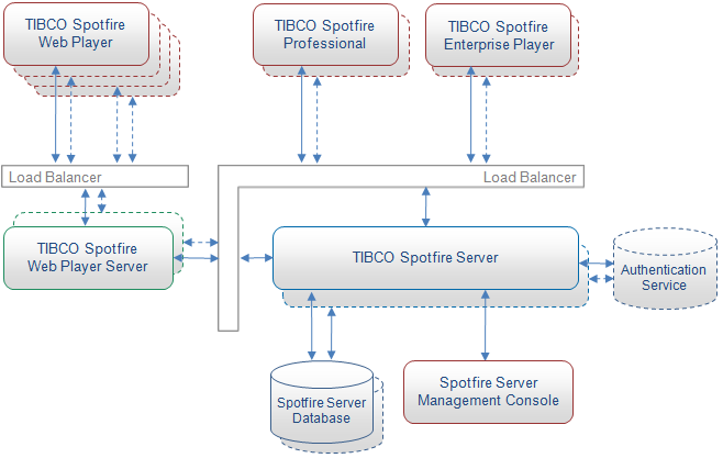
In case if users prefer behind-firewall Clustering and Fail-over configuration for Spotfire deployment, it may look like this:


n007=http://wp.me/pCJUg-5n

20100613

Data Visualization and Data Cubes

Data Visualization stands on the shoulders of the giants  - previously tried and true technologies like Columnar Databases, in-memory Data Engines and multi-dimensional Data Cubes (known also as OLAP Cubes).

OLAP (online analytical processing) cube on one hand extends a 2-dimensional array (spreadsheet table or array of facts/measures and keys/pointers to dictionaries) to a multidimensional DataCube, and on other hand DataCube is using datawarehouse schemas like Star Schema or Snowflake Schema.


The OLAP cube consists of facts, also called measures, categorized by dimensions (it can be much more than 3 Dimensions; dimensions referred from Fact Table by "foreign keys"). Measures are derived from the records in the Fact Table and Dimensions are derived from the dimension tables, where each column represents one attribute (also called dictionary; dimension can have many attributes). Such multidimensional DataCube organization is close to a Columnar DB data structures. One of the most popular usage of datacubes is a visualization of them in form of Pivot tables, where attributes used as rows, columns and filters while values in cells are appropriate aggregates (SUM, AVG, MAX, MIN, etc.) of  measures.

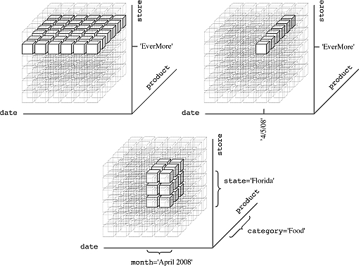
OLAP operations are foundation for most UI and functionality used by Data Visualization tools. The DV user (sometimes called analyst) navigates through the DataCube and its DataViews for a particular subset of the data, changing the data's orientations and defining analytical calculations. The user-initiated process of navigating by calling for page displays interactively, through the specification of slices via rotations and drill down/up is sometimes called "slice and dice". Common operations include slice and dice, drill down, roll up, and pivot:

Slice:


A slice is a subset of a multi-dimensional array corresponding to a single value for one or more members of the dimensions not in the subset.


Dice:


The dice operation is a slice on more than two dimensions of a data cube (or more than two consecutive slices).


Drill Down/Up:


Drilling down or up is a specific analytical technique whereby the user navigates among levels of data ranging from the most summarized (up) to the most detailed (down).


Roll-up:


(Aggregate, Consolidate) A roll-up involves computing all of the data relationships for one or more dimensions. To do this, a computational relationship or formula might be defined.

Pivot:


This operation is also called rotate operation. It rotates the data in order to provide an alternative presentation of data - the report or page display takes a different dimensional orientation.


OLAP Servers with most marketshare are: SSAS (Microsoft SQL Server Analytical Services), Intelligence Server (Microstrategy), Essbase (Oracle also has so called Oracle Database OLAP Option), SAS OLAP Server, NetWeaver Business Warehouse (SAP BW), TM1 (IBM Cognos), Jedox-Palo (I cannot recommend it) etc.

Microsoft had (and still has) the best IDE to create OLAP Cubes (it is a slightly redressed version of Visual Studio 2008, known as BIDS - Business Intelligence Development Studio usually delivered as part of SQL Server 2008) but Microsoft failed (for more than 2  years) to update it for Visual Studio 2010 (update is coming together with SQL Server 2012). So people forced to keep using BIDS 2008 or use some tricks with Visual Studio 2010.

Permalink: http://apandre.wordpress.com/2010/06/13/data-visualization-and-cubes/

20100508

Google keeps own Data Visualizations options open

Recently I had a few reasons to review Data Visualization technologies in Google portfolio. In short: Google (if it decided to do so) has all components to create a good visualization tool, but the same thing can be said about Microsoft and Microsoft decided to postpone the production of DV tool in favor of other business goals.

I remember a few years ago Google bought a Gapminder (Hans Rosling did some very impressive Demos

tumblr_mssaaxhajz1stz40uo1_500

with it a while ago):


and converted it to a Motion Chart "technology" of its own. Motion Chart (For Motion Chart Demo I did below, please Choose a few countries (e.g. check checkboxes for US and France) and then Click on "Right Arrow" button in the bottom left corner of the Motion Chart below)

[googleapps domain="spreadsheets" dir="spreadsheet/pub" query="key=0AuP4OpeAlZ3PdDRwbTVYZFEwdWJUcXk5MS1WM3IzbHc&output=html&widget=true" width="500" height="700" /]

(see also here a sample I did myself, using Google's motion Chart) allows to have 5-6 dimensions crammed into 2-dimensional chart: shape, color and size of bubbles, Axes X and Y as usual (above it will be Life Expectancy and Income per Person) and animated time series (see light blue 1985 in background above - all bubbles will move as "time" goes by). Google uses this and other own visualization technologies in its very useful Public Data Explorer.

Google Fusion Tables is a free service for sharing and visualizing data online. It allows you to upload and share data, merge data from multiple tables into interesting derived tables, and see the most up-to-date data from all sources, it has  TutorialsUser's GroupDeveloper's Guide and sample code, as well as examples. You can check a video here:


The Google Fusion Tables API enables programmatic access to Google Fusion Tables content. It is an extension of Google's existing structured data capabilities for developers. Developer can populate a table in Google Fusion Tables with data, from a single row to hundreds at a time. The data can come from a variety of sources, such as a local database, .CSV file, data collection form, or mobile device. The Google Fusion Tables API is built on top of a subset of the SQL querying language. By referencing data values in SQL-like query expressions, developer can find the data you need, then download it for use by your application. Your app can do any desired processing on the data, such as computing aggregates or feeding into a visualization gadget. Data can be synchronized when you add or change data in the tables in your offline repository, you can ensure the most up-to-date version is available to the world by synchronizing those changes up to Google Fusion Tables.


Everybody knows about Google Web Analytics for your web traffic, visitors, visits, pageviews, length and depth of visits, presented by very simple charts and dashboard, see sample below:


Less people know that Panorama Software has OEM partnership with Google, enabling Google Spreadsheets with SaaS Data Visualizations and Pivot Tables.


Google has Visualization API (and interactive Charts, including all standard Charts, GeoMap, Intensity Map, Map, DyGraph, Sparkline, WordCloud and other Charts) which enables developers to expose own data, stored on any data-store that is connected to the web, as a Visualization compliant datasource. The Google Visualization API also provides a platform that can be used to create, share and reuse visualizations written by the developer community at large. Google provides samples, Chart/API Gallery (Javascript-based visualizations) and Gadget Gallery.

And last but not least, Google has excellent back-end technologies needed for big Data Visualization applications, like BigTable (BigTable is a compressed, high performance, and proprietary database system built on Google File System (GFS), Chubby Lock Service, and a few other Google programs; it is currently not distributed or used outside of Google, although Google offers access to it as part of their Google App Engine) and MapReduce. Add to this list Google Maps and Google Earth


and ask yourself then: what is stopping Google to produce a Competitor for the Holy Trinity (of Qlikview+Spotfire+Tableau) of DV?

Permalink: http://apandre.wordpress.com/2011/02/08/dvgoogle/

20100412

History of Data Visualization

William Playfair said more than 200 years ago: (according to Doug McCune and others, he was the first person who visualized the data, unless the legend about Munehisa Homma will be finally proven): "As the eye is the best judge of proportion, being able to estimate it with more quickness and accuracy than any other of our organs, it follows, that wherever relative quantities are in question …[the Line Chart] ... is peculiarly applicable; it gives a simple, accurate, and permanent idea, by giving form and shape to a number of separate ideas, which are otherwise abstract and unconnected." William Playfair invented four types of Data Visualizations: in 1786 the Line Chart, see it at Wikipedia here:

http://upload.wikimedia.org/wikipedia/commons/5/52/Playfair_TimeSeries-2.png


and Bar Chart chart of economic data, and in 1801 the Pie Chart and circle graph, used to show part-whole relations. Recreation of some Playfair Charts can be found here. Some legends (I have to see a prove of them yet) attributed to Munehisa Homma (also known as Munehisa Honma, Sokyu Honma and Sokuta Honma) the invention of Candlestick Charts way before (around 1755?) first Charts was used and published in western countries.

Article in "Economist", named "Worth a thousand words" referred to "Three of History's Best Charts Ever". Economist obviously had no access (or knowledge?) to original Candlestick Charts (please let me know if you have these images or links to them). The 3 visualizations that The Economist described as "three of history's best" include...

1. Florence Nightangale's 1858 graphic demonstrating the factors affecting the lives (and death rates) of the British army (which resulted in a graphic type called “Nightingale's Rose” or “Nightingale's Coxcomb”), see it on "Economist" site here:

http://media.economist.com/sites/default/files/cf_images/20071222/5107CR3B.jpg.

She showed in a visual graphic that it wasn't wounds killing the highest number of soldiers - it was infections. This Radar (or Polar?) Chart was done in 1859.


2. Charles Joseph Minard's very famous 1861 graphic depicting the Russian campaign of 1812 - Tufte called it the “the best statistical graphic ever drawn”, see it on "Economist" site here:

http://media.economist.com/sites/default/files/cf_images/20071222/5107CR2B.jpg .

What a dramatic story it tells. This Area Chart, overlay-ed over map, was created in 1869.
Old Area Chart by Minard, 1869

Smart people in France even figured out of how to do it Dynamic in Excel:


3. William Playfair's 1821 chart comparing the “weekly wages of a good mechanic” and the “price of a quarter of wheat” over time, see it on "Economist" site here:

http://media.economist.com/sites/default/files/cf_images/20071222/5107CR1B.jpg .

He was one of the first people to use data not just to educate but also to persuade and convince. This old Column Chart, combined with Line (or Area Chart?) - basically one of the first published known Combo Charts, was created in 1821 (almost 200 years ago!)


Minard actually created more charts way before computers and Data Visualization software was created. For example in 1861 he created this Multiline Chart:


In 1866 Mr. Minard created one of the first Stacked Area Charts:


In 1859 Minard published one of the first Bubble Charts, overlayed over Map:


In short, Column, Bar, Line, Combo, Area, Bubble and other type of Charts was used way before (150-200 years ago) people started to use Data Visualization Software. Those oldest charts above and some other very old charts (some created in USA!) you can see in this slideshow:   http://picasaweb.google.com/pandre/Chartology#slideshow/ or/and you can watch this video:

[youtube="https://www.youtube.com/watch?v=r2q8kzdxbac"]

However, as I said in a beginning, some Data Visualization techniques was known and used even before William Playfair. At least 266 years ago in Japan Munehisa Homma invented (again it is a Legend, because even Steve Nison has no copies of original hand-drawn Japanese Candlestick Charts from 18th Century) Candlestick Charts, which eventually became a part of Financial Visualization and they were reused for Stock Charts (a combo of daily Trading Volume and Open-High-Low-Close Multiline Chart of Daily prices).

Permalink: http://apandre.wordpress.com/2010/04/12/history-of-data-visualization/

[soundcloud url="http://api.soundcloud.com/tracks/4986122" iframe="true" /]

20100320

Trend Analysis: see it 1st

Data Visualization can be a good thing for Trend Analysis: it allows to "see this" before "analyze this" and to take advantage of human eye ability to recognize trends quicker than any other methods. Dr. Ahlberg started (after selling Spotfire to TIBCO and claiming that "Second place is first loser") a "Recorded Future" to basically sell ... future trends in form (mostly) of Sparklines; he succeeded at least in selling RecordedFuture to investors from CIA and Google. Trend analysis is an attempt to "spot" a pattern, or trend, in data (in most cases well-ordered set of datapoints, e.g. by timestamps) or predict future events.

Visualizing Trends means in many cases either Time Series Chart (can you spot a pattern here with your naked eye?):


or Motion Chart (both best done by ... Google, see it here http://visibledata.blogspot.com/p/demos.html ) - can you predict the future here(?):


or Sparklines (I like Sparkline implementations by Qlikview and Excel 2010) - sparklines are scale-less visualization of "trends":


may be Scatter (Excel is good for it too):


and in some cases Stock Chart (Volume-Open-High-Low-Close, best done with Excel) - for example Microsoft stock is fluctuating near the same level for many years, so I guess there is no visible trend  here, which may be spells a trouble for Microsoft future (compare with visible trend of Apple and Google stocks):


Or you can see Motion, Timeline, Sparkline and Scatter charts alive/online below: for Motion Chart Demo, please Choose a few countries (e.g. check checkboxes for US and France) and then Click on "Right Arrow" button in the bottom left corner of the Motion Chart below:

[googleapps domain="spreadsheets" dir="spreadsheet/pub" query="key=0AuP4OpeAlZ3PdDRwbTVYZFEwdWJUcXk5MS1WM3IzbHc&output=html&widget=true" width="500" height="700" /]

In statistics trend analysis often refers to techniques for extracting an underlying pattern of behavior in well-ordered dataset which would otherwise be partly hidden by "noise data". It means that if one cannot "spot" a pattern by visualizing such a dataset, then (and only then) it is time to apply regression analysis and other mathematical methods (unless you smart or lucky enough to remove a noise from your data). As I said in a beginning: try to see it first! However, extrapolating the past to the future can be a source for very dangerous mistakes (just check a history of almost any empire: Roman, Mongol, British, Ottoman, Austrian, Russian etc.)

20100202

Dimensionality of Visible Data

Human eye has own Curse of Dimensionality (term suggested in 1961 by R.Bellman and described independently by G. Hughes in 1968). In most cases the data (before they visualized) usually organized in multidimensional Cubes (n-Cubes) and/or Data Warehouses and/or speaking more cloudy - in Data Cloud - need to be projected into less-dimensional datasets (small-dimensional Cubes, e.g. 3d-Cubes) before they can be exposed through (preferably  interactive  and  synchronized set of charts, sometimes called dashboards) 2-dimensional surface of computer monitor in form of Charts.

[caption id="attachment_1155" align="aligncenter" width="510"] Projection of DataCloud to DataCubes and then to Charts[/caption]

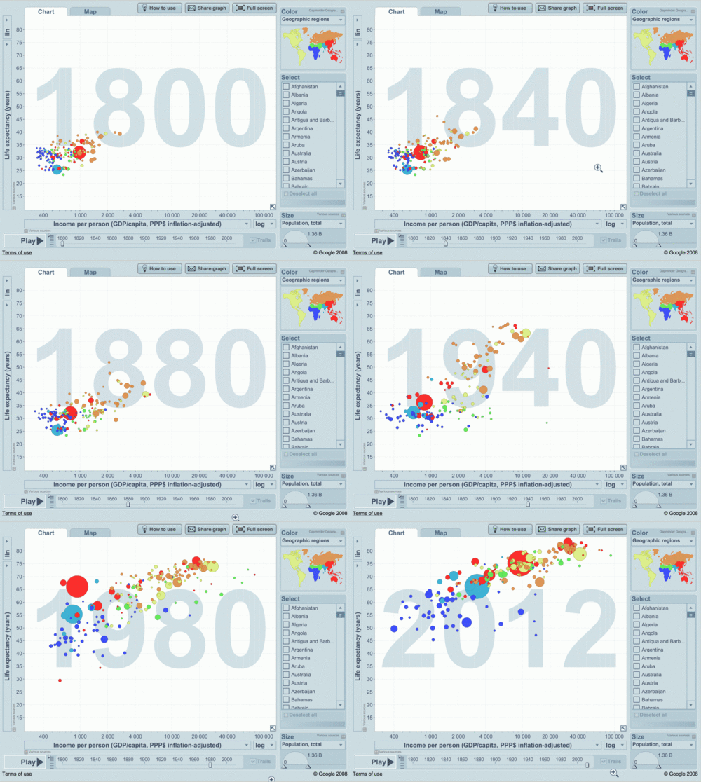
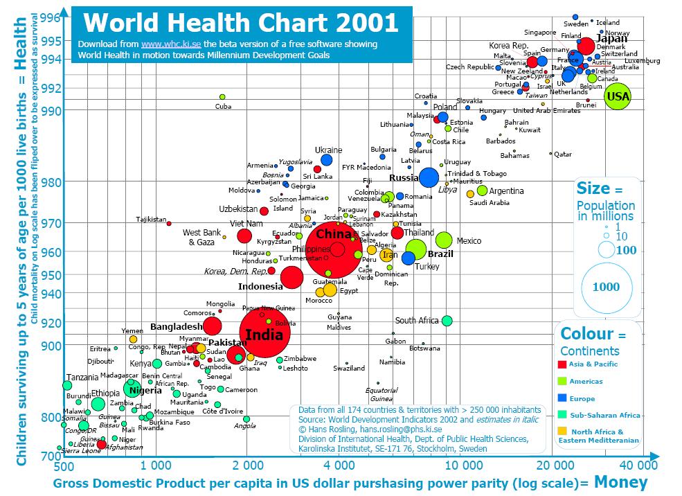
During last 200+ years people kept inventing all type of charts to be printed on paper or shown on screen, so most charts showing 2- or 3-dimensional datasets. Prof. Hans Rosling led Gapminder.org to create the web-based, animated 6-dimensional Color Bubble Motion Chart (Trendalyzer):

tumblr_mssaaxhajz1stz40uo1_500

ansd screenshot of it here:


which he used in his famous demos: http://www.gapminder.org/world/ , where 6 dimensions in this specific Chart are (almost a record for 2-dimensional chart to carry):

  • X coordinate of the Bubble = Income per person,

  • Y coordinate of the Bubble = Life expectancy,

  • Size of the Bubble = Population of the Country,

  • Color of the Bubble = Continent of the Country,

  • Name of the Bubble = Country,

  • Year = animated 6th Dimension/Parameter as time-stamp of the Bubble.


Trendalyzer was bought from Gapminder in 2007 by Google and was converted into Google Motion Chart, but Google somehow is not in rush to enter the Data Visualization (DV) market.

Dimensionality of this Motion Chart can be pushed even further to 7 dimensions (dimension as an expression of measurement without units) if we will use different Shapes (in addition to filled Circles we can use Triangles, Squares etc.) but it will be literally pushing the limit of what human eye can handle. If you will add to the consideration a tendency of DV Designers to squeeze more than one chart on a screen (how about overcrowded Dashboards with multiple synchronized interactive Charts?), we are literally approaching the limits of both human eye and human brain, regardless of the dimensionality of the Data Warehouse in backend.

Below I approximately assessed the dimensionality of datasets for some popular charts (please feel free to send me the corrections). For each Dataset and respective Chart I estimated the number of measures (usually real or integer number, can be a calculation from other dimensions of dataset), the number of attributes (in many cases they are categories, enumerations or have string as datatype) and 0 or 1 parameter (presenting a well-ordered set, like time (for time series), date, year, sequence (can be used for Data Slicing), natural, integer or real  number) and Dimensionality (the number of Dimensions) as a total number of measures, attributes and parameters in a given dataset.


ChartMeasuresAttributesParameterDimensionality
Gauge, Bullet, KPI00
Monochromatic Pie11
Colorful Pie112
Bar/Column112
Sparkline112
Line112
Area112
Radar112
Stacked Line1113
Multiline1113
Stacked Area1113
Overlapped Radar1113
Stacked Bar/Column1113
Heatmap123
Combo123
Mekko213
Scatter (2-d set)213
Bubble (3-d set)314
Shaped Motion Bubble3115
Color Shaped Bubble325
Color Motion Bubble3216
Motion Chart3317


The diversity of Charts and their Dimensionality adding another complexity for DV Designer: what Chart(s) choose. You can find on web some good suggestions about that. Dr. Andrew Abela created Chart Chooser Diagram

[caption id="attachment_1145" align="aligncenter" width="510"] Choosing a good chart by Dr. Abela[/caption]

and it was even converted into online "application"!

Permalink: http://apandre.wordpress.com/2011/03/02/dimensionality/

20100103

Blog as a thought saver

"How do I know what I think until I see what I say?" Or let me rephrase Mr. E.M. Forster: "How do YOU know what I think until I will blog about it"?

I resisted to an idea to have a blog since 1996, because I perceived the blogging as very similar to a fasting in desert (actually after a few months of blogging I am amazed - according to WordPress Statistics - that my blog has hundreds and hundreds of visitors every day!). But recently I got a few excellent pushes to start my own blog because when I posted comments on somebody's blog they got deleted against my will. Turned out that owners of those blogs can delete my comments and thoughts anytime if he/she/they do not like what I said. It happened to me on one of Forrester's Blogs and it happened to me on my own profile on LinkedIn - when I posted so called "update" and some of LinkedIn employees decided to delete it. In both cases above administrators even did not bother to send me my own thoughts for archiving purposes - they just disappear!

So I decided to start the blog about Data Visualization (DV),


because I am doing DV for many years and accumulated many DV implementations and thoughts about DV, DV tools, DV Vendors, DV Market etc. For now I will have 8 main pages (and they will be used as root pages for hierarchy of sub-pages):

  • Home Page of this blog  is a place where all posts and comments will go,

  • Visualization Page (with sub-pages) is for DV Samples and Demos,

  • DataViews Page (and it's sub-pages) is about ... Data Views, Charts and Chartology,

  • Tools Page designated for DV Software and comparison of DV Tools,

  • Solutions Page will describe possible DV solutions, DV System, products  and DV services I can provide,

  • Market Page dedicated to DV Vendors and DV market news and analyses,

  • Data Page is about ETL processes, Data Collection and Data Sources

  • About page can give you an info about me


Another argument (for me to do DV blogging) was said 2500 years ago by Confucius:" Choose a job you love, and you will never have to work a day in your life." And finally, I have to mention this 500-years old story in hope it will help me to filter out from this blog all unneeded pieces: “An admirer asked Michelangelo how he sculpted the famous statue of David that now sits in the Academia Gallery in Florence. How did he craft this masterpiece of form and beauty? Michelangelo’s offered this strikingly simple description: He first fixed his attention on the slab of raw marble. He studied it and then “chipped away all that wasn’t David.”


p001: http://wp.me/pCJUg-3