Showing posts with label Post. Show all posts

20130711

Contractor's Rate vs. Full-Time Employee Pay

I got many questions from Data Visualization Blog's visitors about differences between compensation for full-time employees and contractors. It turned out that many visitors are actually contractors, hired because of their Tableau or Qlikview or Spotfire skills and also some visitors consider a possibility to convert to consulting or vice versa: from consulting to FullTimers. I am not expert in all these compensation and especially benefits-related questions, but I promised myself that my blog will be driven by vistors's requests, so I google a little about Contractor vs. Full-Time worker compensation and below is brief description of what I got:


Federal Insurance Contribution Act mandates Payroll Tax splitted between employer (6.2% Social Security with max $$7049.40 and 1.45% Medicare on all income) and employee, with total (2013) as 15.3% of gross compensation.


Historical_Payroll_Tax_Rates


In addition you have to take in account employer's contribution (for family it is about $1000/per month) to medical benefits of employee, Unemployment Taxes, employer's contribution to 401(k), STD and LTD (short and long term disability insurances), pension plans etc.


I also added into my estimate of contractor rate the "protection" for at least 1 month GAP between contracts and 1 month of salary as bonus for full-time employees.


RR20120507-BCC-2

Basically the result of my minimal estimate as following: you need to get as a contractor the rate at least 50% more than base hourly rate of the full-time employee. This  base hourly rate of full-time employee I calculate as employee's base salary divided on 1872 hours: 1872 = (52 weeks*40 hours - 3 weeks of vacation - 5 sick days - 6 holidays) = 2080 hours - 208 hours (Minimum for a reasonable PTO, Personal Time Off) = 1872 working hours per year.


I did not get into account any variations related to the usage of W2 or 1099 forms or Corp-To-Corp arrangements and many other fine details (like relocation requirements and overhead associated with involvement of middlemen like headhunters and recruiters) and differences between compensation of full-time employee and consultant working on contract - this is just a my rough estimate - please consult with experts and do not ask me any questions related to MY estimate, which is this:


  • Contractor Rate should be 150% of the base rate of a FullTimer


[googleapps domain="docs" dir="spreadsheet/pub" query="key=0AuP4OpeAlZ3PdEtvdGFHZnBRTjNQNmFaOWRIbGlMTXc&output=html&widget=true" width="510" height="790" /]

RS-COLLEGE LOAN SCAMS low resIn general, using Contractors (especially for business analytics) instead of Full-timers is basically the same mistake as outsourcing and off-shoring: companies doing that do not understand that their main assets are full-time people. Contractors are usually not engaged and they are not in business to preserve intellectual property of company.


Capitalist

20120402

Palettes and Colors

(this is a repost from my Tableau blog: http://tableau7.wordpress.com/2012/04/02/palettes-and-colors/ )

I was always intrigued with colors and their usage, since my mom told me that may be ( just may be, there is no direct prove of it anyway) Ancient Greeks did not know what the BLUE color is - that puzzled me.


Later in my live, I realized that Colors and Palettes are playing the huge role in Data Visualization (DV) and it eventually led me to attempt to understand of how it can be used and pre-configured in advanced DV tools to make Data more Visible and to express the Data Patterns better. For this post I used Tableau to produce some palettes, but similar technique can be found in Qlikview, Spotfire etc.


Tableau published the good article of how to create customized palettes here: http://kb.tableausoftware.com/articles/knowledgebase/creating-custom-color-palettes and I followed it below. As this article recommended, I modified default Preferences.tps file; see it below with images of respective Palettes embedded.


For the first, regular Red-Yellow-Green-Blue Palette with known colors with well-established names, I created even a Visualization in order to compare their Red-Green-Blue components and I even tried to placed respective Bubbles on 2-dimensional surface, even originally it is clearly a 3 dimensional Dataset (click on image to see it in full size):


For the 2nd Red-Yellow-Green-NoBlue Ordered Sequential Palette, I tried to implement the extended "Set of Traffic Lights without any trace of BLUE Color" (so Homer and Socrates will understand it the same way as we are) while trying to use only web-safe colors. Please keep in mind, that Tableau does not have a simple way to have more than 20 colors in one Palette, like Spotfire does.


Other 5 Palettes below are useful too as ordered-diverging almost "mono-chromatic" (except Red-Green Diverging, since it can be used in Scorecards when Red is bad and Green is good). So see below Preferences.tps file with my 7 custom palettes.


<?xml version='1.0'?> <workbook> <preferences>
<color-palette name="RegularRedYellowGreenBlue" type="regular">
<color>#FF0000</color> <color>#800000</color> <color>#B22222</color>
<color>#E25822</color> <color>#FFA07A</color> <color>#FFFF00</color>
<color>#FF7E00</color> <color>#FFA500</color> <color>#FFD700</color>
<color>#F0e68c</color> <color>#00FF00</color> <color>#008000</color>
<color>#00A877</color> <color>#99cc33</color> <color>#009933</color>
<color>#0000FF</color> <color>#00FFFF</color> <color>#008080</color>
<color>#FF00FF</color> <color>#800080</color>

</color-palette>

<color-palette name="RedYellowGreenNoBlueOrdered" type="ordered-sequential" >
<color>#ff0000</color> <color>#cc6600</color> <color>#cccc00</color>
<color>#ffff00</color> <color>#99cc00</color> <color>#009900</color>


</color-palette>

<color-palette name="RedToGreen" type="ordered-diverging" >
<color>#ff0000</color> <color>#009900</color> </color-palette>

<color-palette name="RedToWhite" type="ordered-diverging" >
<color>#ff0000</color> <color>#ffffff</color></color-palette>

<color-palette name="YellowToWhite" type="ordered-diverging" >
<color>#ffff00</color> <color>#ffffff</color></color-palette>

<color-palette name="GreenToWhite" type="ordered-diverging" >
<color>#00ff00</color> <color>#ffffff</color></color-palette>

<color-palette name="BlueToWhite" type="ordered-diverging" >
<color>#0000ff</color> <color>#ffffff</color> </color-palette>
</preferences> </workbook>

In case if you wish to use the colors you like, this site is very useful to explore the properties of different colors: http://www.perbang.dk/rgb/

20120205

Data Visualization page on Google+

I started recently the new Data Visualization Google+ page as the extension of this blog here:


https://plus.google.com/111053008130113715119/posts


.


Internet has a lot of articles, pages, blogs, data, demos, vendors, sites, dashboards, charts, tools and other materials related to Data Visualization and this Google+ page will try to point to most relevant items and sometimes to comment on most interesting of them.


.


What was unexpected is a fast success of this Google+ page - in a very short time it got 200+ followers and that number keeps growing!


.


20111210

SQL Server 2012: good DV backend and BI stack

I said on this blog many times that 80% of Data Visualization (DV) is ... Data.


SQL Server 2012 is here.


And technology and process of how these Data collected, extracted, transformed and loaded into DV backend and frontend is a key to DV success. It seems to me that one of the best possible technology for building DV backend is around the corner as SQL Server 2012 will be released soon - Release Candidate for it is out...


And famous Microsoft marketing machine is not silent about it. SQL Server 2012 Virtual Launch Event planned for March 7, 2012 and real release probably at the end of March 2012.


Columnstore Index.


I already mentioned on this blog the most interesting feature for me - the introduction of Columnstore Index (CSI) can transform SQL Server into Columnar Database (for DV purposes) and accelerates DV-relevant Queries by 10X or even 100X of times. Oracle does not have it!


.

Some reasonable rules and features applied to CSI: each table can have only one CSI; CSI has Row grouping (about million rows, like paging for columns); table with CSI cannot be replicated. New (unified for small and large memory allocations) memory manager optimized for Columnstore Indexes, supports Windows 8 maximum memory and logical processors.


Power View.


SSRS (Reporting Services) got massive improvements, including new Power View as Builder/Viewer of interactive Reports. I like this feature: "even if a table in the view is based on an underlying table that contains millions of rows, Power View only fetches data for the rows that are visible in the view at any one time" and UI features (some of them are standard for existing Data Visualization tools, like multiple views in Power View reports (see gallery of thumbnails in the bottom of screenshot below):


.


"2 clicks to results", export to PowerPoint etc. See also video here:


.


.

PowerView is still far behind Tableau and Qlikview as a Visualizer, but at least it makes SSRS reports more interactive and development of them easier. Below are some thumbnails of Data Visualization samples produced with PowerView and presented by Microsoft:


Support for Big Data.


SQL Server 2012 has a lot new features like "deep" HADOOP support (including Hive ODBC Driver) for "big data" projects, ODBC drivers for Linux, grouping databases into Availability Group for simultaneous failover, Contained Databases (enable easy migration from one SQL Server instance to another) with contained Database users.


Parallel Data Warehouse, Azure, Data Explorer.


And don't forget PDW (SQL Server-based Parallel Data Warehouse;  massive parallel processing (MPP) provides scalability and query performance by running independent servers in parallel with up to 480 cores) and SQL Azure cloud services with it high availability features...


.


New Data Explorer allows discover data in the cloud and import them from standard and new data sources, like OData, Azure Marketplace, HTML etc. and visualize and publish your Data to the cloud.


LocalDB.


LocalDB is a new free lightweight deployment option for SQL Server 2012 Express Edition with fewer prerequisites that installs quickly. It is an embedded SQL Server database for desktop applications (especially for DIY DV apps) or tools. LocalDB has all of the same programability features as SQL Server 2012 Express, but runs in user mode with applications and not as a service. Application that use LocalDB simply open a file. Once a file is opened, you get SQL Server functionality when working with that file, including things like ACID transaction support. It’s not intended for multi-user scenarios or to be used as a server. (If you need that, you should install SQL Server Express.)


BIDS.


SQL Server 2012 is restoring a very desirable feature, which was missing in Visual Studio 2010 for 2+ years - something called BIDS (BI Development Studio was available as part of Visual Studio 2008 and SQL Server 2008). For that a developer needs VS2010 installed with SP1 and then install "SQL Server Data Tools" (currently it is in the state of CTP4, but I guess it will be a real thing when when SQL Server 2012 will be released to production).


SSAS, Tabular Mode, PowerPivot, DAX.


Most important improvement for BI and Data Analytics will be of course the changes in SSAS (SQL Server Analysis Services), including the addition of  Tabular Mode, restoration of BIDS (see above), the ability to design local multidimensional cubes with PowerPivot and Excel and then deploy them directly from Excel as SSAS Cubes, the new DAX language shared between PowerPivot and SSAS, and availability of all those Excel Services directly from SSAS without any need for SharePoint. I think those DV tools who will able to connect to those SSAS and PowerPivot Cubes will have a huge advantage. So far only Tableau has it (and Omniscope has it partially).


Backend for Data Visualization.


All of these features making SQL Server 2012 a leading BI stack and backend for Data Visualization applications and tools. I just wish that Microsoft will develop an own DV front-end tool, similar to Tableau or Qlikview and integrate it with Office 201X (like they did with Visio), but I guess that DV market ( approaching $1B in 2012) is too small compare with markets for Microsoft Office and SQL Server.


Pricing.


Now is time for a "bad news". The SQL Server 2012 CAL price will increase by about 27%. New pricing you can see below and I predict you will not like it:


20111107

Data, Story, View: Prototype and Refresh

Data, Story and Eye Candy.


Data Visualization has at least 3 parts: largest will be a Data, the most important part will be a Story behind those Data and a View (or Visualization) is just an Eye Candy on top of it. However only a View allows users to interact, explore, analyze and drilldown those Data and discover the Actionable Info, which is why Data Visualization (DV) is such a Value for business user in the Big (and even in midsized) Data Universe.

Productivity Gain.


One rarely covered aspect of advanced DV usage is a huge a productivity gain for application developer(s). I recently had an opportunity to estimate a time needed to develop an interactive DV reporting application in  2 different groups of DV & BI environments

Samples of Traditional and Popular BI Platforms.


  1. Open Source toolsets like Jaspersoft 4/ Infobright 4/ MySQL (5.6.3)

  2. MS BI Stack (Visual Studio/C#/.NET/DevExpress/SQL Server 2012)

  3. Tried and True BI like Microstrategy (9.X without Visual Insight)


Samples of Advanced DV tools, ready to be used for prototyping


  1. Spotfire (4.0)

  2. Tableau (6.1 or 7.0)

  3. Qlikview (11.0)


Results proved a productivity gain I observed for many years now: first 3 BI environments need month or more to complete and last 3 DV toolsets required about a day to complete entire application. The same observation done by ... Microstrategy when they added Visual Insight (in attempt to compete with leaders like Qlikview, Tableau, Spotfire and Omniscope) to their portfolio (see below slide from Microstrategy presentation earlier this year, this slide did not count time to prepare the data and assume they are ready to upload):

I used this productivity gain for many years not only for DV production but for Requirement gathering, functional Specifications and mostly importantly for a quick Prototyping. Many years ago I used Visio for interactions with clients and collecting business requirements, see the Visio-produced slide below as an approximate example:


DV is the best prototyping approach for traditional BI


This leads me to a surprising point: modern DV tools can save a lot of development time in traditional BI environment as ... a prototyping and requirement gathering tool. My recent experience is that you can go to development team which is completely committed for historical or other reasons to a traditional BI environment (Oracle OBIEE, IBM Cognos, SAP Business Objects, SAS, Microstrategy etc.) and prototype for such team dozens and hundreds new (or modify existing) reports in a few days or weeks and give it to the team to port it to their traditional environment.

These DV-based prototypes have completely different behavior from previous generation of (mostly MS-Word and PowerPoint based) BRD (Business Requirement Documents), Functional Specification, Design Documents and Visio-based application Mockups and prototypes: they are living interactive applications with real-time data updates, functionality refreshes in a few hours (in most cases at the same day as new request or requirement is collected) and readiness to be deployed into production anytime!

However, my estimate that 9 out of 10 such BI teams, even they will be impressed by prototyping capabilities of DV tools (and some will use them for prototyping!), will stay with their environment for many years due political (can you say job security) or other (strange to me) reasons, but 1 out of 10 teams will seriously consider to switch to Qlikview/Tableau/Spotfire. I see this as a huge marketing opportunity for DV vendors, but I am not sure that they know how to handle such situation...

Example: using Tableau for Storytelling: [youtube=https://www.youtube.com/watch?v=_2u-cQED1ek]

20111019

VisiCalc: 32nd anniversary of spreadsheets.

Spreadsheets (VisiCalc or "Visible Calculator" was released by Dan Bricklin and Bob Frankston in October 1979 - 32 years ago - originally for Apple II computer) were one of the very first Business Intelligence (BI) software (sold over 700,000 copies in six years).


It was released on October 19, 1979 - see the original Diary of Dan about it (also see notes of Peter Jennings here and here and especially detailed Bob Frankston's article here):


For historical purposes I have to mention that VisiCalc actually was not the first spreadsheet program invented (for example I am aware of multi-user spreadsheet software written before VisiCalc in USSR in PL/1 for mainframes with IBM's IMS Database as a backend ), but it is a first commercial spreadsheet introduced on American market and it was a turning point of PC industry.

The "Visible Calculator" went on sale in November of 1979 and was a big hit. It retailed for US$100 and sold so well that many dealers started bundling the Apple II with VisiCalc. The success of VisiCalc turned Apple into a successful company, selling tens of thousands of the pricey 32 KB Apple IIs (no matter how hard Bob Frankston tried, he could not fit VisiCalc in the 16 KB of RAM on the low-end Apple II. VisiCalc would only be available for the much more expensive 32 KB Apple II) to businesses that wanted them only for the spreadsheet. Version of VisiCalc for Atari was even retailed for $200!

VisiCalc was published without any Patent and it is a living prove that Patent System currently is useless for people, abused by large corporations for their own benefit, and it is actually a brake for innovations and it is not protecting inventors. Absence of patent protection for VisiCalc created the Spreadsheet Revolution and Innovations (SuperCalc, Lotus 1-2-3, QuattroPro, Excel, OpenOffice's Calc, Google's Spreadsheets and many others) and tremendously accelerated PC industry.


As Dan Bricklin said it by himself "We all borrowed from each other" and as George Bernard Shaw said: "If you have an apple and I have an apple and we exchange these apples then you and I will still each have one apple. But if you have an idea and I have an idea and we exchange these ideas, then each of us will have two ideas."


Application of Spreadsheets in the BI field began with the integration of OLAP (On-Line Analytical Processing) and Pivot tables. In 1991, Lotus (in addition to 1-2-3) released Improv with Pivoting functionality (also see Quantrix as a reborned [originally in 1994-95] Improv), followed by Microsoft’s release (in Excel 5) of PivotTable in 1993 (trademarked by Microsoft). 500+ millions people currently using Excel and at least 5% of them using it for BI and Data Visualization purposes. PowerPivot added to Excel 2010 speedy and powerful in-memory columnar database which enables millions of end-users to have a self-serviced BI.

Essbase was the first scalable OLAP software to handle large data sets that the early spreadsheet software was incapable of. This is where its name comes from: Extended Spread Sheet Database (Essbase owned by Oracle now).  Currently one of the best OLAP and BI software is SSAS (Analysis Services from Microsoft SQL Server 2008 R2 and upcoming SQL Server 2012 with its new Tabular mode) and Excel 2010 with its PowerPivot, PivotTables and Pivot Charts is one of the most popular front-end for SSAS.

There is no doubt that Excel is the most commonly used software for "BI purposes". While Excel is general business software, its flexibility and ease of use makes it popular for data analysis with millions of users worldwide. Excel has an install base of hundreds of millions of desktops: far more than any other "BI platform". It has become a household name.With certain precaution it can be used for a good or at least prototyping Data Visualization (most of charts below created with Excel):


From educational utilization to domestic applications to prototyping (or approximated) Data Visualization and enterprise implementation, Excel has been proven incredibly indispensable. Most people with commercial or corporate backgrounds have developed a proficient Excel skillset. This makes Excel the ultimate self-service BI platform and spreadsheet technologies as a common ground for all viable Data Visualization technologies on market.

20111008

Oracle Exalytics In-Memory Machine

Oracle's timing for "unveiling Exalytics In-Memory Machine" was unfortunate because it was in a shadow of Steve Jobs. In addition It was a lot of distraction between Larry Ellison's and Mark Benioff's egos.

Oracle is late to Analytics appliance game and have to fight already released products like Netezza/IBM (proven performer), SAP HANA (has large sales pipeline already), family of Teradata Appliances (Teradata Columnar coming in 2 months and sounds very good to me plus it packaged with Information Builders BI) , EMC/Greenplum Data Computing Appliance (doubled the sales during last year!), Microsoft Parallel Data Warehouse Appliance (Based on CTP3 I expect the great things from SQL Server 2011/2012/Denali) etc. They all are in-memory Machine, capable to store and process big data (exabytes? I guess depends on price...), almost all of them already have or will have soon columnar database.

Larry Ellison claimed during Oracle Openworld this week that "Exalytics is 10x faster than…just about everything."


Yes, It runs a software stack that includes parallelized versions of Oracle’s TimesTen in-memory database and memory-optimized Essbase OLAP Server ("BI Foundation"), but it is not a columnar database, so I wonder how Oracle is going to prove Larry's bold claims. However, Oracle TimesTen In-Memory Database for Exalytics supports columnar compression that reduces the memory footprint for in-memory data. Compression ratios of 5X are practical and help expand in-memory capacity (Qlikview, PowerPivot and Spotfire can do much better "columnar compression" then 5 times, claimed by Oracle)


Hardware itself looks impressive with four Intel Xeon© E7-4800 series processors (40 cores total) and 1TB of RAM but pricing is unclear. It has total 8 high speed ports:

  • 2 quad-data rate (QDR) 40 GB/s InfiniBand ports. When connected to Oracle Exadata, Oracle Exalytics becomes an integral part of the Oracle Exadata private InfiniBand network and has high-speed, low latency access to the database servers. When multiple Oracle Exalytics machines are clustered together, the InfiniBand fabric also serves as the high-speed cluster interconnect.

  • Exalytics has Two 10 GB/s Ethernet ports for connecting to enterprise data sources

  • Exalytics has Four 1 GB/s Ethernet ports are available for client access


Exalytics includes 3.6TBs of raw disk capacity. Optionally, clusters of Oracle Exalytics machines can leverage network attached storage.

Hardware portion of it probably below $100000 (I saw a guesstimate of $87000) but most expensive probably will be the Essbase (Business Intelligence Foundation Suite with in-memory Cubes now and ability to replicate entire data warehouse into TimesTen in-memory database) with list price about $450000, so we are talking  here about millions of dollars, which is (let's wait and see the final pricing) will definitely reduce the number of potential buyers, especially considering weak Data Visualization and average BI functionality of Oracle's software stack. According to Larry Ellison, Exalytics has 1TB of RAM but can hold five to 10TB of data in memory thanks to COLUMNAR compression.

Oracle Exalytics promotes self service analytics and makes it easier to develop analytics content by introducing a Presentation Suggestion Engine (PSE) which provides recommendations on type of visualizations to use to best represent a data set.


I do not expect anything spectacular from this "PSE". For example Oracle proudly introduced "new micro charts and multi-panel trellis charts to visualize dense multi-dimensional, multi-page data on a single screen. The multi-panel trellis charts are particularly effective at displaying multiple visualizations across a common axis scale for easy comparison, to see a trend and quickly gain insights":


but this micro charts available in much better shape and form for many years from Spotfire, Qlikview, Tableau etc. and relatively recently even from Excel.

In any case, Exalytics suppose to be well integrated with Oracle's Exadata database machine and Exalogic application server. Mr. Ellison did some other bold claims like:

  • "For a given task, it will cost you less on an Exadata than it would on a plain old commodity server."

  • "we move data around a hundred times faster than anyone else in this business"

  • "1,000 Exadata machines have been installed and 3,000 more will be sold this year"

  • "Java applications' response times are 10 times as fast on Exalogic, and companies can serve many more users at once"


Special Note about Java.


I am not sure why Java is advantage for Oracle. Java is not welcome at Apple (can you say Objective C?), at Microsoft (can you cay C# ?) and recently even at Google (after Oracle sued Google for “misuse” of Java, which reminded me the Sun, disappearing after it sued Microsoft for … “misuse” of  … Java). Together those 3 companies have almost all cash (almost $200B if you exclude Oracle as a Java Owner) software companies have worldwide (Apple has $76B+ in a bank, Microsoft has $60B+ and Google has about $40B – may be less after buying Motorola Mobility) and I am simply following the money here. If Oracle wishes to have the Java-based advanced Data Visualization, they are better buy Visokio and integrate their  Omniscope with Exalytics and Exalogic instead of the inventing the wheel with PSE.

20110922

Teradata Columnar sounds good

Teradata sounds good and smells like money, especially today. I already mentioned that they received U.S. Patent #7966340 on June 21, 2011. The patent is about SQL-MapReduce technology: the data analytic framework that combines the popular MapReduce™ software with the enterprise friendliness of SQL. (Also see article about "multi-structured data sources" from Aster  Data).

Today Teradata Columnar is announced (available in December 2011 as a component of Teradata Database 14) and Teradata Database 14 is released. The new columnar capability from Teradata allows users to mix-and-match ("hybrid") columnar and row-based physical storage when it best suits an application. Teradata Columnar is integrated with the row-based storage and relational database software. Only the data in the columns required for a query are pulled into memory for processing, reducing the time-constraining input/output of a row-based approach that would read data from all the columns.

Teradata Columnar brings traditional "columnar" benefit: the flexible data compression. Teradata Columnar dynamically adjusts the compression mechanisms for optimal storage depends on type and size of data involved, automatically chooses from among six types of compression: run length, dictionary, trim, delta on mean, null and UTF8 based on the column demographics.

Again, these are just a good sound bites until Teradata Columnar will be released. Teradata may be trying to out-market Microsoft with its SQL Server 2011 (or Denali; as of today available as CTP3 community release) which already has the Columnstore Index, integrated with row-based storage and relational database.

I am wondering if Tableau will able timely and natively support Teradata Columnar as it supports now the Teradata Database (important for Data Visualization applications):

20110630

3-in-1: PCM, SQL-MapReduce patent, DV is new BI

In last few days something (3 news covered here in one post below) important for the future of Data Visualization and Big Data Analytics happened. IBM recently had 100th Birthday and almost at the same time their engineers published new invention, based on PCM (Phase-Change Memory).

  • PCM will not lose data when when power is turned off.

  • PCM 100 times faster (10 microseconds latency!) then flash and HDD.

  • PCM can endure at least 10 million write cycles (Flash maxed-out @30000)

  • PCM is cheap, has huge capacity and will be mass-produced before 2016.

  • PCM can be used everywhere from huge servers to smartphones


This invention is changing the approach to how to store and access "Big Data" and what portion of "Big Data" need to be in-memory (RAM) for Data Visualization purposes as oppose to outside of RAM (say on hard disk, flash or PCM). IBM may have a keys to Big Data kingdom...

To some people it may be unrelated, but not to me: Teradata just got the Patent on SQL-MapReduce technology they got from Aster Data acquisition. This technology allows also to integrate with Apache Hadoop and derived database systems, used in many Big Data applications.

And last but not least is a recent acknowledgment (for some reason it came from India's branch of IBM Software and I am wondering why, but finally it came "Straight from the horse's mouth"! ) from IBM that Data Visualization is the future of Business Intelligence (I said THIS many years ago and still repeating it from time to time: DV is new BI or in other words: the BI is dead, all hails to DV!). IBM is very proudly saying that Cognos 10 supports "enormous" number of Charts (I guess it will make Qlikview, Spotfire and Tableau people laughing)

and that the most discussed feature in Cognos 10 is Active Reports. This functionality allows the report authors to create interactive reports (apparently it is a big deal for IBM!).

IBM even is spreading rumors for weeks (through people who signed NDA with them) about Cognos TM1-based "new visualization tool", which will "disrupt" DV market... I guess because IBM knows that BI is dead (and IBM wasted $14+B buying 24 BI companies lately) and DV is new BI.

Since IBM improved PCM (see above) and had 100th birthday, I really wish good luck to them, but I wish IBM to stay focused on what they good at instead of spreading all over the high-tech. All these 3 "news" were published yesterday and today and somehow connected in my mind to Data Visualization's future and forced me to publish this "eclectic" post...

20110423

Visual Insight from Microstrategy

Microstrategy is a famous and BI-dedicated company, operating for 22+ years, recently released Visual Insight (as part of the release of Microstrategy 9.2 this week) and joint the DV race. A couple of years ago, I advised to some local company in terms of choosing Data Visualization Partner and final 3 choices were Qlikview, Spotfire and Microstrategy. Microstrategy was most competitive pricing-wise, but their Data Visualization functionality was not ready yet. They are ready now, see it here (from webcast this week):


Visual Insight as part of Microstrategy 9.2 targets so called "self-service BI", and transition (they acknowledged that) from "old BI" (tabular reports: published static and OLAP reports) to "new BI" (Data Visualization and Dashboards), from Desktop to Mobile Clients (that is a forward looking statement for sure), from Physical to Cloud.

Microstrategy is claiming that Visual Insight allows to visualize Data in 30 minutes (that is good to know, but DV Leaders already have it for a while, welcome to the club!) compare with 30 days for the same process with "traditional BI":


(I am saying this for 6 years now and on this blog since inception of it; does it mean that old BI is useless now and too pricey? Microstrategy presenters saying that answer is yes! and I want to thank Microstrategy for the validation of my 6-years old conclusion). For full set of Microstrategy 9.2 slides click here.

Microstrategy 9.2 has a full BI product portfolio, fast in-memory Data Engine, free mobile and tablet clients, has even Free Reporting Suite . Microstrategy (like Qliktech, Tableau and Visokio) is completely focused on Business Intelligence and Data Visualization functionality unlike its giant competitors like SAP, IBM, Oracle and Microsoft.

Update 9/27/11. MIcrostrategy released free Cloud Personal edition, based on Visual Insight, see it for yourself here:


20110410

Visual BI with Vizubi

Since many people will use Excel regardless of how good other BI and DV tools are, I am regularly comparing abilities of Excel to solve Data Visualization problems I discussed on this site. In most cases Excel 2003 is completely inappropriate and obsolete (especially visually), Excel 2007 is good only for limited DV tasks like Infographics, Data Slides, Data Presentations, Static Dashboards and Single-Chart Visualizations. Excel 2010 has some features relevant to Data Visualizations, including one of the best columnar in-memory databases (PowerPivot as free add-in), an ability to synchronize multiple Charts through slicers, a limited ability to drilldown data using slicers and even the support for both 64-bit and 32-bit. However, when comparing with Qlikview, Spotfire and Tableau the Excel 2010 feels like a stone-age tool or at least 2 generation behind as far as Data Visualization (and BI) is a concern...

That was my impression until I started to use the Excel Plugin, called Visubi (from company with the same name, see it here ). Suddenly my Excel 2003 and Excel 2007 (I keep them for historical purposes) started to be almost as capable as Excel 2010, because Visubi adding to all those versions of Excel a very capable columnar in-memory database, slicers and many features you cannot find in Excel 2010 and PowerPivot and in addition is greatly improving the functionality of Excel PivotTables and Tables! Vizubi enables me to read (in addition to usual data sources like ODBC, CSV, XLS, XLSX etc.) even my QVD files (Qlikview Data files)! Visubi, unlike PowerPivot, will create Time Dimension(s) the same way as SSAS does. All above means that users are not forced to migrate to Office 2010, but they will have many PowerPivot features with their old version of Excel. In addition Vizubi added to my Excel tables and Pivots uniques feature: I can easily switch back and forth between Table and PivotTable presentation of my data.

Most important Visubi's feature is that all Vizubi's tables and pivots are interactive and each piece of data is clickable and enables me to drill down/up/through my entire dataset:

[youtube=http://www.youtube.com/v/HNpkGv1htt8&border=0]

It is basically equivalent or exceeded the drilldown ability of Qlikview, with one exception: Qlikview allows to do it through charts, but Vizubi does it through Tables and PivotTables. Visubi enables Excel user creates large databases with millions of rows (e.g. test database has 15 millions of rows) and enables ordinary users (non-developers) easily create Tables, Reports, Charts, Graphs and Dashboards with such database - all within familiar Excel environment using easy Drag-and-Drop UI:


Vizubi's Database(s) enables users to share data over central datastore, while keeping Excel as a personal desktop DV (or BI) client. See Vizubi videos here and tutorials here.

Vizubi is a small (15 employees) profitable Italian company and it is a living prove that size does not matter - Vizubi did something extremely valuable and cool for Excel users that giant Microsoft failed to do for many years, even with PowerPivot. Prices for Vizubi is minimal considering the value it adds to Excel: between $99 and &279, depends on the version and the number of seats (discounts are available, see it here ).

Vizubi is not perfect (they just at version 1.21, less then one year old product), for example I wish they will support a graphical drilldown like Qlikview does (outlining rectangles right on Charts and then instant selection of appropriate subset of data ), a web client (like Spotfire) and web publishing for their functionality (even Excel 2010 supports Slicers on a web in Office Live environment), 64-bit Excel (32-bits is so 20th century), the ability to read and use SSAS and PowerPivot directly (like Tableau does), some scripting (Javascript or VBScript like Qlikview) and"formula"  language (like PowerPivot with DAX) etc.

I suggest to review these articles about Vizubi: in TDWI by Stephen Swoyer and relatively old article  from Marco Russo at SQLBlog .

Permalink: http://apandre.wordpress.com/2011/04/10/visubi/

20110328

Deloitte: me DV too (it wishes...)

Last week Deloitte suddenly declared that 2011 will be a year of Data Visualization (DV for short, at least on this site) and main technology trend in 2011 will be a Data Visualization as "Emerging Enabler". It took Deloitte many years to see the trend (I advise to them to re-read posts by observers and analysts like Stephen Few, David Raab, Boris Evelson, Curt Monash, Mark Smith, Fern Halper and other known experts). Yes, I am welcoming Deloitte  to DV Party anyway: better late then never. You can download their "full" report here, in which they allocated first(!) 6 pages to Data Visualization. I cannot resist to notice that "DV Specialists" at Deloitte just recycling (using own words!) some stuff (even from this blog) known for ages and from multiple places on Web and I am glad that Deloitte knows how to use the Internet and how to read.

However, some details in Deloitte's report amazed me of how they are out of touch with reality and made me wondering in what Cave or Cage (or Ivory Tower?)

[gallery order="DESC" columns="2" orderby="ID"]

these guys are wasting their well-paid time? On a sidebar of their "Visualization" Pages/Post they published a poll: "What type of visualization platform is most effective in supporting your organization’s business decision making?". Among most laughable options to choose/vote you can find "Lotus" (hello, people, are you there? 20th century ended many years ago!), Access (what are you smoking people?), Excel (it cannot even have interactive charts and proper drilldown functionality, but yes, everybody has it), Crystal Reports (static reports are among main reasons why people looking for interactive Data Visualization alternatives), "Many Eyes" (I love enthusiasts, but it will not help me to produce actionable data views) and some "standalone options" like SAS and ILOG which are 2 generations behind of leading DV tools. What is more amazing that "BI and Reporting option" (Crystal, BO etc.) collected 30% of voters and other vote getters are "standalone option" (Deloitte thinks SAS and ILOG are  there) - 19% and "None of the Above" option got 22%!

In the second part of their 2011 Tech Trends report Deloitte declares the "Real Analytics" as a main trend among "Disruptive Deployments". Use of word "Real Analytics" made me laugh again and reminds me some other funny usage of the word "real": "Real Man", Real Woman" etc. I just want to see what it will be as an "unreal analytics" or "not real analytics" or whatever real antonym for "real analytics" is.

Update: Deloitte and Qliktech form alliance in last week of April of 2011, see it here.

More updates: In August 2011 Deloitte opened ""The Real Analytics website"" here: http://realanalyticsinsights.com/ and on 9/13/11 they "Joined forces in US with Qliktech: http://investor.qlikview.com/releasedetail.cfm?ReleaseID=604843

Permalink: http://apandre.wordpress.com/2011/03/29/deloitte-too/

20110324

Win $3M (if you have nothing better to do)

Heritage Provider Network is offering a cool $3 millions in prize money for the development of an algorithm that can best predict how often people are likely to be sent to the hospital. Jonathan Gluck -- senior executive at Heritage -- said the goal of the competition is to create a model that can "identify people who can benefit from additional services," such as nurse visits and preventive care. Such additional services could reduce health care spending and cut back on excessive hospitalizations, Gluck said.


The algorithm contest, the largest of its kind so far, is an attempt (also see Slate article here) to help find the best answers to complicated data-analysis questions. Previous known was the $1 million Netflix Inc. prize awarded in 2009 for a model to better predict what movies people would like. In 2009, a global team of seven members consisting of statisticians, machine-learning experts and computer engineers was awarded the $1 Million contest prize and Netflix replaced its legacy recommendation system with the team’s new algorithm (2nd Netflix's competition was stopped by FTC and lawyers). I personally think that this time Data Visualization will be a large part of winning solution.


The competition -- which will be run by Australian startup firm Kaggle -- begins on April 4 and will be open for about two years. Contestants will have access to de-identified insurance claims data to help them develop a system for predicting the number of days an individual is likely to spend in a hospital in one year. Kaggle spent months streamlining claims data and removing potentially identifying information, such as names, addresses, treatment dates and diagnostic codes. Teams will have access to three years of non-identifiable healthcare data for thousands of patients.

The data will include outpatient visits, hospitalizations, medication claims and outpatient laboratory visits, including some test results. The data for each de-identified patient will be organized into two sections: "Historical Data" and "Admission Data." Historical Data will represent three years of past claims data. This section of the dataset will be used to predict if that patient is going to be admitted during the Admission Data period. Admission Data represents previous claims data and will contain whether or not a hospital admission occurred for that patient; it will be a binary flag.


The training dataset includes several thousand anonymized patients and will be made available, securely and in full, to any registered team for the purpose of developing effective screening algorithms. The quiz/test dataset is a smaller set of anonymized patients. Teams will only receive the Historical Data section of these datasets and the two datasets will be mixed together so that teams will not be aware of which de-identified patients are in which set.

Teams will make predictions based on these data sets and submit their predictions to HPN through the official Heritage Health Prize web site. HPN will use the Quiz Dataset for the initial assessment of the Team's algorithms. HPN will evaluate and report back scores to the teams through the prize website's leader board.

Scores from the final Test Dataset will not be made available to teams until the accuracy thresholds are passed. The test dataset will be used in the final judging and results will be kept hidden. These scores are used to preserve the integrity of scoring and to help validate the predictive algorithms. You can find more about Online Testing and Judging here.


The American Hospital Association estimates that more than 71 million people are admitted to the hospital each year, and that $30 Billion is spent on unnecessary admissions.

20110116

Big Data Analytics: Signal-to-Noise ratio even lower then in BI?

"Big Data Analytics" (BDA) is going to be a new buzzword for 2011. The same and new companies (and in some cases even the same people) who tried for 20+ years to use the term BI in order to sell their underused software now trying to use the new term BDA in hope to increase their sales and relevancy. Suddenly one of main reasons why BI tools are underused is a rapidly growing size of data.


Now new generation of existing tools (Teradata, Exadata, Netezza, Greenplum, PDW  etc.) and of course "new" tools (can you say VoltDB, Aster Data (Teradata now!), nPario "Platform". Hadoop, MapReduce, Cassandra, R, HANA, Paradigm4, MPP appliances etc. which are all cool and hot at the same time) and companies will enable users to collect, store, access and manipulate much larger datasets (petabytes).


For users, the level of noise will be now much bigger than before (and SNR - Signal-to-Noise ratio will be lower), because BDA is solving a HUGE (massive amounts of data are everywhere, from genome to RFID to application and network logfiles  to health data etc.) backend problem, while users interact with front-end and concern about trends, outliers, clusters, patterns, drilldowns and other visually intensive data phenomenas. However, SNR can be increased if  BDA technologies will be used together and as supporting tools to the signal-producing tools which are ... Data Visualization tools.


Example of that can be a recent partnership between Tableau Software and Aster Data (Teradata bought Aster Data in March 2011!). I know for sure that EMC trying to partner Greenplum with most viable Data Visualizers, Microsoft will integrate its PDW with PowerPivot and Excel and I can assume of how to integrate Spotfire with BDA. Integration of Qlikview with BDA can be more difficult, since Qlikview currently can manipulate only data in own memory. In any case, I see DV tools as the main attraction and selling point for end-users and I hope BDA vendors can/will understand this simple truth and behave accordingly.


Permalink: http://apandre.wordpress.com/2011/01/16/bigdata/

20101102

EMC / Greenplum, IBM / Netezza and DW as an appliance

DV (Data Visualization) makes more sense when you trying to Visualize huge datasets, which indirectly implies the eventual need for DW (Data Warehouses) and DW appliances (DWA). Among pioneers for DWA we can name the Teradata . This was not a very hot area until 7/6/10, when EMC bought Greenplum with its own MPP architecture. On 9/20/10 IBM bought Netezza for $1.7B and DWA market became officially hot in anticipation of need of DV and BI users for a lot of DWA for their "big data". Teradata claimed 2 years ago that Netezza are far behind performance-wise, but apparently IBM disagrees or does not care... Please note that Netezza,  before it was bought, pro-actively partnered with DV vendors, using them as a way to expand their market share and this points us to the future.

With "big data" buzz everywhere, I suspect a large wave of partnerships between DWA (EMC DCA (Data Computing Appliance), IBM, Teradata, Microsoft / DATAlegro, Oracle / Exadata, SAP ( HANA + Sybase IQ ) vendors, as well as vendors of virtual DWAs)  and DV vendors is coming in 2011. Data Visualization making DWA much more attractive for end users with huge datasets! Microsoft's PDW was released on 11/9/10 and SAP HANA will be released in November 2010 too

p008: http://wp.me/sCJUg-dwa

20101025

Cognos 10 is here too

BI and DV vendors do not want me to relax and keep releasing new stuff too often. I feel guilty now and I will (3+ months after it was released) comment on Spotfire 3.2 release soon. But today I have to comment on Cognos 10 Release (which will be available Oct. 30; everybody now does pre-announcement: 2 weeks ago Qlikview 10, yesterday BO4, today Cognos 10). I quote: "IBM acquired Cognos in early 2008 during a five year buying spree that saw it swallow over 24 analytics companies in five years for a total bill of US$14 billion". Rob Ashe, general manager for BI at IBM, said: "“Analytics is a key part of our 2015 roadmap. Last year, analytics contributed $9 billion to our revenues, and we expect to see that grow to $16 billion in 2015.”

The Cognos 10 embeds SSPS and Lotus Connections, supports SaaS, active/interactive reports via email (no need to install anything), mobile devices such as iPhones, iPads and BlackBerrys (as well as Symbian phones, and Windows Mobile devices), real-time updates, has “modern” Web 2.0 user interface. Cognos TM1 (from Applix) is a multidimensional, 64-bit, in-memory OLAP engine which provides fast performance for analyzing complex and sophisticated models, large data sets and even streamed data.

Personally I think Cognos 10 compares favorably against BO4, SAS 9.2, OBIEE 11g , but all 4 have at least 2 common problems: they are all engaged too much with Java and they are far (of Qlikview, Spotfire, Omniscope, Tableau etc.) behind in Data Visualization...

n006: http://wp.me/pCJUg-4Z

20101024

SAP pre-announced BO4

"Business Objects 4.0 will be available this  (2010) year" - SAP teases own customers at ASUG. It became a habit for SAP - to say something about a product they did not release yet. For example they did pre-announcement of HANA (in-memory analytics appliance) in May 2010, see http://www.infoworld.com/d/applications/sap-build-new-in-memory-database-appliances-392 and now they are saying that HANA will be released in November 2010: http://www.infoworld.com/d/applications/saps-in-memory-analytics-boxes-set-november-release-117 . It is very funny to see how 3 (SAP, IBM, Oracle) or 4 (if  you include the mindshare leader SAS) BI behemoths trying to compete (using money instead of creativity) with DV leaders like Qlikview and Spotfire who has in-memory columnar DB for years. E.g. IBM recently bought Netezza, SSPS and Applix and trying to marry Applix with Cognos. Or Oracle (after buying Sun) releasing Exadata and Exalogic to compete with... IBM's Netezza and SAP's HANA. SAP actually owns now (after they recently bought Sybase) the best collection of BI and DV-related technologies, like best columnar DB Sybase IQ (ok, Vertica too, but Qlikview, PowerPivot and Spotfire have it in-memory).

Back to BO4: it will be 64-bit only, Desktop Intelligence will not be included in this release, BO4 will be more dependent on Java (SAP, IBM, Oracle and SAS -  all 4 making a strategic mistake by integrating their product with dying Java), BO4 will have "data federation", BO4 will be integrated with SAP Portfolio (e.g. NetWeaver), Bo4 has now multi-dimensional analytical ability,
SAP Explorer allows in-memory Analytics etc. It took SAP 4+ months from pre-anouncement to release of BO4 - I guess they learn from
Microsoft (I am not sure how it helps).

Update as of 7/27/11: BI 4.0 still not released yet and SAP is planning to release it now in August 2011, basically 10 months later then it was pre-anounced! Among other updates: on 7/25/11 SAP released interesting video with Demo:


Update as of 8/31/11: It took SAP 11 months from pre-announcement of BO4 to officially release it, see http://blogs.sap.com/analytics/2011/08/31/update-on-sap-businessobjects-bi-4-0-general-availability/   SAP said today: "Based on efforts over the last several weeks, BI 4.0 is targeted to become generally available starting September 16, 2011." Also "For customers and partners currently using BI 4.0, new eLearning tutorials are now available on the SAP Community Network. Check out the latest tutorials and take advantage of the new capabilities BI 4.0 has to offer." It is very funny and very sad RELEASE process.

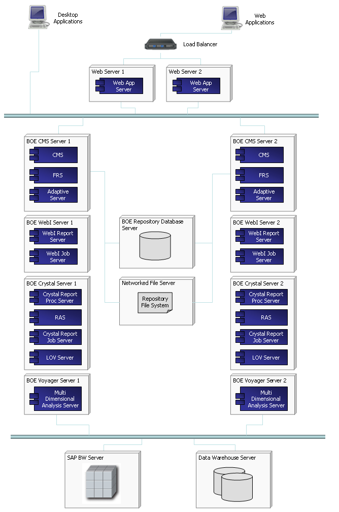
Enterprise Deployment of SAP BO may look like this:


n005: http://wp.me/pCJUg-4o

20101022

Tableau is growing 123% YoY


Tableau added 1500 new customers during last year (5500 total, also it is used by Oracle on OEM basis as Oracle Hyperion Visual Explorer), had $20M in sales in 2009, Q3 of 2010 showing 123% growth over the same period a year ago, claiming to be a fastest growing software company in BI market (faster than Qliktech), see http://www.tableausoftware.com/press_release/tableau-massive-growth-hiring-q3-2010


Tableau 6.0 will be released next month, they claiming it is 100 times faster than previous version (5.2) with in-memory columnar DB, 64-bit support and optional data compression. They are so confident (due increasing sales) so they put 40 job openings last week (they had 99 employees in 2009, 180 now and plan to have 200 by end of 2010). Tableau is raising (!) prices for their Tableau Desktop Professional from $1800 to $1999 in November 2010, while Personal will stay at $999. They aim directly at Qliktech saying (through their loyal customer) this: "Competitive BI software like QlikView from QlikTech is difficult to use without a consultant or IT manager by your side, a less than optimal allocation of our team's time and energy. Tableau is a powerful tool that’s easy to use, built to last, and continues to impress my customers."

In Tableau's new sales pitch they claiming (among other 60 new features):

  • New super-fast data engine that can cross-tab 10 million rows in under 1 second

  • The ability to blend data from multiple sources in just a click

  • Create endless combination graphs such as bars with lines, circles with bars, etc.


n004: http://wp.me/pCJUg-3Z

20100903

This DV blog is a work in progress (as a website)


My original intention was to write a book about Data Visualization, but I realized that all books in Data Visualization area will become obsolete very quickly and that Blog is much more appropriate format. This blog was started just a few months ago and it is always a work in progress, because in addition to blog's posts it has multiple webpages and most of them will be completed over time, approximately 1 post or page per week. After a few months of blogging I really started to appreciate what E.M. Forster (in "Aspects of the Novel"), Graham Wallas (in "The art of thought") and Andre Gide said almost 90 years ago: "How do I know what I think until I see what I say?".


So yes, it is under construction as a website and it is mostly a weekly blog.

Update for 3/24/2011: This site got 22 posts since first post (since January 2010, roughly one post per 2 weeks), 43 (and still growing) pages (some of them incomplete and all are work in progress), 20  comments and getting in last few weeks (in average) almost 200 (this number actually growing steadily) visitors per day. I am starting to get a lot of feedback and some of new posts actually was prompted by questions and requests from visitors and by phone conversations with some of them (they asked to keep their confidentiality).

Update for 11/11/11: This site/blog got (as of today) 46 posts and 61 pages (about 1 post or page per week, or should I say per weekend), 46 comments, hundreds of images and demos, 400+ visitors per weekday and 200+ visitors on weekend days, many RSS and email subscribers. Almost half of new content on this blog/site now created due demand from visitors and as a respond to their needs and requests. I can claim now that it is the visitor-driven blog and it is very aligned to the current state of the science and art of Data Visualization.

Update for 9/8/12: 67 posts, 65 pages, 133 comments, 12000+ visitors per month, Google+ extension of this Blog with 1580+ followers here: https://plus.google.com/u/0/111053008130113715119/posts#111053008130113715119/posts , 435 images, diagrams and screenshots

Permalink: http://apandre.wordpress.com/2010/09/03/dvblogasworkinprogress/

20100508

Google keeps own Data Visualizations options open

Recently I had a few reasons to review Data Visualization technologies in Google portfolio. In short: Google (if it decided to do so) has all components to create a good visualization tool, but the same thing can be said about Microsoft and Microsoft decided to postpone the production of DV tool in favor of other business goals.

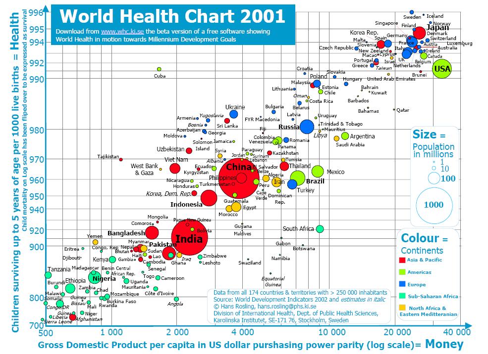
I remember a few years ago Google bought a Gapminder (Hans Rosling did some very impressive Demos

tumblr_mssaaxhajz1stz40uo1_500

with it a while ago):


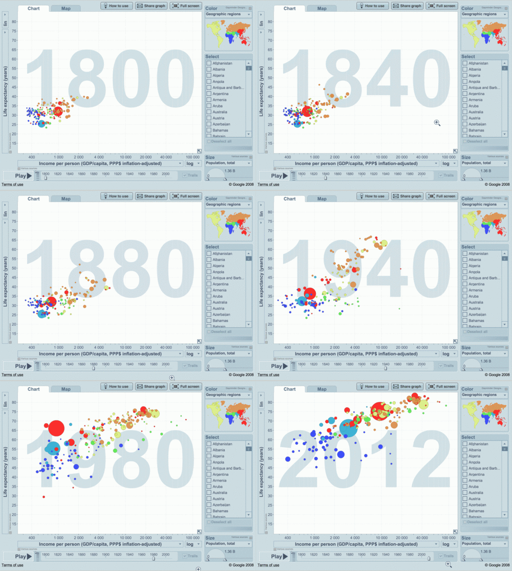
and converted it to a Motion Chart "technology" of its own. Motion Chart (For Motion Chart Demo I did below, please Choose a few countries (e.g. check checkboxes for US and France) and then Click on "Right Arrow" button in the bottom left corner of the Motion Chart below)

[googleapps domain="spreadsheets" dir="spreadsheet/pub" query="key=0AuP4OpeAlZ3PdDRwbTVYZFEwdWJUcXk5MS1WM3IzbHc&amp;output=html&amp;widget=true" width="500" height="700" /]

(see also here a sample I did myself, using Google's motion Chart) allows to have 5-6 dimensions crammed into 2-dimensional chart: shape, color and size of bubbles, Axes X and Y as usual (above it will be Life Expectancy and Income per Person) and animated time series (see light blue 1985 in background above - all bubbles will move as "time" goes by). Google uses this and other own visualization technologies in its very useful Public Data Explorer.

Google Fusion Tables is a free service for sharing and visualizing data online. It allows you to upload and share data, merge data from multiple tables into interesting derived tables, and see the most up-to-date data from all sources, it has  TutorialsUser's GroupDeveloper's Guide and sample code, as well as examples. You can check a video here:


The Google Fusion Tables API enables programmatic access to Google Fusion Tables content. It is an extension of Google's existing structured data capabilities for developers. Developer can populate a table in Google Fusion Tables with data, from a single row to hundreds at a time. The data can come from a variety of sources, such as a local database, .CSV file, data collection form, or mobile device. The Google Fusion Tables API is built on top of a subset of the SQL querying language. By referencing data values in SQL-like query expressions, developer can find the data you need, then download it for use by your application. Your app can do any desired processing on the data, such as computing aggregates or feeding into a visualization gadget. Data can be synchronized when you add or change data in the tables in your offline repository, you can ensure the most up-to-date version is available to the world by synchronizing those changes up to Google Fusion Tables.


Everybody knows about Google Web Analytics for your web traffic, visitors, visits, pageviews, length and depth of visits, presented by very simple charts and dashboard, see sample below:


Less people know that Panorama Software has OEM partnership with Google, enabling Google Spreadsheets with SaaS Data Visualizations and Pivot Tables.


Google has Visualization API (and interactive Charts, including all standard Charts, GeoMap, Intensity Map, Map, DyGraph, Sparkline, WordCloud and other Charts) which enables developers to expose own data, stored on any data-store that is connected to the web, as a Visualization compliant datasource. The Google Visualization API also provides a platform that can be used to create, share and reuse visualizations written by the developer community at large. Google provides samples, Chart/API Gallery (Javascript-based visualizations) and Gadget Gallery.

And last but not least, Google has excellent back-end technologies needed for big Data Visualization applications, like BigTable (BigTable is a compressed, high performance, and proprietary database system built on Google File System (GFS), Chubby Lock Service, and a few other Google programs; it is currently not distributed or used outside of Google, although Google offers access to it as part of their Google App Engine) and MapReduce. Add to this list Google Maps and Google Earth


and ask yourself then: what is stopping Google to produce a Competitor for the Holy Trinity (of Qlikview+Spotfire+Tableau) of DV?

Permalink: http://apandre.wordpress.com/2011/02/08/dvgoogle/