Showing posts with label Guest Posts. Show all posts

20130121

Advizor Visual Discovery, Part 2

This is the Part 2 of the guest blog post: the Review of Visual Discovery products from Advizor Solutions, Inc., written by my guest blogger Mr. Srini Bezwada (his profile is here: http://www.linkedin.com/profile/view?id=15840828 ), who is the Director of Smart Analytics, a Sydney based professional BI consulting firm that specializes in Data Visualization solutions. Opinions below belong to Mr. Srini Bezwada.

ADVIZOR Technology


ADVIZOR's Visual Discovery™ software is built upon strong data visualization tools technology spun out of a distinguished research heritage at Bell Labs that spans nearly two decades and produced over 20 patents. Formed in 2003, ADVIZOR has succeeded in combining its world-leading data visualization and in-memory-data-management expertise with extensive usability knowledge and cutting-edge predictive analytics to produce an easy to use, point and click product suite for business analysis.

ADVIZOR readily adapts to business needs without programming and without implementing a new BI platform, leverages existing databases and warehouses, and does not force customers to build a difficult, time consuming, and resource intensive custom application. Time to deployment is fast, and value is high.

With ADVIZOR data is loaded into a "Data Pool" in main memory on a desktop or laptop computer, or server. This enables sub-second response time on any query against any attribute in any table, and instantaneously update all visualizations. Multiple tables of data are easily imported from a variety of sources.

With ADVIZOR, there is no need to pre-configure data. ADVIZOR accesses data "as is" from various data sources, and links and joins the necessary tables within the software application itself. In addition, ADVIZOR includes an Expression Builder that can perform a variety of numeric, string, and logical calculations as well as parse dates and roll-up tables - all in-memory. In essence, ADVIZOR acts like a data warehouse, without the complexity, time, or expense required to implement a data warehouse! If a data warehouse already exists, ADVIZOR will provide the front-end interface to leverage the investment and turn data into insight.
Data in the memory pool can be refreshed from the core databases / data sources "on demand", or at specific time intervals, or by an event trigger. In most production deployments data is refreshed daily from the source systems.

Data Visualization


ADVIZOR's Visual Discovery™ is a full visual query and analysis system that combines the excitement of presentation graphics - used to see patterns and trends and identify anomalies in order to understand "what" is happening - with the ability to probe, drill-down, filter, and manipulate the displayed data in order to answer the "why" questions. Conventional BI approaches (pre-dating the era of interactive Data Visualization) to making sense of data have involved manipulating text displays such as cross tabs, running complex statistical packages, and assembling the results into reports.

ADVIZOR's Visual Discovery™ making the text and graphics interactive. Not only can the user gain insight from the visual representation of the data, but now additional insight can be obtained by interacting with the data in any of ADVIZOR's fifteen (15) interactive charts, using color, selection, filtering, focus, viewpoint (panning, zooming), labeling, highlighting, drill-down, re-ordering, and aggregation.

AdvizorCharts
Visual Discovery empowers the user to leverage his or her own knowledge and intuition to search for patterns, identify outliers, pose questions and find answers, all at the click of a mouse.

Flight Recorder - Track, Save, Replay your Analysis Steps


The Flight Recorder tracks each step in a selection and analysis process. It provides a record of those steps, and be used to repeat previous actions. This is critical for providing context to what and end-user has done and where they are in their data. Flight records also allow setting bookmarks, and can be saved and shared with other ADVIZOR users.
The Flight Recorder is unique to ADVIZOR. It provides:
• A record of what a user has done. Actions taken and selections from charts are listed. Small images of charts that have been used for selection show the selections that were made.
• A place to collect observations by adding notes and capturing images of other charts that illustrate observations.
• A tool that can repeat previous actions, in the same session on the same data or in a later session with updated data.
• The ability to save and name bookmarks, and share them with other users.

Predictive Analytics Capability


The ADVIZOR Analyst/X is a predictive analytic solution based on a robust multivariate regression algorithm developed by KXEN - a leading-edge advanced data mining tool that models data easily and rapidly while maintaining relevant and readily interpretable results.
Visualization empowers the analyst to discover patterns and anomalies in data by noticing unexpected relationships or by actively searching. Predictive analytics (sometimes called "data mining") provides a powerful adjunct to this: algorithms are used to find relationships in data, and these relationships can be used with new data to "score" or "predict" results.

AdvizorPredictiveModel

Predictive analytics software from ADVIZOR don't require enterprises to purchase platforms. And, since all the data is in-memory, the Business Analyst can quickly and easily condition data and flag fields across multiple tables without having to go back to IT or a DBA to prep database tables. The interface is entirely point-and-click, there are no scripts to write. The biggest benefit from the multi-dimensional visual solution is how quickly it delivers analysis, solving critical business questions, facilitating intelligence-driven decision making, providing instant answers to "what if?" questions.

Advantages over Competitors:


• The only product in the market offering a combination of Predictive Analytics + Data Visualisation + In memory data management within one Application.
• The cost of entry is lower than the market leading data visualization vendors for desktop and server deployments.
• Advanced Visualizations like Parabox, Network Constellation in addition to normal bar charts, scatter plots, line charts, Pie charts…
• Integration with leading CRM vendors like Salesforce.com, Blackbaud, Ellucian, Information Builder
• Ability to provide sub-second response time on query against any attribute in any table, and instantaneously update all visualizations.
• Flight recorder that lets you track, replay, and save your analysis steps for reuse by yourself or others.

Update on 5/1/13 (by Andrei): Avizor 6.0 is available now with substantial enhancements: http://www.advizorsolutions.com/Bnews/tabid/56/EntryId/215/ADVIZOR-60-Now-Available-Data-Discovery-and-Analysis-Software-Keeps-Getting-Better-and-Better.aspx

20130111

Advizor Visual Discovery, Part 1

If you visited my blog before, you know that my classification of Data Visualization and BI vendors are different from researchers like Gartner. In addition to 3 DV Leaders - Qlikview, Tableau, Spotfire - I rarely have time to talk about other "me too" vendors.

However, sometimes products like Omniscope, Microstrategy's Visual Insight, Microsoft BI Stack (Power View, PowerPivot, Excel 2013, SQL Server 2012, SSAS etc.), Advizor, SpreadshetWEB etc. deserve attention too. However, it takes so much time, so I am trying to find guest bloggers to cover topics like that. 7 months ago I invited volunteers to do some guest blogging about Advizor Visual Discovery Products:

http://apandre.wordpress.com/2012/06/22/advizor-analyst-vs-tableau-or-qlikview/

So far nobody in  USA or Europe committed to do so, but recently Mr. Srini Bezwada, Certified Tableau Consultant and Advizor-trained expert from Australia contacted me and submitted the article about it.  He also provided me with info about how Advizor can be compared with Tableau, so I will do it briefly, using his data and opinions. Mr. Bezwada can be reached at

sbezwada@smartanalytics.com.au , where he is a director at

http://www.smartanalytics.com.au/

Below is quick comparison of Advizor with Tableau. Opinions below belong to Mr. Srini Bezwada. Next blog post will be a continuation of this article about Advizor Solutions Products, see also Advizor's website here:

http://www.advizorsolutions.com/products/


CriteriaTableauADVIZORComment
Time to implementVery FastFast, ADVIZOR can be implemented within DaysTableau Leads
ScalabilityVery GoodVery GoodTableau: virtual RAM
Desktop License$1,999$ 1,999$3,999 for AnalystX with Predictive modeling
Server License/user$1K, min 10 users, 299 K for EnterpriseDeployment license for up to 10 named users $8 KADVIZOR is a lot cheaper for Enterprise Deployment $75 K for 500 Users
Support fees / year

20%


20%


1st year included
SaaS PlatformCore or DigitalOffers Managed HostingADVIZOR Leads
Overall CostAbove AverageCompetitiveADVIZOR Costs Less
Enterprise ReadyGood for SMBCheaper cost model for SMBTableau is expensive for Enterprise Deployment
Long-term viabilityFastest growthPrivate company since 2003.Tableau is going IPO in 2013
MindshareTableau PublicGrowing FastTableau stands out
Big Data SupportGoodGoodTableau is 32-bit
Partner NetworkGoodLimited PartnershipsTableau Leads
Data InteractivityExcellentExcellent
Visual DrilldownVery GoodVery Good
Offline ViewerFree ReaderNoneTableau stands out
Analyst's DesktopTableau ProfessionalAdvizor has Predictive ModelingADVIZOR is a Value for Money
Dashboard SupportExcellentVery GoodTableau Leads
Web ClientVery GoodGoodTableau Leads
64-bit DesktopNoneVery GoodTableau still a 32-bit app
Mobile ClientsVery GoodVery Good
Visual ControlsVery GoodVery Good
Data IntegrationExcellentVery GoodTableau Leads
DevelopmentTableau ProADVIZOR Analyst
64-bit in-RAM DBGoodExcellentAdvizor Leads
Mapping supportExcellentAverageTableau stands out
Modeling, AnalyticsBelow AverageAdvanced Predictive ModellingADVIZOR stands out
Predictive ModelingNoneAdvanced Predictive Modeling Capability with Built in KXEN algorithmsADVIZOR stands out
Flight RecorderNoneFlight recorder lets you track, replay, save your analysis steps for reuse by yourself or others.ADVIZOR stands out
Visualization22 Chart typesAll common charts like  bar charts, scatter plots, line charts, Pie charts are supportedAdvizor has Advanced Visualizations like Parabox, Network Constellation
Third party integrationMany Data Connectors, see Tableau's drivers pageADVIZOR integrates well with CRM software: Salesforce.com, Ellucian, Blackbaud and others.ADVIZOR leads in CRM area
TrainingFree Online and paid ClassroomFree Online and paid via company trainers & PartnersTableau Leads

20110920

Proliferation of useless Dashboards

This is a guest post from, Marc Gedansky, a well-known sales and marketing consultant in the Business Intelligence space.  Marc writes and speaks frequently on a variety of issues that influence technology providers and users, and is based in Cambridge, MA. I am fortunate to know Marc as Business Intelligence and Data Visualization expert and as my friend for many years.

Recently I noticed that internet (thanks to big data waves and to easy to use Data Visualization tools) is polluted with a lot of useless Dashboards and I spoke with Marc about this topic. Turned out he has a a very good explanation for it and he was kind enough to share his opinion on this blog as a guest blogger. Marc's post reminded me the old story:

"An admirer asked Michelangelo how he sculpted the famous statue of David that now sits in the Academia Gallery in Florence. How did he craft this masterpiece of form and beauty? Michelangelo’s offered this strikingly simple description: He first fixed his attention on the slab of raw marble. He studied it and then “chipped away all that wasn’t David.

________________________________________

Dashboards – why are so many useless?


Marc Gedansky, http://marc1717.blogspot.com/

“Perfection is achieved, not when there is nothing more to add, but when there is nothing left to take away.” - Antoine de Saint-Exupery

Most dashboards are designed with no clue as to the meaning and/or importance of this quote.

(BTW, even though this is a blog about data visualization, I (M.G.) won’t show any poorly designed dashboard examples, as they are ubiquitous.  Trying to find them is about as difficult as trying to find leaves


on the ground in New England during the Fall).

I view dashboards every day; on software company sites, news sites, financial sites, and blogs.  Since dashboards can distill so much information and display it in such a small space, they hold the potential of quickly delivering valuable insights; of cutting through the “data clutter” to immediately reveal important trends or truths.

So why then, are most dashboards crammed with so many charts, dials, and graphs that they overwhelm you?  Just because you can fit a half-dozen on a screen, why is there a need to do it?  (This approach reminds me of my friend Geoff, who, upon hearing that Hellmann’s was coming out with mayonnaise that had half the calories remarked, “great, now I can eat twice as much”.)

I think there can only be two reasons.

1. The designer/developer wants to show off their expertise with Qlikview, or Spotfire, or Tableau, or X product.

2. The designer/developer does not care about the average person, and wants to build smart software for brilliant users.

That attitude reminds me of a meeting I attended at a software company a few years ago.  The head of development was upset because he was being asked to make his software “easy to use”.    He called it “dumbing down”, and complained that it would be less challenging for his development team to build “software for idiots”.  At this point, the President of the company interjected, “if our customers are smart enough to write us a check, then they are smart enough to use our software.  And the onus for them to be able to use our software is on us, not on them.”

For Continuation of this post please see it on this blog's page: http://apandre.wordpress.com/dataviews/dashboard/proliferation-of-useless-dashboards/

20110627

Excel as a BI Platform – Part 3

Below is a Part 3 of the Guest Post by my guest blogger Dr. Kadakal, (CEO of Pagos, Inc.). This article is about of how to build Dashboards and Data Visualizations with Excel. The topic is large, and the first portion of article (published on this blog 3 weeks ago) contains the the general Introduction and the Part 1 “Use of Excel as a BI Platform Today“.  The Part 2 – “Dos and Don’ts of building dashboards in Excel“ published 2 weeks ago  and Part 3 – “Publishing Excel dashboards to the Internet“ is started below and its full text is here.

As I said many times, BI is just a marketing umbrella for multiple products and technologies and Data Visualization became recently as one of the most important among those. Data Visualization (DV) so far is a very focused technology and article below shows how to publish Excel Data Visualizations and Dashboards on Web. Actually a few Vendors providing tools to publish Excel-based Dashboards on Web, including Microsoft, Google, Zoho, Pagos and 4+ other vendors:

I leave to the reader to decide if other vendors can compete in business of publishing Excel-based Dashbaords on Web, but the author of the artcile below provides a very good 3 criterias of how to select the vendor, tool and technology for it (and when I used it myself it left me only with 2 choices - the same as described in article).

Author: Ugur Kadakal, Ph.D., CEO and founder of Pagos, Inc. 


Publishing of Excel Dashboards on the Internet


Introduction


In previous article (see "Excel as BI Platform" here) I discussed Excel’s use as a Business Intelligence platform and why it is exceedingly popular software among business users. In 2nd article ("Dos&Don’ts of Building Successful Dashboards in Excel") I talked about some of the principles to follow when building a dashboard or a report in Excel. Together this is a discussion of why Excel is the most powerful self-service BI platform.

However, one of the most important facets of any BI platform is web enablement and collaboration. It is important for business users to be able to create their own dashboards but it is equally important for them to be able to distribute those dashboards securely over the web. In this article, I will discuss two technologies that enable business users to publish and distribute their Excel based dashboards over the web.

Selection Criteria


The following criteria were selected in order to compare the products:

  1. Ability to convert a workbook with most Excel-supported features into a web based application with little to no programming.

  2. Dashboard management, security and access control capabilities that can be handled by business users.

  3. On-premise, server-based deployment options.


Criteria #3 eliminates online spreadsheet products such as Google Docs or Zoho. As much as I support cloud based technologies, in order for a BI product to be successful it should have on-premise deployment options. Without on-premise you neglect the possibility of integration with other data sources within an organization.

There are other web based Excel conversion products on the market but none of them meet the criteria of supporting most Excel features relevant to BI; therefore, they were not included in this article about how to publish Excel Dashboard on Web .

20110614

Excel as a BI Platform – Part 2

Below is a Part 2 of the Guest Post by my guest blogger Dr. Kadakal, (CEO of Pagos, Inc.). This article is about of how to build Dashboards and Data Visualizations with Excel. The topic is large, and the first portion of article (published on this blog last week) contains the the general Introduction and the Part 1 “Use of Excel as a BI Platform Today“.

The Part 2 – “Dos and Don’ts of building dashboards in Excel“ is below and Part 3 – “Publishing Excel dashboards to the Internet“ is coming soon. It is easy to fall into a trap with Excel, but if  you avoid those risks as described in article below, Excel can become of one of the valuable BI and Data Visualization (DV) tool for user. Dr. Kadakal said to me recently: "if the user doesn't know what he is doing he may end up spending lots of time maintaining the file or create unnecessary calculation errors". So we (Dr. Kadakal and me) hope that article below can save time for visitors of this blog.

BI in my mind is a marketing umbrella for multiple products and technologies, including RDBMS, Data Collection, ETL, DW, Reporting, Multidimensional Cubes, OLAP, Columnar and in-Memory Databases, Predictive and Visual Analytics, Modeling and DV.

Data Visualization (aka DV), on other hand, is a technology, which enabling people to explore, drill-down, visually analyze their data and visually search for data patterns, like trends, clusters, outliers, etc. So BI is marketing super-abused term, while DV so far is focused technology and article below shows how to use Excel as a great Dashboard builder and Data Visualization tool.

Dos&Don’ts of Building Successful Dashboards in Excel


Introduction (click to see the full article here)


In previous week's post (see also article "Excel as BI Platform" here) I discussed Excel’s use as a Business Intelligence platform and why it is exceedingly popular software among business users. In this article I will talk about some of the principles to follow when building a dashboard or a report in Excel.

One of the greatest advantages of Excel is its flexibility: it puts little or no constraints on the user’s ability to create their ideal dashboard environments. As a result, Excel is being used as a platform for solving practically any business challenge. You will find individuals using Excel to solve a number of business-specific challenges in practically any organization or industry. This makes Excel the ultimate business software.

On the other hand, this same flexibility can lead to errors and long term maintenance issues if not handled properly. There are no constraints on data separation, business logic or the creation of a user interface. Inexperienced users tend to build their Excel files by mixing them up. When these facets of a spreadsheet are not properly separated, it becomes much harder to maintain those workbooks and they become prone to errors.

In this article, I will discuss how you can build successful dashboards and reports by separating data, calculations and the user interface. The rest of this post you can find in this article

 Dos and Don’ts of building dashboards in Excel" here.


It discusses how to prepare Data (both static and external) for dashboards, how to build formulas and calculation models, UI and Input Controls for Dashboards and of course - Pivots,Charts, Sparklines and Conditional Formatting for innovative and powerful Data Visualizations in Excel.

20110605

Excel as a Business Intelligence Platform - Part 1

This is a Part 1 of surprise Guest post. My guest is Ugur Kadakal, Ph.D., he is the CEO and founder of Pagos, Inc., which he started almost 10 years ago.

Dr. Kadakal is an expert in Excel, Business Intelligence, Data Analytics and Data Visualization. His comprehensive knowledge of Excel, along with his ambitious inventions and ideas, supply the foundation for all Pagos products, which include SpreadsheetWEB (which converts Excel spreadsheets into web applications), SpreasheetLIVE  (a fully-featured, browser-based spreadsheet application environment) and Pagos Spreadsheet Component (which integrates Excel spreadsheets into enterprise web applications).

Pagos started and hosted the largest free collection and repository of professional templates of Excel spreadsheets on the web: http://spreadsheetzone.com . 3 Excel-based Dashboard below can be found on this very popular repository and done by Dr. Kadakal:

Dashboard 1 : Human Resources Dashboard: http://spreadsheetzone.com/templateview.aspx?i=498

Dashboard 2 : Business Activity Dashboard in EuroZone: http://spreadsheetzone.com/templateview.aspx?i=490

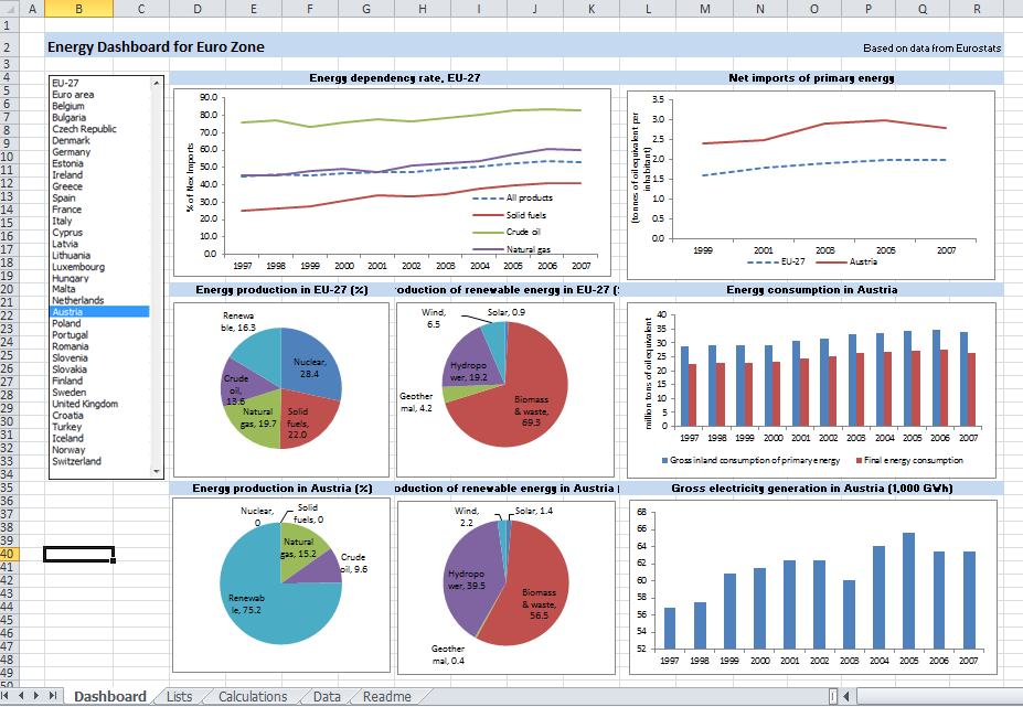
Dashboard 3 : Energy Dashboard for Euro Zone: http://spreadsheetzone.com/templateview.aspx?i=491

The topic is large, so this Guest article is splitted on 3 blog posts. The first portion of article contains the Introduction and Part 1 "Use of Excel as a BI Platform Today", then I expect Dr. Kadakal will do at least 2 more posts: Part 2 - "Dos and Don’ts of building dashboards in Excel", Part 3 - "Moving Excel dashboards to the Web".

Excel as a Business Intelligence Platform – Part 1


Introduction


Electronic spreadsheets were one of the very first Business Intelligence (BI) software. While the availability of spreadsheet software and it use as a tool for data analysis dates back to the 1960s, its application in the BI field began with the integration of OLAP and pivot tables. In 1991, Lotus released Improve, followed by Microsoft’s release of PivotTable in 1993. However, Essbase was the first scalable OLAP software to handle large data sets that the early spreadsheet software was incapable of. This is where its name comes from: Extended Spread Sheet Database.

There is no doubt that Microsoft Excel is the most commonly used software for BI purposes. While Excel is general business software, its flexibility and ease of use makes it popular for data analysis with millions of users worldwide. Excel has an install base of hundreds of millions of desktops: far more than any other BI platform. It has become a household name. From educational utilization to domestic applications and enterprise implementation, Excel has been proven incredibly indispensable. Most people with commercial or corporate backgrounds have developed a proficient Excel skillset. This makes Excel the ultimate self-service BI platform. However, like all systems, Excel has some weaknesses that make it difficult to use as a BI tool under certain conditions.


Use of Excel as a BI Platform Today


Small Businesses


Traditionally, small businesses are not considered as an important market segment by most BI vendors. Their data analysis and reporting needs are limited primarily due to their smaller commercial volumes. However, this is changing quickly as smaller organizations begin to collect large amounts of data, thanks to the Internet and social media, and require tools to manage that data. However, what is not changing is the limited financial resources available to them. Small businesses cannot spare to spend large amounts of money on BI software or consultants to aid them in the creation of the applications. That’s why Excel is the ideal platform for them and will most probably remain that way for a foreseeable future. The reasons are clear: (1) most of them already have Excel licenses, (2) most of their users know how to use Excel and (3) their needs are simpler and can be met with Excel.

Mid-Range Businesses


Mid-range businesses are a quickly growing market segment for BI vendors. Traditionally, Excel as a BI platform has been more popular among these businesses. Cost and availability are the primary factors in this. However, two aspects have been steering them to searching for alternatives: (1) Excel can no longer handle their growing data volumes and (2) other BI vendors started offering cost-effective alternatives.

As a result, Excel’s market share in this field is in decline although it still remains the most popular. On the other hand, with the release of Office 2010 and its extended capabilities for handling very large data sets, Excel stands a good chance at reversing this decline.


Large Enterprises


The situation with large enterprises is rather complex. Most of them already have large-scale a BI implementation in place. Those implementations often connect various databases and data warehouses within the organizations. They have made significant investments and continue doing so to expand and maintain their BI systems. They already have a number of dashboards and reports designed to serve their business units. However, business users always need new and different dashboards and reporting tools. The only software that gives them the ultimate flexibility in creating their own reports is Excel. As a result, even in large Enterprises, usage of Excel for BI purposes is common. Business users often go to their data warehouses or BI tools and get a data extract to bring into Excel. They can then prepare their analysis and build their reports in Excel.

Enterprises will continue using their existing platforms because they have made huge investments building those systems. However, Excel use by business users as their secondary BI and reporting tool will continue to rise unless the alternative vendors significantly improve their self-servicing capabilities.


Summary


Excel is one of the ultimate business platforms and offers unparalleled features and capabilities to non-programmers. This makes it an ideal self-service BI platform. In this article, we examined the use of Excel as a BI platform in companies of different sizes. In the next article of this series, we will discuss how to use Excel more efficiently as a BI platform, from handling data to calculations and visual interactions.